(Repost) Tips on getting a better CV resume layout
Contrast issues and making good choices for colors
how can i learn how to get better at UIUX design??
animated svg file is not uploading to figma and it appears as a blank screen when converted to gif
Feedback for a nonprofit website
Create a style guide after UX Design?
how to animate those self drawing path following animations?
Background image + linear gradient combined not working on phone (safari)
Ideas to implementing menus in middle of page
Feedback for ''FrontEnd Mentor'' beginner project that I recreated for practice!
Isometric illustrations to explain a service blueprint
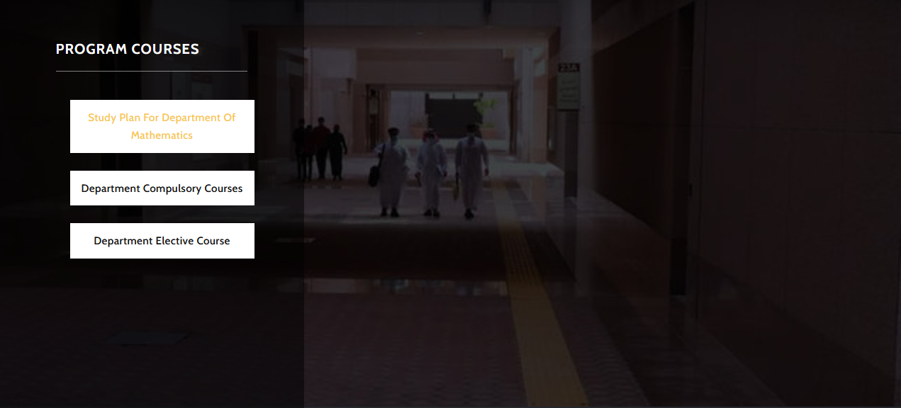
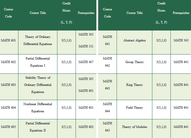
Best way to show this long table


Check my site I created for my project in school (you probably won't understand the text)
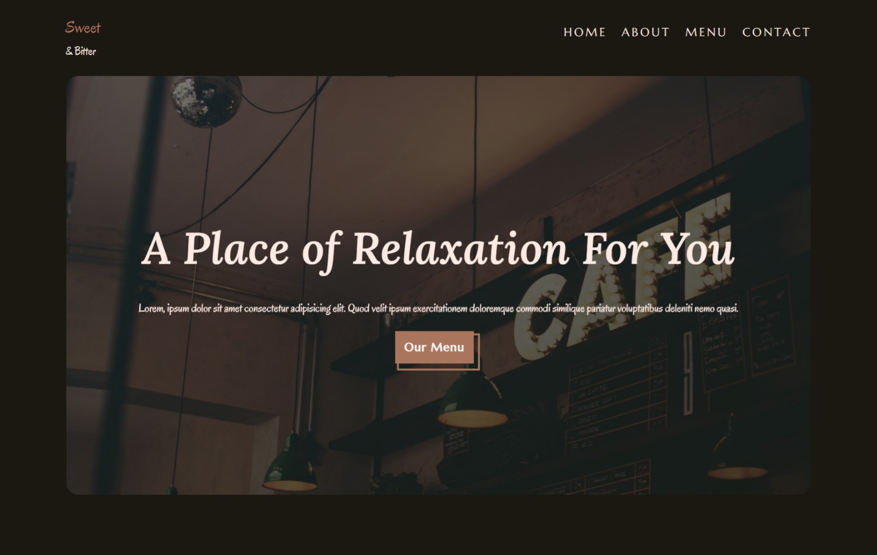
Looking for feedback for WIP landing page
Transition is not smooth when it starts over
Design Improvements and Feedbacks
Portfolio Feedback