Design Improvements and Feedbacks
Hi! This is my first time making a design for website. I need feedback and advice for improvements. And I want to know if this is good enough to put in my resume or portfolio. Thank you in advance!
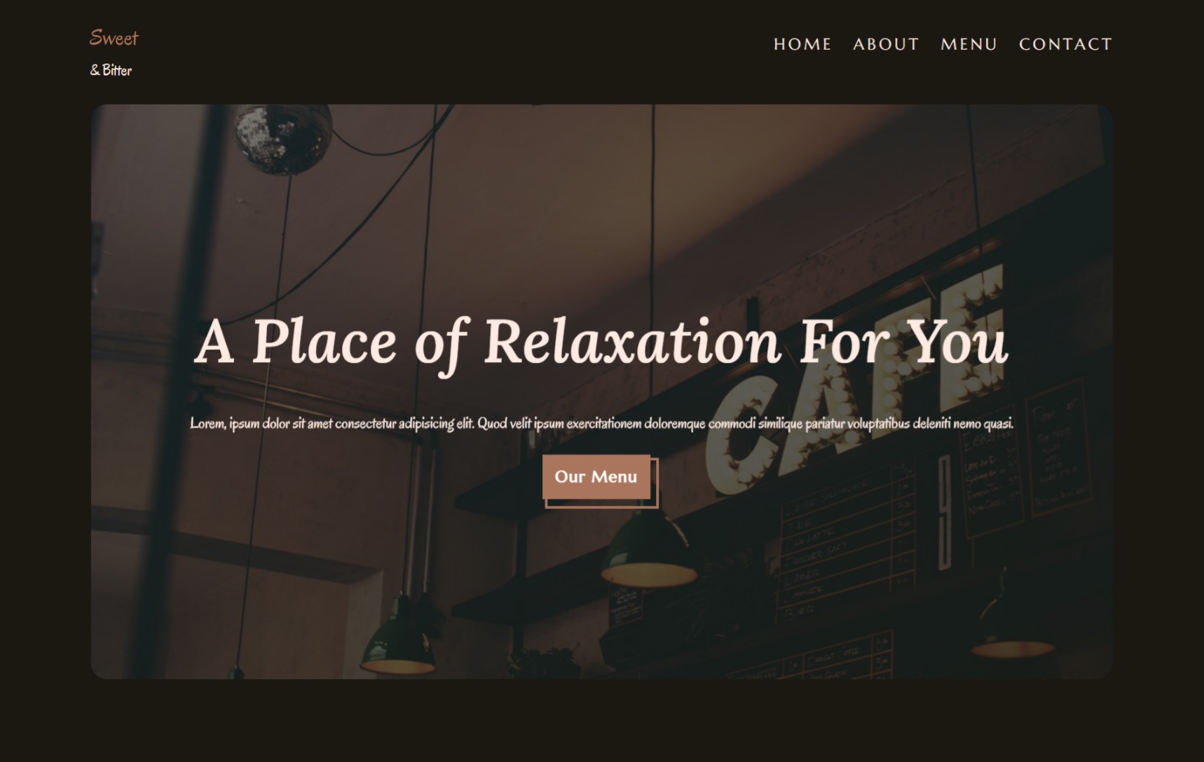
https://cafe-website.pages.dev/
2 Replies
hey TL, it's really solid for your first time design! great work. If you would like to iterate on it, then areas I would focus on would be:
1. alignment - If you make all your sections the same width / horizontally aligned, it will give it a cleaner look (including nav bar)
2. your background might look better if it wasn't such a strong brown. Try desaturating it a good bit and see if you find something that is more pleasing to look at
Also, the bg is overwhelming everything else, so that might help tone it down and make the content stand out more
3. Hero Section - Typically with a large H1, you'll want to reduce the vertical spacing so the 2 lines aren't so separated
4. Services? section - the black outline is way too low contrast compared to the brown bg (altho it might be fixed if you adjust the bg color).
5. Menu - The menu icons are also too low contrast, they are almost invisible on the page. Maybe you could put circular bg's behind them or change them to white?
6. Footer - you'll want to properly center this on the page, and since you have a fairly small amount of info here, it might look nice with 3 or 4 columns
7. Fonts - 3 fonts is a bit heavy for a page like this. And 'oregano' might be a bit too whimsical for a body copy font, maybe try a nice sans serif font for all the paragraph copy. And whatever Sans you choose (inter, jakarta plus, poppins, open sans, etc), I would replace Marcellus with it as well
Thanks for your advice, I change font family to Open Sans and reduce the saturation and increase the brightness of my color palette. It is indeed look better. But I haven't figure out how to do with footer. Thanks a lot.