Working with Off-Screen Tabs
On a mobile website, is it a problem to have off-screen tabs? (As denoted by my blue right-arrow)

The eternal grid UI problem: auto-adjusting to screen width while also honoring saved user settings
In apps with lots of tabular data (backoffice admin tasks, reporting, etc.), a common feature is to allow users to save their view settings for grids, such as which columns to show, column order, column width, and sorting. Unfortunately, this sometimes steps on the toes of another helpful feature for large grids: auto-expanding to fill up the available width in the viewport.
Imagine that when a user views a grid for which they haven't saved view settings, the grid uses "natural width" (column widths are set proportionally based on their content and the available viewport width). As soon as a user wants to change the width of a column, it seems to me that auto-width can no longer be used for the entire grid, instead using hard-coded widths. This creates a frustrating usability issue where the user is left wondering why the grid no longer sizes intuitively, and all the developers can say is "that's because you customized a column's width. You have to delete your customization". Not ideal.
How have you guys dealt with this issue? Is there a more elegant solution than this?...
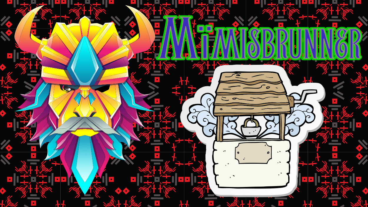
Feedback needed fot the layout and overall design
I added white blur blocks on the left and right sides and used a lot of images onb the page to make it more dynamic.
I'm really curious to hear your thoughts, do you like the style?
Feel free to share any feedback or suggestions for improvement!...

Need help with consistent colours across devices.
Hi guys, I'm having an issue with a specific colour in my palette.
Colour Palette
```CSS
--white: oklch(87% 0 0);...
Need help with this chevron border effect
Hello, I've been trying now for quite a while to get this border effect with the chevrons. I used clip-path to mask the image, but I can't figure out a way to create the chevron border effect so that it lines up perfectly with the image. Any help would be appreciated.

Website Background
Hello! Ever since I started making websites I've mainly used solid or gradient colors. I've been wanting to get more experience into making websites with the same vibes/background as the attached images, but I'm not sure where to start and how to implement it. Would the workflow for designing something like this be photoshop and then having it as a background image, or what would be the best?

General tips for web design
Hey guys, i just wanted some feedback on the look and feel of my website. This is my 1st design which also happen to be my future portfolio site. I would appreciate any type of feedback regarding it. I have the desktop and mobile version. If you have any questions, please ask. Thanks in advanced!

Hero Section Comparison Feedback would be nice
I have created multiple versions of the hero section and would like to ask which one is the best and if there are any possible improvements. Thank you in advance!

Media Ranker Keyboard Navigation
I'm working on a program that allows users to create ranked lists of content to be aggregated and drive a recommendation engine.
I'm fleshing out the UI at the moment & one of my goals is for it to be completely mobile & keyboard navigable.
Currently, here's where I'm at in my planning of functions:...
Optimizing HeroSection for Mobile and Desktop
Hey, how does the Herro section look, especially on mobile? Is it good or are there any improvements that can be made?

Start make web App from 0%
How can I model the movement of user A in my app in an abstract way? I don't want to complete goal xy. A big picture of my app.
to test the Concept
design later...
UI looks zoomed in
I designed my UI in figma but when I built it out in css it looks zoomed in and zooming out the browser window to 90% actually makes it look really good. This seems to be a common occurence for me can anyone tell me how to remedy it so that it looks like 90% zoomed out by default
Create a website for a poem/book
Hey folks. A friend of mine is an excellent poet and he has a poem that he thinks is hard to get accepted by a publisher so I convinced him to create a website, showing the poem like a digital book, with transitions animations and a link to buy the digital book. Now I want to know if anyone know some examples of websites like this in order to get inspired.
need some ui recommendations
So totally 6 images I sent here , all the contents was in 1 page and similar like this I have other pages as well but content would differ , when I saw this It kinda seems like I reading in Wikipedia so kinda I need any recommendations or iconsor image I can add and my site is based on digital marketing

i don't know how i can do responsive on a design
hey everyone, so i struggle to do responsive on a website that i'm working, on, not the css aspect of it but like on the design itself
meaning this ; i was given a design & i was told to make a website looking like this; the bloglist & single blog;
so i made something that somewhat looks like it ...

Figma Question
Hi, I'm new to Figma. One thing that has been bothering me is that it seems there's no built-in way to slot in components inside other components.
For example, I'm building this search bar + search suggestions component. With the way I have it set up right now, I can have one search suggestion inside the search suggestions container, but if I want to add more, I have to add it inside the master component, or detach the component instance.
Another thing I wanted to do was build a page layout component to keep a consistent 20px left/right padding on all my pages. But again, I can't insert content inside instances of the layout component. I don't know, is it a bad idea to try to add padding this way in the first place?...

I want to make product cards with size and prices
I can't figure out how to make it look good. Any ideas?
Image #2 was the best I could come up with but it doesn't look all that polished. I don't want the price and size to be hidden under a collapsible bar on anything....

Looking for feedback on my blogging website
Hello, I am looking for any feedback on the content, readability, design or anything would greatly be appreciated . Also I would like some feedback on styling my Tables of Content. Should I do
list-style: none; on all the li elements or just the children of the li elements?
https://blogbydave.netlify.app/blog/...Looking for feedback on this gym app design I am making
Making this simple gym app for users to track their workouts, bodyweight, strength and calorie intake using only one app. I am more of a software developer so am not really well versed with design guidelines other than a few so would love feedback if I have violated or haven't implemented some of them to keep in mind for further projects. The stuff I need feedback on are:
1. My color combo is the blue and light beige color, so in the navbar I thought to use white for unactive tab since its a standard, but I feel like they aren't that contrasting as compared to active tab so user might have difficulties seeing it especially in bright conditions. Any ways to make them contrasting while keeping the same color combos or should I change it?
2. Most of my pages doesn't have the back button because I am thinking to use swipe back, but I don't know how good this is in point of UI view....