Contrast issues and making good choices for colors
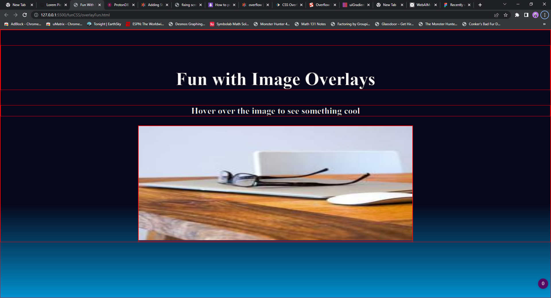
I'm terrible at art and color mixes so I dont notice the visual issues that others may deal with. For me, suggestions on my current pen can help me understand these issues and notice them. I'm hoping for more advice on choosing my color schemes for a given design and how to avoid the mess ups like in this codepen. Please let me know fixes for issues and improvements I could learn from.
https://codepen.io/MD-2016/pen/WNKejLj
37 Replies
one question I would have for you, is how are you currently deciding what colors to use on your gradients?
I borrowed them from uigradients
uiGradients
uiGradients - Beautiful colored gradients
uiGradients is a handpicked collection of beautiful color gradients for designers and developers.
this is the one I used
also got an overflow issue
Color in UI Design: A (Practical) Framework
The importance of color variations · Darker vs. lighter variations · Analyzing the real world · The Rules (in HSB) · Luminosity · The Way of Color
this is a cool article on color that might interest you
and this dude also made a pretty cool generator that can make really nice gradients
Gradient Generator Tool
Create gorgeous, buttery-smooth color gradients for UI design. Export as CSS or SVG image.
and he also has a really great email newsletter with daily advice on how to become better at design in general
yeah as you see from my pen im not very poor at design
background: linear-gradient(to top, #0090cd, #07061a);
just messing with your colors as the starting point, i wound up with these 2 values which is more pleasing to my eyes, but color is extremely subjective
one article I read suggested picking a base color and sticking to complementary colors then using light or dark greys and using black text on those or greyish text on white
that's very nice!
my general 'gradient' strategy, is I go for 3 color gradients 99% of the time, I find they are easier to work with than 2 colors
or I stick with gradients that are 1 color and just going to transparency
you can't go wrong with that, but of course it depends what is behind the gradient
you got some examples of these?
seems like I pick horrible color combos either ones that dont mix or too much light and dark and causing contrast issues
yeah it definitely takes practice and repetition

here's an example of a page with the bg having a 3 color gradient
and the middle sections have single color to alpha gradients to create a more organic flow from one section to the next
looks very pretty
plus fitting for the theme of the current month
yeah after the holidays, the bg gradient will remain, but the rest will go back to a much less festive look 😄
you made this?
yeppers
very well done 🙂 I wish I could make stuff like that
it's an ecommerce site in Bosnia gets about 1-2k unique hits a day
you will definitely be able to make this and much better if you keep going forward in your learning 🙂
what do you think of my Stroke choices?
on the text?
what would look good with that gradient?
yeah im trying to avoid the contrast meltdowns I had last night
I'm not generally a fan of using a black on white stroke
i usually just use a plugin in figma
to make sure the contrast is good enough to not need a stroke
https://webaim.org/resources/contrastchecker/
or this page has one as well that will show you if you are wcag2 compliant
for instance, if you plug in that gradient i used, the contrast is insanely high on the white letters
so you definitley don't need the stroke
Interesting
What would you suggest I change?
if you are keeping your original colors, then change the gradient stop to push the darker color down more, so instead of 0, make it like 25 or 35 and then all the white text will be in the darkest part of the gradient
25%?
and i would also suggest, you make your designs in software like Figma rather than while you are doing the code. It is way easier to do design first then code 2nd

that is probably too steep, but you can experiment until you get a depth you want
but in this case, it doesn't matter as much
because the contrast is already super high
just signed up for figma starter
only get 3 though
you get unlimited drafts tho
which is what you can design in since you won't be collaborating
so just create a new file in the drafts and you can add unlimited pages and layers and frames and just go completely crazy with no issue 😄
15% maybe? I need to get rid of the contrast issue

getting there I think I used 35%