Would anyone be kind enough to rate my website's UI? Will DM the link to those interested in helping
Would anyone be kind enough to rate my website's UI? Will DM the link to those interested in helping. TIA! 🙂
Portfolio feedback
I've been working on the second version of my portfolio the last couple of weeks, and I'm curious to know what anyone else thinks. I'm not done yet, (still needs a footer, and mobile responsiveness), but I'm just wanting to maybe get a few pointers if possible. Thanks!
I'm also still updating the contact section. I'm trying to use toastify to send a success alert after the email is submitted, but it's not working at all. Not entirely sure why, but I'm just going to make a custom alert at this point.
https://www.devjones.space/...
Patient Details Modal Ideas
hello guys I am building a dashboard for one of a laboratory. Now for showing basick details of the patients I want to use modal. can anyboady give me some ideas or share pic how should I desing a patitnet modal.
Portfolio Website Help
Hey guys, I redid my portfolio website. Please let know know your thoughts. Please let me know if I can make any improvements.
https://namanprat.com/...
Portfolio idea
https://www.figma.com/file/6yXavsPf5VVw5xiehZJoDK/Portfolio-Idea?type=design&node-id=0%3A1&t=rzsR8usw44uWtNiY-1
I'm toying around with some portfolio designs and came across this hero section (thanks Misha!). I was thinking about making my portfolio just this frame that's in figma, as I think it would be nice if a recruiter doesn't have to scroll down at all and can view everything really quickly. However, I feel like there's too much there, and it's too much cognitive load. What do you guys think? Should I stick with something more traditional?...
tags? pills? chips? buttons? the "all look alike hell"
So in my company we are developing a design system, one thing that bothers me a lot is the "chips" or "pills" design in the way it's applied on multiple design systems (culture amp, ant design, atlassian etc.), the thing is:
labels/pills/chips in most design systems can be clickable or not, and that's documented in those DS's as a normal behavior but for me as a user it make absolutely no sense, how can you have the same visual element being interactive or not in your page without any other clues of that? the user is supposed to guess when they can or cannot click something? I'm missing something here or there are really a lot of big companies doing it wrong?
How are you people handling this, I see a lot of difficulties making those kind of components usable, here on discord we have "tags", I think they font-size is a little to small to be readable but if they get bigger they will look too much like the "post" button, other thing... Sometimes, specially when people call them "chips" and not tags, they can behavior like a radio button (only one option selectable) or a checkbox (multiple selection) and to know if you can select one or more you have to... guess.
Have you worked with those? what rules did you used? can you point good examples of those things?...
Show expertise on sth...
I polished my website https://ali-hussein.com and need to show my focus on developing ai-driven apps. I need some ideas on how to show it clearly. thanks

Need advice
I already posted a bit about it in #general but figured it would be best to make a new thread here.
I've been watching Flux Academy, DesignCourse, and some other website design content on youtube for around a year or so, on and off, whenever I'm trying to design websites. I'm at the point where I can look at the website and notice some things that they do well and things they don't do well. However, when I go to make a design in Figma, I just cannot for the life of me make something that looks decent. I've watched Kevin's video about how he approaches making new website designs, and I do the same thing, but I struggle because I end up liking one or two designs a lot and end up either copying them or just giving up out of frustration because I don't want my design to look exactly like theirs. I also struggle because I feel like what makes websites stand out in today's landscape is really good graphics, but I'm not good at photoshop at all so making assets that pop and make an otherwise boring website look good is beyond me, for now anyway.
I almost feel like I'm stuck in tutorial hell for design, which is a weird thing I've never felt before with coding. Usually with coding I just dive right in and if I get stuck I'll read the docs and figure it out. I know design is a skill, and it can be learned just like coding can, but I feel like its so much more subjective so it's a lot harder to pick up in a sense. I was thinking maybe I should just pick out a really nice course one of you guys recommend and go along with it and after that just make a ton of designs in Figma. ...
where to find good portfolio website templates
Would like to find some neat dynamic responsive editable portfolio website templates for developers. Preferably in Figma. The image is an example I have in mind. I have searched in websites and scrolled Figma. Still haven’t find one stratifying

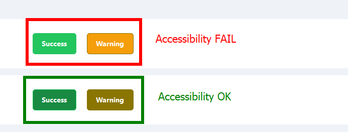
Accessibility and Colors
Hi, in my company we are creating websites and require pass AA of Accessibility.
I'm learning everything about that but I have some doubts. If I try to use nice colors for my background or text, doesn't pass accessibility and If I try to modify looks like this (very ugly)
For example my "warning" or "success" color that I attached to this post. The "warning" passed accessibility with 4.52 (from 4.50 is OK to pass).
I see a lot of websites that doesn't pass accessibility colors and very big companies too and I don't know if it's really very important or not....

Anyone here use 12 column grids?
I'm learning a lot about 12 column grids and they seem great for design, but I'm not sure how practical they are to set up in css from project to project. It seems like a very different approach to the way I usually set up my css. Anyone have advice and/or repositories or tutorials to get started with a grid system?
Struggling with UI/UX layout design and color palettes...
Hey folks! So, I do pretty well with putting together layouts once I have an idea. I really enjoy it. My main issue is coming up with:
1. A nice color palette
2. A nice, unique layout
I have used sites like coolors but I guess the main issue for me with coolors or other palette generators is I have no idea how to implement them a lot of times. Which one is for the background? Which one is best for the font color? Which is best for links? Buttons? A secondary color for certain cards/divs? ...
Any Idea for my background or improve design?
I have a design and my body is divided with a dark blue color in 30% and 70% in light gray.
My problem is with my table. If I have only one or two rows, the rest of the content is too empty and is like is too gray.
Someone can give an idea to improve it?
Thanks!...
Need some advice to improve that design
Here is my try to create an design for e-commerce website. I began from mobile version because it think it is the easiest one. I would like some tips and recommendations about how could I improve that.

How to make designs for social medias and sites
I want to know how to make nice designs like in dribble just like in photo to showcase the prototypes. I am a beginner in ui/ux so I want to know tools and processes to make it happen.
Feedback on git website redesign typography
I was pretty proud of this minimal page that I made for a git website redesign, until I created the header, which doesn't seem to fit in with the rest of the page, as it looks relatively small and basic. I would appreciate some feedback on the typography and position/sizing. If the Figma files are required I can send them over.

Landing page design feedback
Curious what you guys think. I feel like the footer is pretty over-saturated with texture but I feel like if I remove the background svg texture it's too bland. Any and all critiques welcome!
https://splendorous-tartufo-44b679.netlify.app/
Here's the old thread: https://discord.com/channels/436251713830125568/1077133483773804564...
Feedback on Prosocial Design Network Library
IRL, I’m one of the cofounders of the Prosocial Design Network. We’re a 501(c)3 that curates evidence based ways social media might be redesigned so as to promote prosocial behaviors.
https://www.prosocialdesign.org
I’d like feedback on our site. Specifically, I’d like to know:...