Any Idea for my background or improve design?
I have a design and my body is divided with a dark blue color in 30% and 70% in light gray.
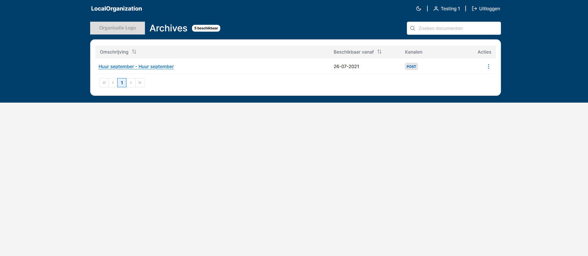
My problem is with my table. If I have only one or two rows, the rest of the content is too empty and is like is too gray.
Someone can give an idea to improve it?
Thanks!
10 Replies
if the content is not enough to fill the page, it's probably better to center it more in the viewport, and also, just use a solid bg color instead of the 2tone
also, i notice a whole lot of variation in the border radius amounts on your various elements, which could be cleaned up a bit
Thanks for your feedback @ghostmonkey. In the beginning I had a solid bg color and not 2tone, but the website was very very white (light) and Looks empty. And for that I added a second color and when the table has more rows is perfect.
But the problem is in this case, with 3 o 4 rows :(. It's really necessary in UX/UI change the design only if 1 case (the screenshot) is not OK?
Thanks again 🙂
in that case, and assuming that this table is the only content on the page, one solution would be to make the table's container have a min height on screen of say 75% or something, and then even if the table is a short one, it will still fill up most of the page with the secondary bg color. So, the tables that are bigger won't be affected, and the tables that are less than that, will still fill up the page.
But, I don't know if that is necessary. For instance, if you really like the blue bg, why not just make it that color entirely instead of white? Or, make the bg blue, and add a white footer at the bottom of the page if you like the 2tone look. There is no reason that the bg color part of the layout is tied to the table itself. Do you have an example of a bigger table that shows how it is that you like?
Yes I was thinking of give to the wrapper min-height but I didn't like the result.
This is a complete table that you can see with 10 rows (this is the max for page)

here adding min-height. I don't like the result 😦

yeah it looks really nice with a full table
but it does look better than the original image still I would say
but it does look better than the original image still I would say
well another solution you could consider, is add static content below the table generation. Something like a contact form or more information in cards, or whatever, and then you could fill a whole page regardless of the size of the table (assuming you aren't trying to force a full frame / no scroll layout)
thanks for your opinion. Yes here we decide increase the min-height too and it's good but in my head continue thinking maybe we can improve and for that I was writting here ahhaha
or you could also create like a really subtle svg design or the company logo, and make it the bg of the table with the equivalent of say 10-15% opacity. And you would only see it when the table doesn't fill up the space
yes, in this page we have no scroll layout. When you open an archive sometimes has attachments, and it's opened inside, but always the scroll is inside the table not the browser
this is not bad idea, but the problem with this is we will have multiple organization, we need to create a logo svg with opacity for each organization ahhaha
but I will try with this right now
thanks again for all your advices 🙂
ha no worries, good luck, and I'm sure you will find a solution