2 Replies
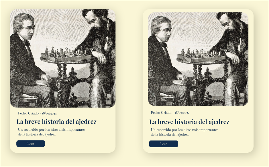
In my opinion the left-hand one.
In both of them you have a minor issue with the left-hand padding on the texts and button
I like the left as well. One experiment: remove the border radius on the bottom of the image. This will make it look like a single cohesive card with the text.
In this case, I think the biggest challenge is you have 3 extremely low contrast elements stacked on top of each other (*bg, card bg, grayscaled image). I usually try to avoid any more than 2 low contrast layers in a row.
Some solutions: 1. use a color image, or one with darker content in the top of the image. 2. Add a 1-2px border around the card / image that is say 20-30% darker than the card color. 3. Make the shadow non directional and extend from all 4 sides equally 4. Give either the bg or the card bg a very subtle texture, grain, or noise element
