Kevin Powell - Community

KPC

Kevin Powell - Community

A friendly place for developers to meet other devs, ask questions, get help, and just have a good time 🙂.

Join

front-end

resources

back-end

ui-ux

os-and-tools

justify-self and align-self flexbox?

Do justify-self and align-self not work for elements in a flexbox container? I’m finding mixed info and some of it is 8 years old.

prefers-reduced-motion is a text color animation ok?

I'm making a text-based browser game and I just added a Wating for player to join indicator when you join the room and it has a wave animation, but I'd also like to take into consideration users with prefers-reduced-motion setting on so I made an alternative for it, where text "shines" through. I'm not sure if it's a good alternative or if it's still too much for users who prefer reduced motion, does anybody know anything about it? First gif is original, second is reduced motion version...
No description

grid-template-columns vs grid-auto-columns

Hey, what would be the difference between the examples below? Other than the ability to define a specific number of columns and how the elements fill the container when using grid-template-columns, when using auto-fill or auto-fit these both seem like they would achieve the same thing to me? Any explanation would be appreciated, Thanks in advance.
grid-template-columns: repeat(auto-fit, minmax(16rem, 1fr));
grid-auto-columns: minmax(16rem, 1fr);
grid-template-columns: repeat(auto-fit, minmax(16rem, 1fr));
grid-auto-columns: minmax(16rem, 1fr);
...

svelte logic (if else) - can you write this in the js? (potential very dumb question)

Basically I want to put a conditional in here so if count is == 0 then the decrement button vanishes (haven’t coded it as on phone).. I figured that’d be a conditional in the decrement function, and if it is do I write it as a typical js conditional, or a svelte conditional? ‘’’js <script>...

Where should I use the clamp() function and what to use for responsive design overall

Just what the title says. When I've discovered the clamp() function, I've been using it everywhere so I can avoid media queries, should I keep doing that? I've been using that for padding, margin, position, everything overall, here is a sample of my code: ```css #logo { font-size: clamp(0.94rem, 1.56vw, 3.75rem);
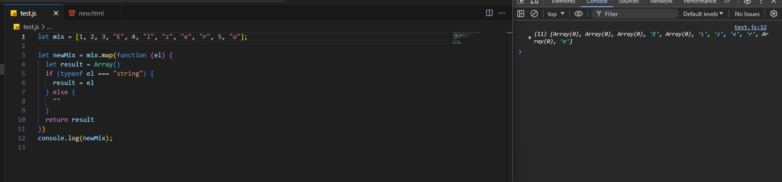
 color: #fff;...

array doesn't want to go away

i want array values that are numbers to be deleted but it doesn't go away and it still shows as ""
No description

I need help with media-queries for Responsive Web layout

when i start writing media-queries i mess up so many things like hamburger menu and grid layout for cards.if somebody know how to change the elements size and text-sizes while writing media queries that would be really help full

@font-face practices

Hey, what are some best practices for using @font-face? Perhaps some properties that are a must? I currently use it like this, i'd appreciate any pointers, things i've missed or clarification that i've got it down. Thanks in advance. ```css @font-face { font-family: 'xyz'; font-style: normal;...

how to get heading section button on shopify to be responsive

I'm struggling to get a button on my heading section on shopify to be responsive, I can't get it to be in the spot i want for all resolutions? Any help ❤️ here is the website https://www.evcustom.ca/. I've tried coding it for two resolutions but I think there must be an easier solution, and If I try to code another resultion is doesn't work, i've tried 1920 and 2560 px widths so far

focus-visible not properly working on inputs

Hey. We are currently styling an input element and we try to show the outline when the user navigates by keyboard. There is the selector :focus-visible for that. Unfortunately it also gets triggered when we navigate by mouse. I’ve found out, that is a new and intentional behavior for inputs. Buttons and links work just fine....

Help removing horizontal scroll

I coded this website from a Frontend Mentor Challenge. I cannot get the horizontal scroll to go away. I have tried overflow: hidden. What am I missing? Or is there a better way to create my ::before elements so I don't have this scroll? https://github.com/Stephanie-Dennehy/Workit-Landing-Page https://stephanie-dennehy.github.io/Workit-Landing-Page/...
No description

Any idea how to achieve these animation?

these lines animation are now quite trendy, I don't think they do it manually

Trying to make a website for tracking student attendance and behaviour

Hello, I am trying to build a website which tracks Student Attendance and Behaviour. I am wondering how hard this would be to create as a beginner to Web Dev. Thank you in advanced...
No description

What is node js and why do we need it

I was hoping someone could provide me with an in depth explanation regarding node js

Math.round()

Steps to reproduce: 1]Cost of item1:$20.95 Cost of item2:$7.99 Cost of item3:$18.99 Cost of Shipping:$4.99...

overlapping fixed navbar caused the space at the right

can someon help me out on how to figure this out? based on my title thats my problem
No description

Sticky footer

Does anyone know if Kevin has a video about how to make a sticky footer. So a footer which is always on the bottom...

Line chart in react

if I'm making a line graph in react how can I make it so that the x-axis is consistent regardless of the number of elements in the array. for example if I had an array of 20 elements or an array of 10 elements. I thought about doing it as having 20 tics but if then were 40 elements each tick would go up by 2 elements but when if I don't have an whole number such as 27 each tick ends up being like 1.35 and I don't want decimals

Unwanted clipboard behavior flex inline table

Concerning https://jsfiddle.net/a2bsvoer/ Visually I have what I want. However, the linked jsfiddle causes the browser to copy cells into the clipboard with each cell (character) on its own line. How do I make it so that the browser copies full lines into the clipboard? I'm open to completely refactoring with these requirements:...

Container with image bleeding out while text stays in.

I have a container which max-width so it doesn't stretch too much on big screens. Now I have two columns in which left column is an image and right column is text. I want the image to take all the space available on the left (overflowing the container) and on the right, the text stays in the container (no overflow). How do I achieve this? I have attached screenshot of design for reference.
No description