Help styling an component via props using TailwindCss.

Reusable button component:
export type ButtonProps = {
children: JSX.Element | string;
variant?: ButtonVariant;
color?: ButtonColor;
size?: ButtonSize;
rounded?: ButtonRounded;
leadingIcon?: JSX.Element;
trailingIcon?: JSX.Element;
disabled?: boolean;
};

export function Button(props: ButtonProps): JSX.Element {
const base = (): ClassName => {
const colorVariant = buttonVariantStr(buttonColorStr(props.color), props.variant);
const size = buttonSizeStr(props.size);
const rounded = buttonRoundedStr(props.rounded);
const disabledClass = props.disabled ? 'cursor-not-allowed' : '';
return `${colorVariant} ${size} ${rounded} ${disabledClass} focus:outline-none font-medium text-sm`;
};

//const baseClass = `button-${props.color}-${props.variant} button-rounded-${props.rounded} button-size-${props.size}`;

return (
<button
class={base()}
type='button'
disabled={props.disabled}
>
{props.leadingIcon && <span class='me-2'>{props.leadingIcon}</span>}
{props.children}
{props.trailingIcon && <span class='ms-2'>{props.trailingIcon}</span>}
</button>
);
}
usage:
<div class={'w-40 h-24 p-4'}>
<Button
color='success'
variant='filled'
size='md'
rounded='md'
>
Button
</Button>
</div>
<div class={'w-40 h-24 p-4'}>
<Button
color='success'
variant='filled'
size='md'
rounded='md'
>
Button
</Button>
</div>
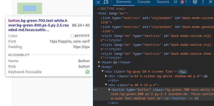
I feel like there is something i'm not aware of. At the browser nothing is being properly rendered, it does says it have the necessary classes, but the style isn't being applied:
No description
16 Replies
Brendonovich
Brendonovich4mo ago
what do buttonSizeStr, buttonRoundedStr etc look like?
mrVinicius
mrViniciusOP4mo ago
They take the property type value and return the proper tailwind class, example:
function buttonColorStr(color: ButtonColor = 'neutral'): string {
switch (color) {
case 'success':
return 'green';
case 'danger':
return 'red';
case 'info':
return 'blue';
case 'warning':
return 'yellow';
default:
return 'gray';
}
}

function buttonVariantStr(color: string, variant: ButtonVariant = 'neutral'): string {
switch (variant) {
case 'outlined':
return `border-2 border-${color}-700 text-${color}-800 hover:bg-${color}-700 hover:text-white`;
case 'filled':
return `bg-${color}-700 text-white hover:bg-${color}-800`;
default:
return `text-${color}-800 hover:bg-${color}-700 hover:text-white`;
}
}
Jasmin
Jasmin4mo ago
this doesn't work Tailwind needs to see class names as a whole in your file to know what to compile for example you need to write text-green-700 hover:bg-green-800 in your buttonColorStr instead of just green.
Brendonovich
Brendonovich4mo ago
i had a feeling haha i'd suggest using cva to manage variants, here is an example
Jasmin
Jasmin4mo ago
yep cva is great for this exact use case! Can recommend
mrVinicius
mrViniciusOP4mo ago
This doesn't quite make sense to me, because the console.log shows the full class name for me: bg-yellow-700 text-white hover:bg-yellow-800 px-5 py-2.5 rounded-md focus:outline-none font-medium text-sm
export function Button(props: ButtonProps): JSX.Element {
const base = (): ClassName => {
const colorVariant = buttonVariantStr(props.color, props.variant);
const size = buttonSizeStr(props.size);
const rounded = buttonRoundedStr(props.rounded);
const disabledClass = props.disabled ? 'cursor-not-allowed' : '';
return `${colorVariant} ${size} ${rounded} ${disabledClass} focus:outline-none font-medium text-sm`;
};

console.log(base()) // here
//const baseClass = `button-${props.color}-${props.variant} button-rounded-${props.rounded} button-size-${props.size}`;

return (
<button
class={base()}
type='button'
disabled={props.disabled}
>
{props.leadingIcon && <span class='me-2'>{props.leadingIcon}</span>}
{props.children}
{props.trailingIcon && <span class='ms-2'>{props.trailingIcon}</span>}
</button>
);
}
i'll take at look I'd assume you meant tailwind needs to know the class at compile time, and base() is only getting it's value at runtime?
Jasmin
Jasmin4mo ago
yes what tailwind does is it looks trough all your files and finds tailwind classes in strings and your classes are dynamically generated and tailwind can't know what these values will be on runtime and because of that it can't generate classes for you
mrVinicius
mrViniciusOP4mo ago
makes sense, i"ll look for another option
Jasmin
Jasmin4mo ago
Content Configuration - Tailwind CSS
Configuring the content sources for your project.
Madaxen86
Madaxen864mo ago
Have a look at e.g. shadcn-solid implementation of a button and their tailwind config: https://github.com/hngngn/shadcn-solid/blob/main/packages/tailwindcss/ui/button.tsx
GitHub
shadcn-solid/packages/tailwindcss/ui/button.tsx at main · hngngn/sh...
shadcn/ui, but for Solid. Contribute to hngngn/shadcn-solid development by creating an account on GitHub.
mrVinicius
mrViniciusOP4mo ago
yeah, thanks yall I ended up with something similar, as i decided to go with cva. I tried pandacss but not my thing.
Brendonovich
Brendonovich4mo ago
only thing i'd change is to either make variantClass a function or call buttonStyles directly in the class attribute spreading props in the component body will stop them from being reactive
mrVinicius
mrViniciusOP4mo ago
like this id imagine:
export function Button(props: ButtonProps): JSX.Element {
return <button class={buttonStyles(props)}"/>;
}
export function Button(props: ButtonProps): JSX.Element {
return <button class={buttonStyles(props)}"/>;
}
i'll test this properly later, or else i'll use splitProps
Brendonovich
Brendonovich4mo ago
Yeah this is fine or use splitProps if typescript complains
Want results from more Discord servers?
Add your server