Overlapping panels on Quest
In 2.7.15, the "More" and the "Tools" panels overlap slightly by default (in advanced mode).
26 Replies

Have to check that. The one that always killed me was the overlap with the color wheel, always had to tear the palette off and then usually lost track of it. Are they the same size panels?
I don't see any overlap of the color panel
@andybak , is this from dec51502f40f215393190b9864acf53af960b86d?
nevermind, I thought I'd seen something there about the panel positioning being changed, but I misread what it was
I think it got updated. The version I was using last night didn't have the problem. The above issue was in that file though, super annoying.
Would have to check which one it was. I've got so many installs that are good at different things it's hard to keep track of
Don't worry. It's an easy fix. I'll slip it into an existing PR
I saw the commit message and wondered 😉
Can we do a separate PR?
Yeah but it's such an insanely trivial change. Sometimes I procrastinate or simply avoid small fixes because of the procedural hassle - so I was hoping to set a precedent. 🙂
If you say "no" I'll just sneak stuff into an unrelated commit next time 😂😈😁
What's the hassle? Git cherry pick, push, merge-without-approval 😉
I think it makes it much cleaner if we ever need to revert, or to figure out why it happened... (like in this case!)
The prefabs aren't particularly friendly for looking at diffs, which is exactly why I'd like a logical commit....
You won't even need to update your branch. Just merge the cherry pick first
If you confirm that it's just the one commit that it seems like it is, I'll do it myself if it helps 🙂
Yeah. the "merge-without-approval" bit swings it. As long as the change is trivial enough that testing separately and reviewing separately isn't required then the overhead is not an issue. I wonder if there's an awkward middle ground but we can bicker about that when it comes to it.
I think if it's small enough that you feel comfortable slipping it into a different PR without asking anyone to test it, it's fine to just merge. I don't mean this to be passive aggressive; if it's not something you ask someone to look for, and it's not part of the PR's description, I don't think it'll get tested any better in a combined PR.
Maybe @mikesky wants to be a bit more cautious, but as long as we're not right before a release, and as long as the submitter believes its good and as long as they've done their due dilligence... I'm quite ok with not being so strict on reviews, especially for tiny things.
I think reviews are more important for cases when (a) you know there's something that you don't know or (b) it's big/risky/complex enough that there might be sometghing you don't know that you don't know. Otherwise, I'm afraid being strict would just disincentivize contributions, or at least discrete contributions (and encourage discreet ones!)
i was going to approve that mini pr without checking, if that's any indication 😄
I'm finding this discussion fascinating but I also realize my desire to continue it is probably in inverse proportion to its importance!
i'm totally guilty of merging the trivial things without asking, so I think it's fine to just go ahead and do it
Andy, do you think this is more a case of Parkinson's Law of Triviality or Sayre's Law? 😉
heads off to google
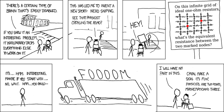
xkcd: Nerd Sniping

I first saw this problem on the Google Labs Aptitude Test. A professor and I filled a blackboard without getting anywhere. Have fun.
I was going to go more with the "rearranging the deckchairs on the titanic" metaphor
my desire to continue it is probably in inverse proportion to its importance
Baker's 11th law of Discord: "The number of gifs in a discussion increases exponentially as the discussion runs out of steam"
be funny if after all this, that fix is wrong.
we'll catch it next quarter!

(ignore the occlusion please)
@andybak , is this what it looks like on desktop, or just Quest 2?
From dragging, I think it needs to be two "clicks" higher; one higher still leaves a bit of overlap when highlighting