Centered navbar with cta button

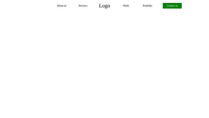
Hey guys, I'm trying to make a navbar where the logo is dead center of the screen. I've already figured out how to do that; however, I have an extra item, the cta button, I need to add in. So instead of it being 5 li items, it's 6, which means the logo will not be dead center of the screen. Right now, I'm using position: absolute but it's not super responsive and feels super hacky. I could use vw units I suppose (I can't even get it to be responsive with vw) but I feel like there might be a better way with grid somehow. Curious what your thoughts are on how to tackle this problem. https://codepen.io/vince1444/pen/yLRyOQy
42 Replies
Unknown User
Unknown Userβ€’2y ago
Message Not Public
Sign In & Join Server To View
vince
vinceOPβ€’2y ago
Client requirements
Unknown User
Unknown Userβ€’2y ago
Message Not Public
Sign In & Join Server To View
vince
vinceOPβ€’2y ago
Yup I basically did that, I was hoping there was a better way so I didn't have to do that though 😭
Dazani
Dazaniβ€’2y ago
Hey @vince! Couldn't you use grid to define 5 columns: padding, 1fr, Logo, 1fr, padding and then for the first 1fr column div, you could put your 2 links and the second 1fr column your 3 links? I'm just throwing an idea out there, but I'll go create a codepen to see if this works. created the codepen~ is this what you were looking for? https://codepen.io/joelramos_io/pen/jOeEMaZ
vince
vinceOPβ€’2y ago
Thanks Dazani! I never actually thought about structuring my HTML like that, I'll have to look up the html spec for nav. I've always just put my links inside of a list for better accessibility but I don't believe it's needed if it's inside a nav element... πŸ€” thanks again, I really appreciate you taking your time out to help!
glutonium
glutoniumβ€’2y ago
hmm I'd prolly do like this https://codepen.io/-bloop-/pen/RweNGeG
Dazani
Dazaniβ€’2y ago
I actually don’t know the best practices for navigation menus (like whether to use lists and such). If anybody can comment on this, that would be great!
glutonium
glutoniumβ€’2y ago
u can use list u can just do it with a tags i don't think it matters that much
Dazani
Dazaniβ€’2y ago
Why does this work actually? Saw you put the β€œLogo” in a span element (which I think is an inline element right?)
glutonium
glutoniumβ€’2y ago
i mean here logo is probably going to be an image the text logo was just to indicate that and idk if span is an inline element or anything, but it generally doesn't do anything at all unless u customize it it's just like div by default, it's ike invisible and i could do the same with lists as well but I don't feel like lists r important here so didn't use
vince
vinceOPβ€’2y ago
Thank you! Why margin-left: 15% though? is it because of the differing flex children lengths?
glutonium
glutoniumβ€’2y ago
noo.. it's to make the logo come in the center
vince
vinceOPβ€’2y ago
Oh I see It's not centered though ;)
vince
vinceOPβ€’2y ago
vince
vinceOPβ€’2y ago
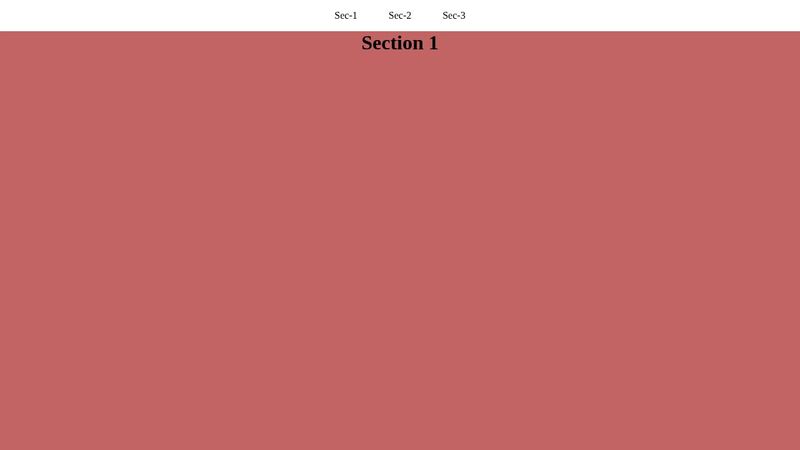
That's why I was using position: absolute in the first place to take the 6th element out of the equation so the nav can center my items based off 5, which means the logo will be dead center of the page From the w3 spec (https://www.w3.org/TR/2011/WD-html5-author-20110809/the-nav-element.html): A nav element doesn't have to contain a list, it can contain other kinds of content as well. In this navigation block, links are provided in prose:
<nav>
<h1>Navigation</h1>
<p>You are on my home page. To the north lies <a href="/blog">my
blog</a>, from whence the sounds of battle can be heard. To the east
you can see a large mountain, upon which many <a
href="/school">school papers</a> are littered. Far up thus mountain
you can spy a little figure who appears to be me, desperately
scribbling a <a href="/school/thesis">thesis</a>.</p>
<p>To the west are several exits. One fun-looking exit is labeled <a
href="http://games.example.com/">"games"</a>. Another more
boring-looking exit is labeled <a
href="http://isp.example.net/">ISPβ„’</a>.</p>
<p>To the south lies a dark and dank <a href="/about">contacts
page</a>. Cobwebs cover its disused entrance, and at one point you
see a rat run quickly out of the page.</p>
</nav>
So it looks like your markup is valid πŸ™‚. I don't know if it's less accessible compared to the usual navigation > ul though... I could be wrong but I believe lists allow you to tab through the links, so if I don't have that then I don't think I'd be able to tab through the links, which would be less accessible. I'd have to test it though
~MARSMAN~
~MARSMAN~β€’2y ago
~MARSMAN~
~MARSMAN~β€’2y ago
Sorry I'm a little lost Vince, isn't this already centered?
vince
vinceOPβ€’2y ago
Yup! But that's because I used position: absolute on my Contact Us cta button... which isn't exactly responsive, so I was wondering if there was a better solution πŸ™‚ I'm not great at grid
~MARSMAN~
~MARSMAN~β€’2y ago
Oh ok i just noticed the button position 🫣
vince
vinceOPβ€’2y ago
πŸ˜‚ I love that emoji
~MARSMAN~
~MARSMAN~β€’2y ago
Lol
glutonium
glutoniumβ€’2y ago
@vince
<!DOCTYPE html>
<html lang="en">
<head>
<style>

*{
margin: 0;
padding: 0;
box-sizing: border-box;
}

a{
text-decoration: none;
color: black;
}

span{
font-size: 1.5em;
}

button{
background: green;
border: none;
padding: 10px;
font-weight: 600;
color: white;
}

nav{
width: 100%;
display: grid;
grid-template-columns: repeat(9,1fr);
}

a:nth-of-type(1){
grid-column-start: 3;
}

a,span{
display: flex;
align-items: center;
justify-content: center;
}

</style>
</head>
<body>

<nav>

<a href="#">About us</a>
<a href="#">Service</a>
<span>Logo</span>
<a href="#">Work</a>
<a href="#">Portfolio</a>
<button>Contact us</button>

</nav>

</body>
</html>
here is a similar code but with grid previous one was flex made in case u want to use grid
glutonium
glutoniumβ€’2y ago
vince
vinceOPβ€’2y ago
Thank you!! Looks similar to Dazani's πŸ™‚ I appreciate your help!!
glutonium
glutoniumβ€’2y ago
but the better thing about this is there aren't any margins xD
vince
vinceOPβ€’2y ago
πŸ˜‚ Yea once you start adding the random margins/right: -10rem like I did it gets really messy... which is what I was trying to avoid in the first place lolol
glutonium
glutoniumβ€’2y ago
ahaha yaa
~MARSMAN~
~MARSMAN~β€’2y ago
I tried this, see if it's what you want I just added a fake span in the ul and changed the grid to grid-auto-flow: column;
glutonium
glutoniumβ€’2y ago
i used 9 grids for 6 items Extra grids for the space xD
vince
vinceOPβ€’2y ago
This would be great if <span>s are valid children of uls 😩 https://www.w3.org/TR/2012/WD-html-markup-20120329/ul.html
glutonium
glutoniumβ€’2y ago
yours alao great tho i mean it's working fine.. so good enough i guess
vince
vinceOPβ€’2y ago
Less semantic/accessible though. I also believe if you use semantic elements wrong it's worse for SEO
glutonium
glutoniumβ€’2y ago
i think u can just use empty li insted won't that work?
~MARSMAN~
~MARSMAN~β€’2y ago
Hmm, but span has no meaning at it and will ignored eventually i believe.
glutonium
glutoniumβ€’2y ago
yaa span isn't a semantic tag
vince
vinceOPβ€’2y ago
Yea I suppose, but it would still wouldn't be semantic/accessible because if I'm adding a list element there should be something in there I've gotta fiddle around with everything, I think the best bet might just be to talk to the client about it and give them the option... Thanks again for all your help guys! Again, I'll look through these solutions and see if I can retrofit something from them and get back to you guys if I do πŸ€”
glutonium
glutoniumβ€’2y ago
u can also further more just add area-hidden = "true" to further seal the deal
vince
vinceOPβ€’2y ago
Ohhhh I didn't even think about that
glutonium
glutoniumβ€’2y ago
it hided elements from screen reader sure thing
Coder_Carl
Coder_Carlβ€’2y ago
Just fyi peeps: the typical ul>li for a navbar doesn't add anything for it's accessibility as soon as you add css list-style: none; Unless you add a role="list" back to the ul. Main thing is to add those landmarks in using the nav html tag and maybe an aria-label="Primary navigation" if relevant to identify the landmark and contents appropriately
Want results from more Discord servers?
Add your server