
28 Replies
I really like the minimalist flat style, the content boxes remind me of Material UI text inputs with their flat & highlighted bottom edge.
I think the image of the person holding a brain and a heart is a bit too far from the design language of the site, it's got a bit too much texture and the colors are quite bright and vibrant compared with the cool & toned-down dark UI around it.
I think finding a more muted image would go a long way, images are supposed to draw your attention but on the screenshot you sent that image is the first thing you see and overshadows a lot of the important content.
@willsterjohnson 100% true!
I made some changes.
I couldn't find a better image for "why us" section. I will search again later for a new one.
I needed to change the color theme to dark slate to stick with the main theme and I added a gradient to the content boxes.
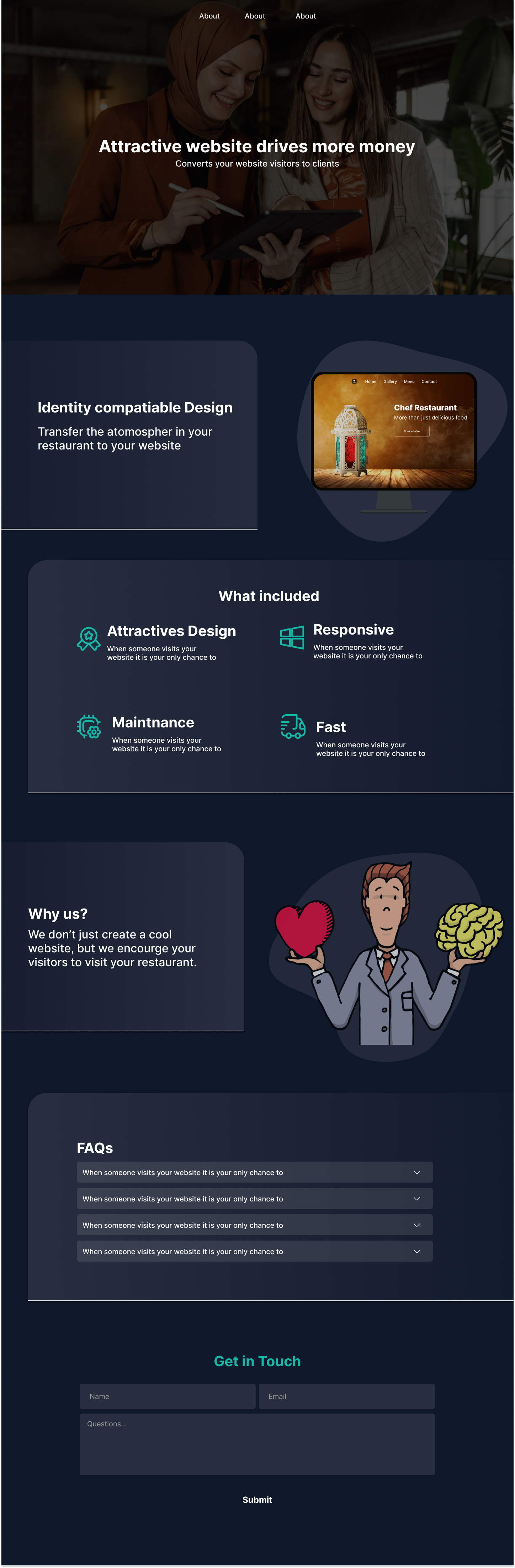
I agree with above, I dont think the images match the design
Also, not sure how I feel with the border bottom and the border radius on only one side
I think the hero section looks minimalistic and professional but the rest of the site gives off another vibe from that currently
Might be the border radius too, if you're going for a professional look I think you should make them less rounded, but I'm not a designer so I could just be completely off base
less rounded radius sounds like a good idea. the hero section is minimalistic because I am also not a designer. 😅 anyway, I will keep improving it. @vince thank you for the feedback
Minimalism can be a good thing, and I think it's better if you don't have a design background to keep it simple. You're moving away from simplicity by adding gradients and shapes.
First figure out how you want to lay out your content, then think about adding onto the complexity
I replaced the hero image with a blob, I could add more blobs but I will have a hard time positioning them! 😅
it is now more consistent I think.
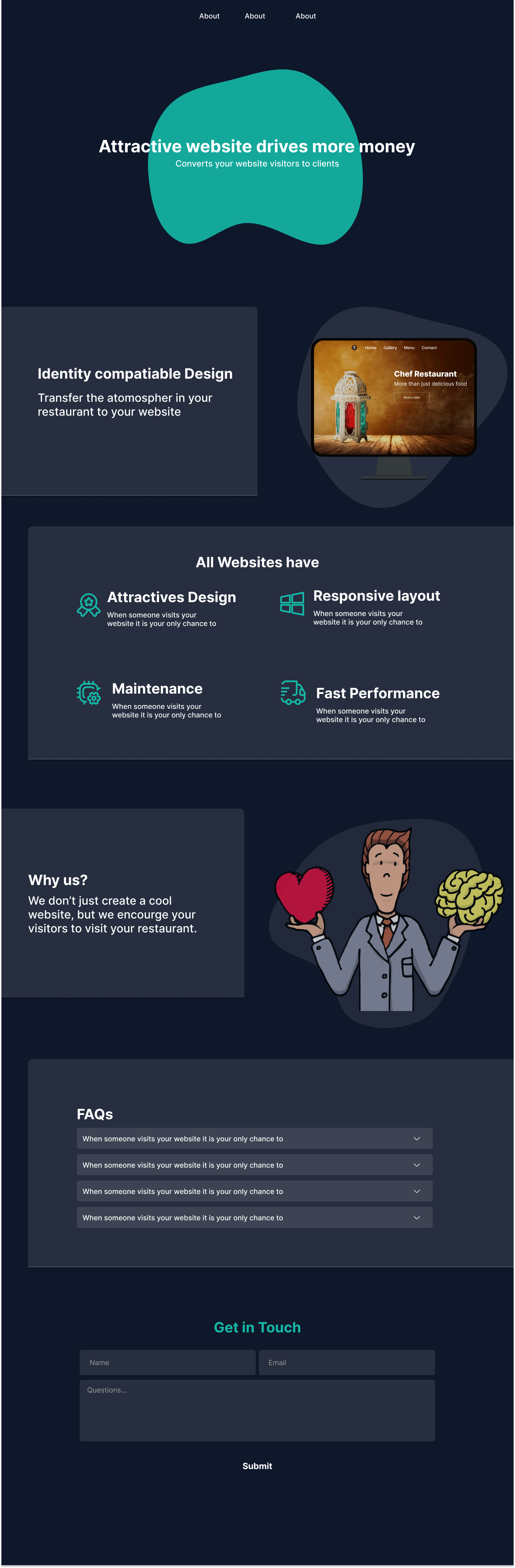
I think the hero image was a lot better
Somehow wish I could watch you code this 😂😂 interested to know how you do position blobs and images
you can export a blob and an image as a one image!
Yeaaa...not that it would be difficult just would like to see how you structured the code
I tried to do a design similar to this and am not particularly used to grid yet so had to go all flex on it
you don't need a grid
Flex?
all the design are just a content box with an imge, flex col for mobile and flex row for wide screen
Ok
similar to this https://green-menus.com/en-US
How would you do the cut off on some of the elements where it kinds feels like it's going off screen
I am playing around with it right now https://play.tailwindcss.com/oJxzPtWOht?file=css
Tailwind Play
Tailwind Play
An advanced online playground for Tailwind CSS that lets you use all of Tailwind's build-time features directly in the browser.
just don't add padding to the left/right, and also you can add
translate-x-5 or -translate-x-5 for exampleYeaa don't do tailwind
Okayyy yea thought so
hover over the classes and you can see the style applied also you can click on the panel in bottom of the screen to see the generated style
Nice..I would have used a padding tho (my first thought) with a css variable linking the translate to the padding.. although I think that would generate issues on mobilr
Why? all you need few pixels!
Said first thought lol...cause to manage for the text to not also be cut off
anyway! once I implement it, I will poke you
Okay thanks
You've already gotten a lot of feedback, but one thing I would strongly consider is adding a whole lot more white space between your sections. That extra breathing room will mean the viewer is only seeing one section at a time and can focus on it
and i would definitely challenge you to work on the hero a whole lot more. That is the only part of the page someone clicking into it will see
and within ~3 seconds roughly, they need to know what the page is about and why
Typically, that is done with a logo that clearly identifies the brand, and a hero image that clearly shows the purpose of the page, and right now you don't have either of those
and finally, you need some call to actions, both at the top and the bottom. Assuming I wanted this product, I dont' see any option to 'sign up' or 'purchase' it or any hook like 'try the free demo now' etc that will engage me to pursue this further
agree, the hero section should be designed in an attractive and meaningful way. it should have as less compromises as possible.