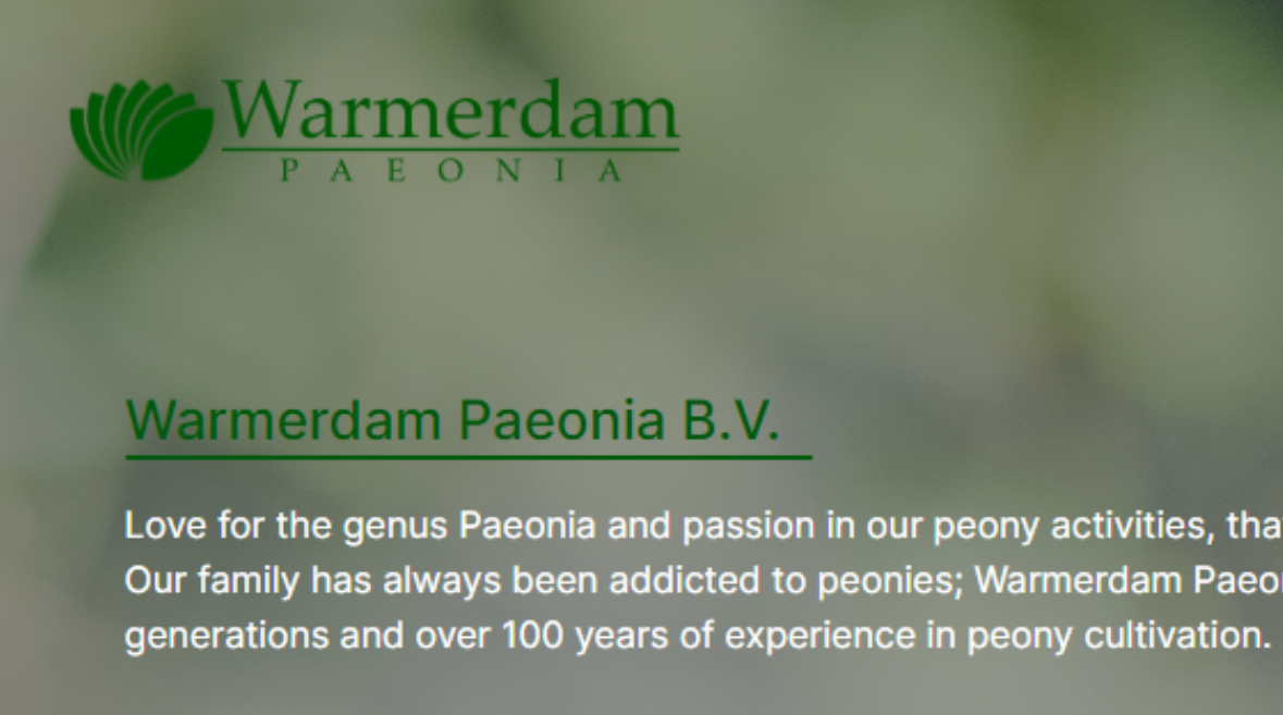
is putting image background to footer a bad idea*

is putting image background to footer a bad idea*
81 Replies
Unknown User
Unknown Userβ€’3y ago
Message Not Public
Sign In & Join Server To View
ABK | Muneer
ABK | Muneerβ€’3y ago
Not bad idea here's a example i used for footer as long as everything is clear to read it's good to go
Mert Efe
Mert EfeOPβ€’3y ago
Mert Efe
Mert EfeOPβ€’3y ago
which one looks better any feedback? Do you think these looks OK ? @xukita @iqmuneer
ABK | Muneer
ABK | Muneerβ€’3y ago
could make the img darker since the img is white and the text is white
ABK | Muneer
ABK | Muneerβ€’3y ago
like this
Mert Efe
Mert EfeOPβ€’3y ago
img is darker in my images
ABK | Muneer
ABK | Muneerβ€’3y ago
the contrast of of your img doesn't make the green text show nicely
Mert Efe
Mert EfeOPβ€’3y ago
filter: 'brightness(60%)',
ABK | Muneer
ABK | Muneerβ€’3y ago
is your site main color is green?
Mert Efe
Mert EfeOPβ€’3y ago
yeah
Mert Efe
Mert EfeOPβ€’3y ago
ABK | Muneer
ABK | Muneerβ€’3y ago
here's the problem
ABK | Muneer
ABK | Muneerβ€’3y ago
ABK | Muneer
ABK | Muneerβ€’3y ago
the green is mixing with background
Mert Efe
Mert EfeOPβ€’3y ago
that doesn't look too bad
ABK | Muneer
ABK | Muneerβ€’3y ago
if you can use photoshop and mirror the right side twice so it's flower on both sides it could've been better
Mert Efe
Mert EfeOPβ€’3y ago
oh yea good idea but seems a bit hard
ABK | Muneer
ABK | Muneerβ€’3y ago
right right side on that one looks fine the left side kinda hard to read the green this one has the opposite
Mert Efe
Mert EfeOPβ€’3y ago
Mert Efe
Mert EfeOPβ€’3y ago
i think this is easy to read and more clean what u think
ABK | Muneer
ABK | Muneerβ€’3y ago
green with green
MarkBoots
MarkBootsβ€’3y ago
what if you make it a green opaque overlay. and make the image and title white? You could try
Mert Efe
Mert EfeOPβ€’3y ago
Mert Efe
Mert EfeOPβ€’3y ago
i changed the direction of the gradient the top is whiter
ABK | Muneer
ABK | Muneerβ€’3y ago
i think that's better
Mert Efe
Mert EfeOPβ€’3y ago
which image is better u think
Mert Efe
Mert EfeOPβ€’3y ago
Mert Efe
Mert EfeOPβ€’3y ago
i think this that seems good idea
ABK | Muneer
ABK | Muneerβ€’3y ago
yup this looks good
Mert Efe
Mert EfeOPβ€’3y ago
how can I make opaque overlay
MarkBoots
MarkBootsβ€’3y ago
you now have a gradient. make the first color stop 100% and let it go transparent (or whatever, doesnt matter) something like
linear-gradient(rgb(0 255 0 / .5) 100%, transparent 0)
Mert Efe
Mert EfeOPβ€’3y ago
Mert Efe
Mert EfeOPβ€’3y ago
background-image: linear-gradient(0deg, rgba(0,89,12, 0.2), rgba(255, 255, 255, 1)), url('/images/paeonia_new2.jpg'); is this better ? imo this is better than white opaque it was white before what u think
Unknown User
Unknown Userβ€’3y ago
Message Not Public
Sign In & Join Server To View
MarkBoots
MarkBootsβ€’3y ago
I don't know. maybe it is a just to detailed image. You can also ask in #ui-ux there are people with a better eye for design
Unknown User
Unknown Userβ€’3y ago
Message Not Public
Sign In & Join Server To View
Mert Efe
Mert EfeOPβ€’3y ago
image darker gets rly bad
MarkBoots
MarkBootsβ€’3y ago
i think i would go for a much lighter image and green/black text
Mert Efe
Mert EfeOPβ€’3y ago
me too
Mert Efe
Mert EfeOPβ€’3y ago
Mert Efe
Mert EfeOPβ€’3y ago
how's this one ? fck it its too hard
MarkBoots
MarkBootsβ€’3y ago
the green leaf it too green πŸ˜‰ another idea. instead of the gradient on the full footer. What if you do it on the inner container and a lot lot lighter. Then you'll have some color at the side, but more clear behind the text or blur the background to get rid of some hard details (but then you'll have to put the background-image in a pseudo element)
Unknown User
Unknown Userβ€’3y ago
Message Not Public
Sign In & Join Server To View
Mert Efe
Mert EfeOPβ€’3y ago
the more i play the more shitty it gets
MarkBoots
MarkBootsβ€’3y ago
do you have a codepen?
Mert Efe
Mert EfeOPβ€’3y ago
no man this is getting too much time-waste gonna leave it like this πŸ˜„
Mert Efe
Mert EfeOPβ€’3y ago
Mert Efe
Mert EfeOPβ€’3y ago
@MarkBoots how do u decide which font family ? u experienced ithat ?
MarkBoots
MarkBootsβ€’3y ago
I normaly work from what is given by designer / business style guide Else i try to match what is in the logo. And if that won't work... I struggle too.
Mert Efe
Mert EfeOPβ€’3y ago
I chose Inter since it was more in line with logo text
MarkBoots
MarkBootsβ€’3y ago
for readability serif fonts are better, so I'd try that too. specially for longer text but your current one looks nice and safe too (Note: Im not a designer)
Mert Efe
Mert EfeOPβ€’3y ago
thanks do I have to write All Rights Reserved ?
MarkBoots
MarkBootsβ€’3y ago
Well, it is kind of a protection for your content. https://www.legalzoom.com/articles/the-term-all-rights-reserved-explained (Although I am also not a legal expert.... I just realized I am not a lot of things πŸ˜‰ )
The Term "All Rights Reserved" Explained
Protecting your creative work requires a basic understanding of copyrights, including the meaning and use of the phrase β€œall rights reserved."
Mert Efe
Mert EfeOPβ€’3y ago
Mert Efe
Mert EfeOPβ€’3y ago
maybe this is less busy and safer option ?
vince
vinceβ€’3y ago
i think this one is better than the other one
MarkBoots
MarkBootsβ€’3y ago
yea much better
Mert Efe
Mert EfeOPβ€’3y ago
i agree %100 this one or the above guys ?
Mert Efe
Mert EfeOPβ€’3y ago
Mert Efe
Mert EfeOPβ€’3y ago
this will be final i liked it too
MarkBoots
MarkBootsβ€’3y ago
you could try to give the paragraph a tiny little white text-shadow to distanciate it even a bit more
Mert Efe
Mert EfeOPβ€’3y ago
oh yea that's a great idea. i opened the image a bit here does it make it look more busy ?_
MarkBoots
MarkBootsβ€’3y ago
i like it
Mert Efe
Mert EfeOPβ€’3y ago
ok i decided this looks much less busy and clean as hell fcking deciding everything is hard πŸ™‚ this or that that or this
Mert Efe
Mert EfeOPβ€’3y ago
how's the header ? @vince._ @MarkBoots
Mert Efe
Mert EfeOPβ€’3y ago
i tried to made it compatible is it too bri,ght?
vince
vinceβ€’3y ago
header should have no bg image i'd honestly make the header and footer have no bg image
Mert Efe
Mert EfeOPβ€’3y ago
says where ?
vince
vinceβ€’3y ago
no where, my opinion
Unknown User
Unknown Userβ€’3y ago
Message Not Public
Sign In & Join Server To View
Mert Efe
Mert EfeOPβ€’3y ago
just peonies thanks for feedback Are you sure these are not peonies?
Unknown User
Unknown Userβ€’3y ago
Message Not Public
Sign In & Join Server To View
Mert Efe
Mert EfeOPβ€’3y ago
you scaring me man indeed they look i found those on pexels.com by searching for paeonia
Unknown User
Unknown Userβ€’3y ago
Message Not Public
Sign In & Join Server To View
Mert Efe
Mert EfeOPβ€’3y ago
i agree i had the same thought hopefully client wouldN't mind either way.
Myndi
Myndiβ€’3y ago
Kevin has a video with a great trick to isolation: isolate the background image, so you could change the opacity of it, and add a filter on top, so font would be readable regardless of the color.
vince
vinceβ€’3y ago
What!!! You can do that?! So you don't need an overlay??
Myndi
Myndiβ€’3y ago
Kevin Powell
YouTube
Lower the opacity of a background-image with CSS
We can play with the opacity of colors by changing the alpha value of them very easily, but with background-images, we’re a little more stuck with what we have… or are we? ⌚ Timestamps 00:00 - Introduction 00:38 - the first thing people usually try 1:32 - creating the pseudo-element 4:38 - putting the background-image on the pseudo-element 5:0...
vince
vinceβ€’3y ago
Thank you !!
Mert Efe
Mert EfeOPβ€’3y ago
Wow thanks so much for pointing that out πŸ™‚
Want results from more Discord servers?
Add your server