Flexbox or Grid?
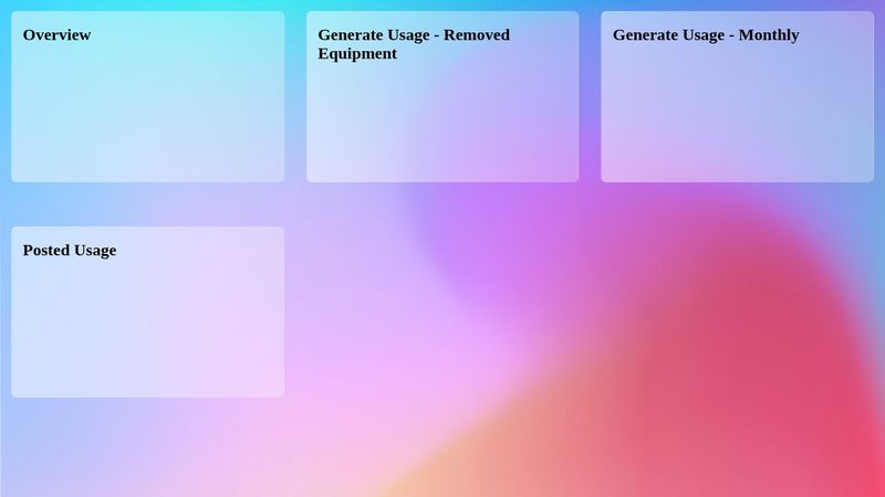
I'm trying to build this UI here (see screenshot)
I wanted to add the flex wrapping behavior for mobile responsiveness, but also am having trouble figuring out what I am supposed to do with flex basis or grow or shrink.
If I give each tile
Here is the code pen link to what I have so far:
https://codepen.io/Chris-Rowe/pen/xbKOyEe
Am I just overlooking an obvious way I can set up grid with auto columns to do this?
These tiles with words in them are the V1 MVP of the feature we're rolling out but the tile components may each have their own unique layout of various bits of information. Eventually I will put container queries on these guys and treat each one like a little viewport
I wanted to add the flex wrapping behavior for mobile responsiveness, but also am having trouble figuring out what I am supposed to do with flex basis or grow or shrink.
If I give each tile
flex: 0 0 588pxflex: 1 1 588pxHere is the code pen link to what I have so far:
https://codepen.io/Chris-Rowe/pen/xbKOyEe
Am I just overlooking an obvious way I can set up grid with auto columns to do this?
These tiles with words in them are the V1 MVP of the feature we're rolling out but the tile components may each have their own unique layout of various bits of information. Eventually I will put container queries on these guys and treat each one like a little viewport