What code pattern/approach should I take for this numeric input?
Hey all, our UI/UX designer has come to me with a custom numeric input and I'm not sure what approach to take. (see Figma screen shot)
I know semantically
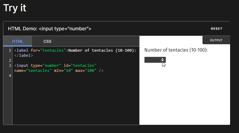
<input type="number" /> is how you make these in HTML traditionally, but it gives the tiny little spin up/down arrows and seems like we're off to a poor start for using CSS to mash a square peg into a round hole using webkit to target those arrows etc.
I was thinking of making my own component (our tech stack is Blazor but it does the same thing as the major JS front end frameworks) with a bound integer value, and custom buttons and all of that but want to make sure I'm not losing a ton of accessibility features from not doing the numeric input control with the built in spin buttons. Also things like arrow keys up/down to increment/decrement the value. Set a min and max limit etc.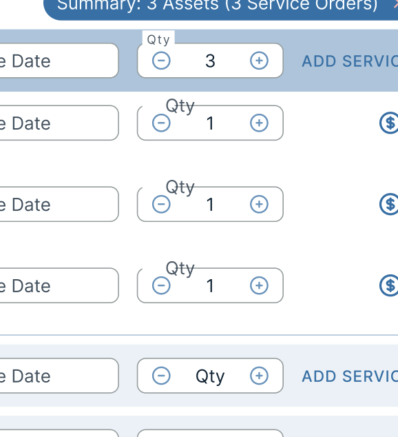
5 Replies
I know how I would code it for a good dev experience, but want to make sure it doesn't abandon accessibility/compatibility. I'm posting a screenshot of what I have mocked up in my IDE. For those of you who aren't familiar with C# or Blazor syntax (which I suspect is a great deal of front end engineers), I'll explain what I have going on in this code:
The markup at the top is straight forward, with a bind and 2 event listeners
In the code block, the
[Parameter] decorator before a declared variable means the component would take one in as a prop like in React or Vue.
the fancy get/set thing going on with counter value just means the component will emit an event with the new integer value up to the parent when the value is changed.
the Min/Max parameters will let me set the limits on the component (again as a prop)
and the two event driven methods just do what they say they do.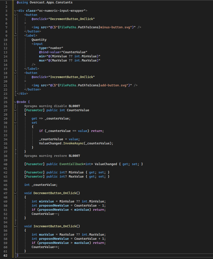
if you prefer to review as plain text instead of a screenshot:
I hadn't written the css for this but it would basically be the wrapper gets absolute positioning, rounded corners, bg color and a 1px solid border.
The label would be a float label on focus/valid state for the control using relative positioning and a bg color to obfuscate the border on the wrapper when its "floating"
The numeric input would have transparent background and borders and all that to be centered in the wrapper, and the 2 icon buttons would be absolutely positioned to the wrapper on the left and right sides.
yea, seems the way to go. Here my simple demo in just vanilla js/css and with a fieldset so you can use the legend instead of a floating label.
Imo the accessibility should be okay as you are using btns
https://codepen.io/MarkBoots/pen/GRLzQpy
Thanks for putting that together! I just feel like its good to stop and ask the questions if there are ever accessibility or performance concerns. Just wanted to run it by the community.
Also, its remarkable how close the user stylesheet in the browser got you to the finished product with such minimal css.
Every other label in our UI is dynamic/floating so I'm not sure I could make fieldset and legend work in the final product but its quite inspiring how good what you made looks considering you really only got rid of the arrows with your CSS
yea the fieldset/legend thing is something that works really well in this scenario. specially because you don't need to hide the border and the normal background shows through