✅ Help needed with WPF GUI
Hello, Good Day!
Overview
I just started with WPF a few weeks ago so I'm still quite new to all this, for now I've been trying to create a dashboard UI for my project which has been going good so far, in my dashboard UI I have a grid divided into 3 rows (1 header, 1 footer and 1 for content) and 2 columns (1 for sidebar and one for content). I've created an interactive sidebar, so when you hover over to it, it'll auto expand and show you the button names and everything, when it's collapsed it'll show only the icons of those buttons.
Problem
So, as the sidebar is interactive, it auto expands when mouse over, but if the main window is resized it and the column 1 (the one with sidebar) has enough space to hold the expanded form of the sidebar, it will expand the sidebar to it's expanded state and will remove the mouse over animations. But if the sidebar's column's width is greater than the collapsed width but still lesser than the expanded width, it leaves a space between the sidebar and the content column, which gives a very inconsistent look to my app. So is there any way to overcome this issue? I'm attaching my xaml and code behind for your better understanding.
100 Replies
Sidebar.cs
so u want to fix
But if the sidebar's column's width is greater than the collapsed width but still lesser than the expanded width, it leaves a space between the sidebar and the content column, which gives a very inconsistent look to my app? do u have some screensshot of what it looks like too to give a better idea of even a video/gif Also its missing the mouse enter and leave events among some other things like SetWidth, Expanded Width etc for the spacing I think the problem is the width 95 u have there are a few other inconsistencies I could find but without the rest of the code I can't really fully test it
Sure, here's the video
sidebar.cs
Sorry for the over saturated video, I don't know what's wrong with my OBS.
well I did my own partial code to the missing bits
not sure if this is the desired outcome
ah ok its floating sidebar
that makes more sense
I guess this it, but the problem is that it's not a smooth animation, I'm guessing you're changing the column width?
well yeah I did not had the animations
so I was just winging it to see what the issue was
let me try the full code and see
Alright sure
what is container in you sidebar the usercontrol itself? the grid?
it's a rectangle
I might need the sidebar xaml as well then
On a second thought, why did I even use a rectangle for it, what was I thinking....
:catlaugh:
Oh yeah, I was thinking to add a blur effect to it but if I apply the blur to the grid itself, it'll blur the whole thing so I used a rectangle but at the end the blur didn't work out well so I stick to container.Opacity
so do u want to keep it always open at which size and above?
900 ?
900 = the main window size?
1500 px if that's the case
min is set to 800
my bad MinWidth="1172"
yeah
so it shouldn't go lower than that size wise
yep
ok so 1500+ always open?
yes
may sound silly but give this a go
and
you're always matching the size of the columnWidth
but u never consider the actual window size
where do I use it? mainwindow.cs?
in your sidebar I suppose
isn't that the place u handle the expand / collapse
right, hold on
Uhmm...
I don't think you understood the problem here, I was fine with my logic of expansion and collapsed state. The problem here is there is a gap between the sidebar's collapsed state and the column 2's content. This


that is the 95 width u have in the mainxaml
I said it above
or at least I belive it is
let me double check
You did, so what do I replace it with?
u just remove it?
gap still exists

mmm looks like some padding too let me see on that one
also ur missing WindowChrome.IsHitTestVisibleInChrome="True" your header buttons and capitionheight needs to be bigger than 0 so u have a drag / movable window
but I assume u know these 😉
I didn't know that, I was using the DragMove(); in my code behind for now.
try setting the captionheight to 40 for example
u will notice u can now drag it perfectly
Alright, I'll give it a go.
the sizing seems tricky because ur using a %
it would work better if it was a fixed size instead I think let me try
I see so the problem is that you're working within the sidebar to run the animations
without modifying the actual sidebar witdh
so it always run inside that space instead of resizing changing etc
Mhmm yeah
there is no simple answer to the spacing unhappily other than remaking it in a way it takes into consideration the space between the 2
since its kind of a floating sidebar
u can probably getting it pretty close by changing the width from 0.2* to 15 ish
removing the margin and the 95 width
but u will still have a space because its based on a %
and then the expand would not work as intended either
Yeah figured
so u would have to find the sweet spot
But as the screen resolution increases it'll still be inconsistent
welp, so basically re-design it?
yep
Any tips
eh I never done a sidebar like that I normally do it like sliding from the corner
like the one I showed u earlier
I see
its much easier to manage
Probably, just wanted to try out some of my imaginations with WPF but seems it's kinda difficult 😅
yeah a lot of things require a lot of fine tunning
Alright, thanks for your time though. I really appreciate it!
what you're doing is definitively possible thou
Yep, just need to figure out how
I just dont have the time or will do try it out myself 🙂 these things are like small adventures
Haha, no need to sweat on this. I got this. Thanks again.
gl 🙂 $close
Use the /close command to mark a forum thread as answered
@remi.nz my bad I just realized something that might work
basically just letting auto handle the sidebar column
@remi.nz let me know if that works the same for u
I've come up with this before joining the server but through this approach I lose the overlapping part on mouse hover
by setitng it to "auto" it will always push away column2 on mouse hover but I only want it to do that when I've removed the mouse hover events
I came up with this solution, not too long ago:
u can add an animation so it pushes away nicely thou
so it would feel fluid with the layout
instead of just pushing away
Yeah, figuring out how can I add animations to grid
Do you know any tutorial or documentation for it?
GitHub
GitHub - XamlFlair/XamlFlair: XamlFlair is an animation library for...
XamlFlair is an animation library for UWP, WPF, and Uno, built to facilitate Xaml animations using only attached properties. - XamlFlair/XamlFlair
maybe this is of interest
I'll give it a go, thanks.
Hey, one more thing
Video Training - WindowsClient.net
Microsoft portal site for the Windows Forms and Windows Presentation Foundation (WPF) developer community. Download samples, download controls, post to the forums, read community blogs and product team blogs and learn about windows client development.
there is this but its old and I am unsure u can get the video
https://stackoverflow.com/questions/197855/in-wpf-has-anybody-animated-a-grid
So as you can see in this video, while hovering the gives a glow effect and the opacity goes 0.9, but changing the opacity doesn't seem a right way to do it because the contents behind the sidebar are giving it a weird look, is there any way I can add acrylic blur? I tried with Guassian blur yesterday but it just blurs the edges too and it looks like a very bad photoshop.
I'm trying to achieve a blur like this

well border does have BlurEffect and u can set the KernelType to Gaussian
But it would blur the entire thing and it looks gross imo
in the photo above the border of the sidebar are well distinguished but in guassian blur its not
I see
you're referring to the light that comes out when it expands
as it its right now on the video?
that pops in the middle ofthe control
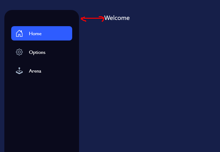
this welcome text, I want to hide it behind the blur

I see
what it looks like with the above?
Wdym
nvm I'm dumb, lemme try the guassian blur and show it to you
as you can see the edges are blurred too and it doesn't hide it well

ah yeah it looks awful
yeah
So I was wondering if acrylic blur is possible
mmm natively no I dont know
I know its possible
GitHub
GitHub - riverar/sample-win32-acrylicblur: Sample WPF Acrylic Blur app
Sample WPF Acrylic Blur app. Contribute to riverar/sample-win32-acrylicblur development by creating an account on GitHub.
I've came across this repo but this is just cryptic code for me and I've got no clue how will I be able to use it.
its not too hard, its basically using the win32 api for SetWindowCompositionAttribute to set certain parts of a control
but yeah its by no means simple when u have to use that
the alternative would be using some ui library that fits the purpose I guess
$wpfuilibs
MahApps
https://github.com/MahApps/MahApps.Metro
ModernWPF
https://github.com/Kinnara/ModernWpf
Adonis UI
https://github.com/benruehl/adonis-ui
Material Design
https://github.com/MaterialDesignInXAML/MaterialDesignInXamlToolkit
Biaui
https://github.com/YoshihiroIto/Biaui
HandyControl
https://github.com/HandyOrg/HandyControl
WPFUI (Windows 11 inspired)
https://github.com/lepoco/wpfui
Waves (WPF/Avalonia/More)
https://github.com/waves-framework/waves.ui.wpf
Mhmmm alright, thanks.
do u have a github of your project?
No, not yet. As I said I'm just getting started with WPF and exploring it.
well if u make one I can look into whether that code I linked above would work
I made it work!
Now just the acrylic blur 🥹
I checked it out by the way and reviewing the code (by Copilot) it says the method which it uses for acrylic blur can only be applied to Window not a specific element/usercontrol
turns out there was a mis-match in animation time duration between the sidebar and the grid, matched the duration now and the animation is now consistent.
nice
there is a repository called BlurryControls
I dont have the link thou but give it a look
aside from what WPF UI which is a ui library does seem to have the blur u want
and its a very nice looking lib
Will do, thanks!
Hello, it's me again!
So, now I'm trying to create a Task Manager clone, just the graphs part for now. So, I have a UserControl called Graph.xaml which is basically a graph and a text box. Then I have a Home.xaml which is my View and then HomeVM which is obviously my ViewModel. Now, I have an issue. In my Graph.xaml I've created a Binding called GraphData and then through Home.xaml I'm trying to define that GraphData so that my User Control remains re-usable and I use it for other graphs too.
Home.xaml
and in my Graph.xaml, I've put it like this
but when I debug the program, it says that Graph.xaml is looking for "GraphData" in HomeVM and it's unable to find it, but instead it should look for "GraphDataCPU" as defined in Home.xaml, why is it not working?
Graph.xaml.cs
Home.xaml.cs
@leowest Sorry for the @ but I don't think anyone else would check this out.
Basically somehow it's getting hardcoded within the Graph.xaml UserControl. If I define Series="{Binding GraphDataCPU}", it would work but it would not accept the databinding defined by the home.xaml
I am a bit tied right now it would be better if u compile this question into a new #help there are many others around here that do WPF and can help as well
Alright, no worries. Thanks
if no one checks it by the time im free I will look into it thou
Appreciate it.