Improving accessibility of a Card component
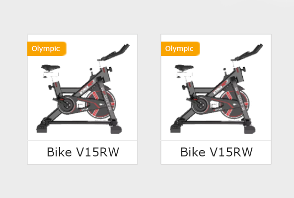
Hi there, I'd like to make my ProductCard component more accessible and wanted to have your thoughts on it. It's a product card used several times throughout the website (ecommerce). What I've read was that I could replace the <div className={style.card}> for <article className={style.card}> - does it make sense in this case? Also, should I use <header> and <footer> inside the card? If so, which part should be wrapped in the header and footer? Because it seems weird for the image to be inside the <header>, but I could be wrong. On the other hand, should the Badge component have a role attribute? Here's the code and also an image of what the product card looks like
And the Badge component, which uses absolute positioning to place itself at the top left border of the card, it renders the product category:

0 Replies