Hero layout creation

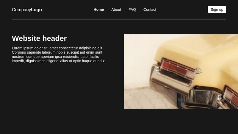
Hey, i'm practicing and improving on how to achieve certain hero section layouts that are typically used and I've got a question with a design In the image, i know the two column layout is achieved by using flexbox or grid however i'm wondering the best practice to use to have the image positioned off of the screen whilst still keeping the consistent alignment etc. I'd appreciate anyone's help with this 😄
38 Replies
Mannix
Mannix17mo ago
i made this for someone a while back https://codepen.io/MannixMD/pen/jOQQbEo maybe it will give an idea how to achive what you want 😉
Mannix
CodePen
jOQQbEo
...
snxxwyy
snxxwyyOP17mo ago
ah thank you, i'll give that a look @mannix_ i'm not going to lie, i'm still kinda lost on how i would achieve it even after looking at your pen, would you mind explaining it please?
Mannix
Mannix17mo ago
basically you create 3 columns with grid and then you put the "off the screen" part in column 2 and 3 and the rest just in column 2.
snxxwyy
snxxwyyOP17mo ago
ohh i see now, thank you
snxxwyy
snxxwyyOP17mo ago
sorry to bother you with it again @mannix_, it's probably frustrating having to explain this 😅, i've been experimenting and i can't seem to get it to function the way i want, I've whipped up a quick responsive site with a grid layout for the hero section with two columns, do you think you (or anyone else reading this) would be able to show me what you mean with the three column thing and positioning it off screen please? Here's a codepen of that if that helps, the grid properties are at the bottom in the desktop media query. https://codepen.io/deerCabin/pen/BaGXLEY
croganm
croganm17mo ago
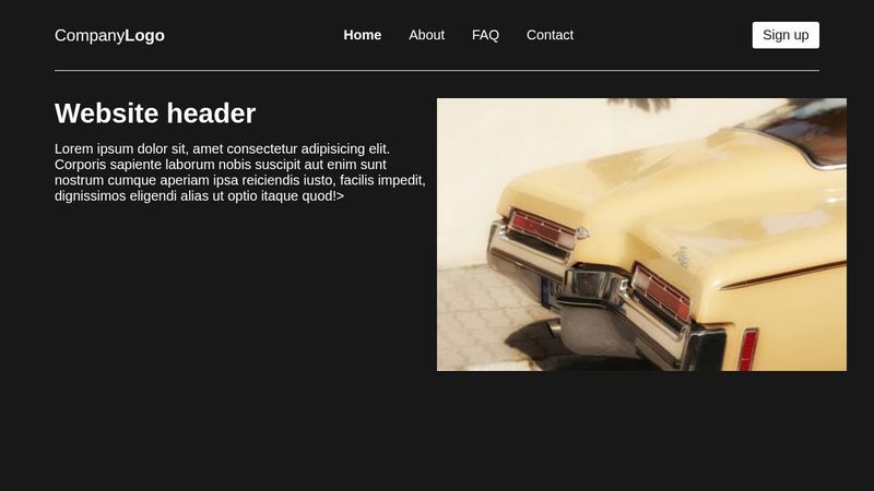
Let me know if this is what you were going for https://codepen.io/croganm/pen/NWEQbJQ If so I'll explain what I did Elsewise I'll try to fix it 😂 Tried to make it look like the photo
snxxwyy
snxxwyyOP17mo ago
that was what i was going for yeah 😅, i've also been helped by someone else who's given a different solution so an explanation of your one would be great thanks
croganm
croganm17mo ago
Yea no problem. I noticed the wrapper, so all I did was make the grid go 100vw (which is just the size of the screen). I knew it would overflow. I then put a overflow clip on the body. Kept it two columns This way, it could start where the wrapper starts But overflow it on the ends What was the other way it was done?
snxxwyy
snxxwyyOP17mo ago
ohhh i see, thank you for explaining 😄, i was just playing around with it and it doesn't seem to let me adjust the grid-gap, would you mind if i ask about that? 😅
croganm
croganm17mo ago
Haha I put a max width on the text Personal preference
snxxwyy
snxxwyyOP17mo ago
snxxwyy
snxxwyyOP17mo ago
ohhh haha
croganm
croganm17mo ago
On smaller screen sizes the grid gap will change, just the max width was to prevent the lines from getting too long. Text should really only be 75 characters per line 😂 You can just get rid of that last rule on the CSS sheet where I set it and it will allow you to fully customize it 😂 Also that solution is very similar! They just did width 150% Instead of 100vw
snxxwyy
snxxwyyOP17mo ago
ah can't argue with that 😅, so adjusting the gap would basically just be changing the max width of the text?
croganm
croganm17mo ago
Almost. Basically the gap is more than 80px most of the time, but the minimum gap will now be 80px
snxxwyy
snxxwyyOP17mo ago
ahhh gotcha gotcha thank you for your solution, i appreciate that, gives me a wider outlook to solutions for these things 😄
croganm
croganm17mo ago
Yea no problem! Glad to help even if it was a little late 😂
snxxwyy
snxxwyyOP17mo ago
it wasn't too late man, any solution is a step towards learning more about css to me 😄 oh one thing i have noticed @croganm is that the alignment of the hero text and navbar is a little off? is that to do with it being pushed off screen?
croganm
croganm17mo ago
I on purposely centered it to look like the picture. If you want it to be left aligned with the nav, just remove the place-items: center; from the section.hero 🙂 Didn't know how much like the photo you wanted it to look like 😂
snxxwyy
snxxwyyOP17mo ago
ohh that's entirely my bad, i didn't even notice that line 😅 appreciate the reply
croganm
croganm17mo ago
No problem! Just changed it to align-items instead, probably more so what you're going for 😂
snxxwyy
snxxwyyOP17mo ago
ah yeah that'll be the one! 😅 thank you!
Mannix
Mannix17mo ago
no need to play with vw or overflows
croganm
croganm17mo ago
It doesn't stretch to the outside
croganm
croganm17mo ago
Mannix
Mannix17mo ago
it stops at 1200px
croganm
croganm17mo ago
Ah, I wasn't sure if we wanted the image to continue stretching or not. I was under the assumption he did. Yours is how you should do it if you want to keep it within the container 👍
Mannix
Mannix17mo ago
imo it needs to stop at some point on 4k screen it's gonna look weird tbh
croganm
croganm17mo ago
That's fair. I always test on 4K at home but it's a bit tougher on mobile.
snxxwyy
snxxwyyOP17mo ago
Thanks for another solution @mannix_ , could I ask what margin-inline: auto; does?
Mannix
Mannix17mo ago
it like setting margin-left:auto; and margin-right: auto;
snxxwyy
snxxwyyOP17mo ago
Ah is there any significant difference or can you put those two and have the same result? Like is it a shorthand for those two?
Mannix
Mannix17mo ago
it's just quicker to write one instead two. I just need to mention if you would change the writing-mode to vertical the margin-inline would become margin-top and margin-bottom margin-inline is a logical property you should read about them 🙂
snxxwyy
snxxwyyOP17mo ago
Ohhh I see, I'll check it out, thank you And is the changing the writing mode just changing the direction of the text? Like horizontal and vertical?
Mannix
Mannix17mo ago
yup
snxxwyy
snxxwyyOP17mo ago
Oh gotcha, appreciate the information
snxxwyy
snxxwyyOP17mo ago
@mannix_ @croganm, i was playing around with it a little bit, with this solution, the image goes off screen around tablet size, then formats equally at desktop, wouldn't a simpler solution without playing around with the grids be to set a min-width larger than the screen size around tablet size like so? https://codepen.io/deerCabin/pen/WNYVgxO
Want results from more Discord servers?
Add your server