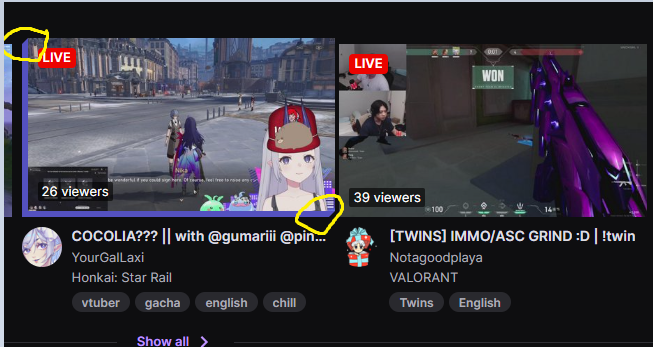
Twitch card hover effect
I have been messing around with CSS but couldn't get this 3d hover effect that Twitch made.
I tried doing this but couldn't get those edges (I circle them in the image)

12 Replies
i looks like it's 4 separate elements 2 for those corner and 2 for those lines
wut if u use border for those 2 sides and then before and after to cut out the side part
that's how twitch does it
ooh lol
tutorial (german)
https://youtu.be/3BOVlMQoQ24
Unleashed Design
YouTube
Twitch 3D :hover Effekt mit CSS3 👍 [TUTORIAL]
Heute bauen wir den 3D :hover Effekt von Twitch mithilfe von CSS3 nach und schauen mal ob wir ihn etwas verbessern können!
Fragen oder Probleme? Werde Teil der Community! (Kostenlos)
📣 Discord Server: https://discord.gg/NV2NrXA
Unterstütze den Channel:
🧡 Adobe Creative Cloud: https://prf.hn/l/QxRnVXD (Affiliate Link)
🧡 Meine UI Design Tool: ht...
It could also be done with a single pseudo element and no borders…. One sec, actually I’m not so sure now…
This is as close as I can get at the moment. I am on mobile so I am struggling with codepen.
https://codepen.io/cbolson/pen/RweJdMe
What I am struggling with is how to correctly animate the box so that it appears to slide out from its shadow. For now I have tricked it a bit with a delay but I must be able to do better.
( I know the corners are off, I have just been concentrating on getting the animation to work - all too fiddly on the mobile)
@Chris looks pretty good
this got more complicated than I thought
and to think, the way that twitch has this done is even more complicated than the way you did it. The
clip-path on the pseudo element simplifies things a lot. But is still a pain. Still trying to get the CSS working group and browsers to care about implementing corner-shape which would help a lot here.and to think, the way that twitch has this done is even more complicated than the way you did it 🤣
look at me overengineering one card component, putting strange unnecessary divs, writing a bunch of weird repetitive CSS codes for hover, making my codes unreadable for everyone in my team
might there be a way to do this with just straight up adding a bottom and left
border-width on hover? Transitioning the border-width And then a clip-path for the angles? So no pseudos?You are right. That is possible. One less element
https://codepen.io/cbolson/pen/poxOzOx
Ahh, one sec… the clip path is cutting off the corners…
Sorted the corners, just getting a slight flicker on hover out (on my mobile)
I have refactored the border animation to use keyframes rather than a transition. https://codepen.io/cbolson/pen/poxOzOx
Single element with no pseudo elements.
One issue with this solution is that it will require extra CSS to prevent it from messing up its siblings positioning. This isn't an issue with my previous solution.