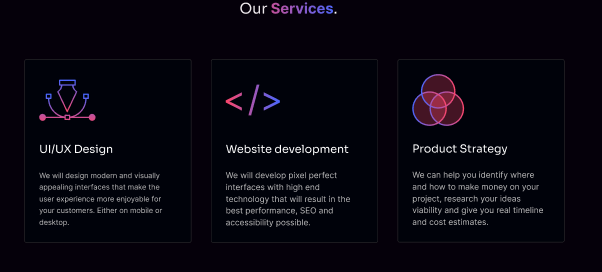
Can anyone give me some feedback on this section?
I'm still learning design and it looks good IMO, but could be better. The thing is, I don't know how to improve it.

8 Replies
Unknown User•3y ago
Message Not Public
Sign In & Join Server To View
looks great as is to me, but if you want to experiment further, you could try adding a very subtle black to black gradient on the bg (and if you want to get real crazy, also on the cards but in the opposite direction
and maybe make the "our services" text bigger, at least as wide as the middle card might look nice
I'm not a designer but imo I feel like you might have overused the gradients a bit
Maybe remove the gradient from the header and just keep it in the card images?
Also I feel like the card heading is a bit detached from the content text, and I would also center the images. Another thing I'm looking at is that I feel as if the cards are a bit flat, maybe you can add a border-bottom/box shadow to make it a bit more 3d and pop?
Hello guys, I'm thankful for yall answers.
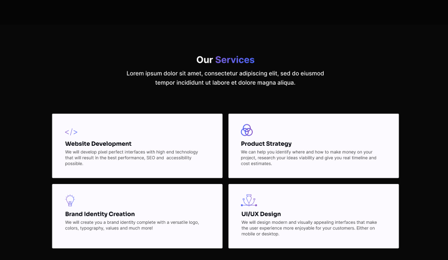
This image attached is the end design I went for.
I'm sorry for missing that you guys answered me. I've requested feedback on multiple places but almost no one answered me and I'm not very good at using Discord.

The idea was a flat card, I just like flat grids personally. But I will try to experiment with box shadow/better borders
Np! I would be careful using black and white like that, hurts my eyes just looking at it through the image let alone on an actual website
Dammit, I thought they looked cool but a lot of people told me this. I will try to make them grayer
I don't know if you know js but try making a slider with a timeout every 4 secs so the user can see all the divs plus add a hover and use transform scales and box shadow