✅ How to structure this login/signup page layout
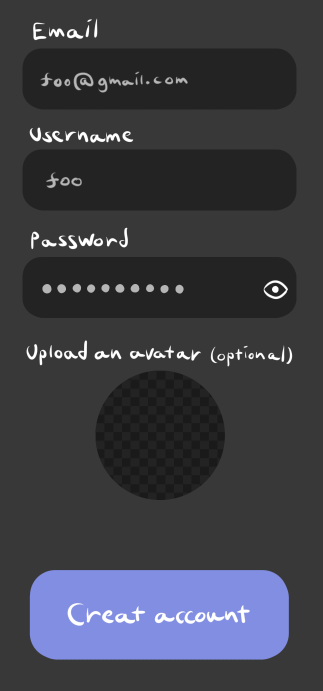
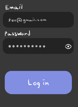
So I have this mockup of the layout I want for a login/signup page in my Blazor WASM app. Pretty standard, the signup thing should have fields for email, username, password, and avatar image, and the login one should have a field for the email and password.
The question I'm running up against is how to properly separate all the design aspects out into components such that the page doesn't become overly cluttered yet the components feel reasonable enough. The email and username fields could just be their own component since they share the exact same behavior, however the password field looks the same, except it should display its text as dots instead of plain text, and it should have an eye icon on the right to toggle dots/plain text.
I'm also wondering whether the two forms are different enough to warrant separating them into individual components, because much of the logic (like input and validation) would be practically the same, so that would lead to a lot of code repetition across the two components.
(also excuse my terrible handwriting)


5 Replies
TextInput, PasswordInput, AvatarSelector, ActionButton would be the components I'd use
And, yes, I'd make each form its own component as well
is IMHO better than placing all of that code in each branch
Just asking to make sure, those aren't pre-made components, right?
Nope
At least not far as I know
good because they sounded kinda like they could've been
yeah, that makes sense
Was this issue resolved? If so, run
/close - otherwise I will mark this as stale and this post will be archived until there is new activity.