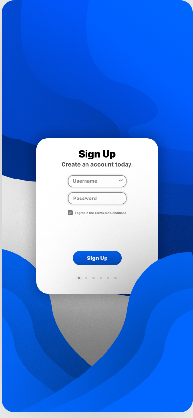
I made a sign up page for mobile, any feedback?
I recently started working on UI / UX design, as I wanted to start making professional looking sites. I just wanted to ask here to get some feedback on my design and what I should change/improve.

14 Replies
also tried making a homepage with the same elements but it really doesn't look too good lol 💀

Hey Areg, welcome to the world of UI design. Don't be too down on your early attempts, at this stage in your journey, you want to just be throwing everything at the wall and seeing what sticks. Don't be afraid to experiment, you'll learn what works and what doesn't super fast that way
that said, some thoughts on how you could iterate this to the next version:
1. the sign up card is the main focus of this app page, not the background. One good way to show this through design is by sizing. Try increasing the sign up card to say 75-80% of the total screen space and see how that feels. As the bg fades into ... the bg, it will become less of an eyesore
2. Modern design cues: Current trends are much more narrow border radius amounts, say 4 or 8px. And pill shaped buttons have kind of fallen off as well. Maybe give everything on the page only 8px radius or 4px radius and see how it looks
3. Colors: blue is a great choice, and these 4 shades are a nice gradient from light to dark, but they are extremely saturated. I took them down 50% and I think the palette really pops that way (the top 4 boxes are 4px radius, and the bottom 4 are 8px radius fyi)

4. the lower overlap: I think this is a fantastic idea that you can explore. One thing you might try, is to remove the shadows, and then reduce the opacity of the blue to say 85% so that some of the card still comes through underneath, that might give it a better sense of depth.
that's all I have for now, keep up the work
Thank you! I will try to incorporate these changes and see how they turn out!
This is the final result! NOW THIS IS JUST MY OPINION but I prefer the over saturated colors lol, but I do like the resized card, I'll have to resize/reposition some elements inside of it though.

I was KIND OF going for a mix between brutalism and smooth-gradients for this I guess, thats why I don't enjoy these colors very much
Going off of what ghostmonkey said, I think you should put the bottom right wave underneath the sign up card. I'd also make the form elements bigger so that there isn't as much whitespace (whitespace is essential but that's too much imo), and I would also remove the gradient from the button as it looks a bit early 2000s to me
Also, from a user experience standpoint, what's the use of the 3 dots on the bottom of the card? It reminds me of a carousel
Yeah I was thinking of a carousel that like introduces you to some functions of the app
after you sign up
I think it would make more sense to redirect to the home page of your app and ask the user if they want a tutorial or not
Probably would be better lmao
I should probably mention im doing this for practice lmao--
Bro I like this much better than the updated one you created with non pilled button and desaturated colours
same
@aregprograms keep in mind that a keyboard will slide in from below, so your form / dialog should move accordingly or consider
dvh for positioning.
Safari Mobile tends to zoom into the form element having focus by default; can't recall right how to disable this.
About ten gazillion mobiles in the wild not built by Apple, Huawei or Samsung have a screen with less than a 2:1 aspect ratio.
You can also use @media (min-height) to check there's enough space incl. the unaccounted space required for possible error messages if the login fails or credentials are missing.
I'd drop that faded background for other "pages".
In any case it's distracting and serves no particular purpose. You could try using thin colored (out)lines instead.