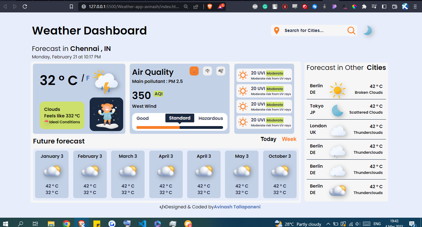
Can i have feedback on my project
I would like to have feedback on the layout, colour combination etc.
Note i only did basic structure still there are tons to do
11 Replies
I'd remove the right Forecast in Other Cities, from a UX standpoint I don't think it's really adding anything to the user experience
Remove the white background for the main section
the 3 biggest issues i see are the lack of whitespace within your elements, the inconsistent alignments, and the mismatched border radius amounts. Those are the areas I would focus on correcting first.
For whitespace, come up with some standard unit, say 8px, and make sure everything inside your element is exactly that far from the borders. If you do this for all the elements, they will look a lot more consistent and pleasing to the human eye
For the border radius, just pick one and stick with it across all your elements
and for the alignment, look at things like how your search bar/dark mode don't align with the 'forecast in other cities' section, or how the top 3 elements are not center aligned within the white background border, leaving a weird gap on the right
and, not design related, but 350 AQI is not 'standard', thats a bit more towards 'extremely hazardous to life' territory
overall, I like your initial desing, and with a few tweaks, and maybe a slight reduction in total information, this will look very good
hey thanks for the feedback, i understood most of the stuff except whitespaces within elements?  the elements in forecast are moving left and right , so thats why it feels like there are off
if you dont mind can you highlight where all tweaks needs to be done. im new to design and i would love to have pointers so it will stay on my mind
the elements in forecast are moving left and right , so thats why it feels like there are off
if you dont mind can you highlight where all tweaks needs to be done. im new to design and i would love to have pointers so it will stay on my mind 
the elements in forecast are moving left and right , so thats why it feels like there are off
if you dont mind can you highlight where all tweaks needs to be done. im new to design and i would love to have pointers so it will stay on my mind 
I added a ton of little pink and green boxes to kind of highlight how they are all different sizes and there is no consistency. So for instance, if all the pink boxes were the same size across all these elements, and all the internal data was aligned with them, it would look a lot better
Now i understood and will work on it, thankyou
This is not a recommendation , but this actually looks real good. BTW could u reply whether this is a static website u just made for the design or it is dynamic
Unknown User•2y ago
Message Not Public
Sign In & Join Server To View
@BOIITHUGGER @HansanaDasanayaka @Hassaan Shahzad
live version https://weather-warden.netlify.app/
would love to hear some feedback on it.
note there is some issues with mobile phone. i will work on it after i finish my current project
Weather Warden
Weather Warden gives current weather conditions based on your location and can be searched based on location. Dashboard Dashboard was built with CSS for styling, JavaScript for functionality, and API for live weather data.
Unknown User•2y ago
Message Not Public
Sign In & Join Server To View
its going out of the screen. so i have to reduce font size or add padding