How to reduce width of a div without hard coding values? the only element it contains is a image
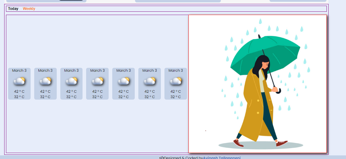
As you can see in the image the parent component has display:flex, jcc, aic properties. parents has two child divs one containing ul and other is image. the original image is of diff size so i used width:20% on img, the size of the image is reduced but the div surrounding is not reducing in width. how to fix it?
https://codepen.io/avinash-tallapaneni/pen/ExRomwX

28 Replies
if u want the div to fit the img
u can set
width : fit-content;
TO the div
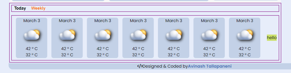
and it would resize itself to fit to it's contents widthwisei tried that before. As you can see the image size is way bigger.
is it big by default or did the img get bigger when given the fit width
to the div
iage is big by default 612*612 i guess
u r trying to fit the div to the img ryt?
in the picture in your questions the img is small
yes, im trying to fit it to the div. So the entire lower section looks somewhat same sized
u trying the img to fit the div or the div to fit the img
yeah i gave width:20% on image but not on the div
well have u given fit Content TO THE DIV?
im trying to fit the image to the div, by default the image is big. i tried giving fit content to the div.
okee so that won't work
cause fit Content is when u wanna fit the div to the content
u r trying to fit the img to the div
or say content to the div
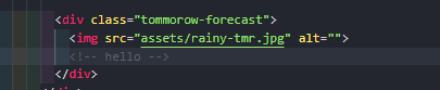
i replaced image with hello, its working fine , but when i add image src its taking spaces. i dont want hard code value on the div tho
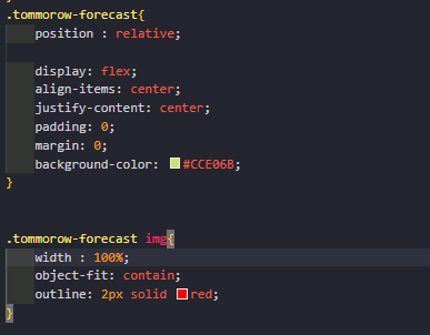
well first off since the img is square,
make the div square as well
and then to the div give
position : relative;
and to the img give
this way the img should take 100% thw width of the div and since the div is a square as well it should take 100% the height of the div as well
try what I saidnope didnt work
share ss of both the html and css
of the img and div part
well U want the img to fit the div
but the div itself doesn't have any height or width
what will it fit based on?
u can see the div without height and width is cause it's fitting itself to the img
i think yesterday one of the mod said not to use height/width. so i followed that method, it was working fine as i only gave dimensions for the image but not for the divs. here also i tried the same but didnt work 🙄
i gave values for div and it worked 
well lemme tell you
if u make a div , and do nothing else u won't see it
cause it doesn't have any height by default
basically it doesn't exist
so if u want to do something relative to that div u need to give that div an existence
u can't make something relative to something that has no appearance
and mod said not to giv fixed value is cause fixed values r to be avoided as much as one can
cause it creates many problems when it comes to responsiveness
u just have to know when to use and when to not
if that is the case wont it cause problem with the image now? 
it will if u give the div a value like px
if your div is relative to something else then it'll depend on that
but then again if THAT something else has a fixed unit like px then THAT something can create problem and then since the div id relative to THAT something the div will create problem and so will the img😂
that's why u need to be careful about using them
in this case u have no choice
but I'd still recommend u to use % insted of px
ok now i understood
i only use rems for dimensions 😬
well, thinking simple, these problems occur mostly when the change is drastic
u can use media query to make it compatible for most devices
i saw kevin video where ems scale on previous parent or something, so im like nope, i will stick to rems
but u should try your hard to make it as responsive as u can without media query
they r very very tricky to get youe heads around when it comes to units
I'd recommend to make the biggest parent relative to the screen size using vh and vw and then any direct child of that div will be realtive to that big div and then things inside those smaller divs will he realtive to their own direct parent and so on
as you can see mine is not responsive what so ever . tried my best but i couldnt 🥹

that's why media query
u can make your webpage responsive for both devices without media query
well when u make things realtive to the screen they WILL be responsive in one regard and that is the elements will shrink or enlarge im respect to the screen
but the layout will not change
so it won't look good either
yeah i have to do mq after im done with desktop version