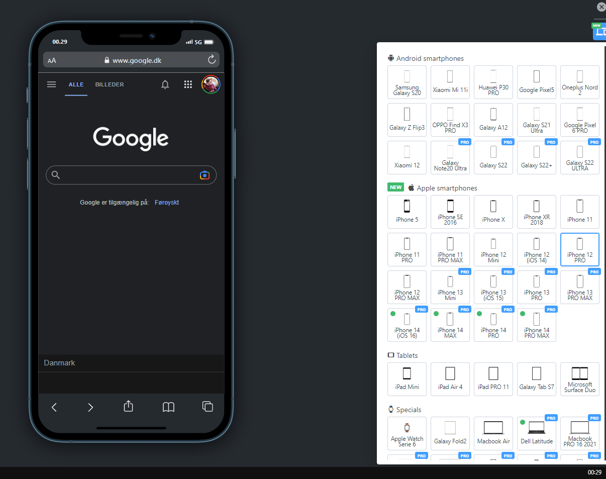
Is there a way to properly check how your website looks on different devices?

I've seen that some components in my website look differently when using a Samsung A11 VS Xiami Mi Note Pro 10 for example. But I had to physically check this to know it, since on Firefox/Chrome responsive view it looks fine, so I was wondering if there's a (ideally free) way to properly check how your website looks on different devices. Like, truly simulation software?
26 Replies
b1mind
b1mind•2y ago
There is no free vm solution unfortunately... Cost money to emulate/vm so. Browser stack is the one though Also know that if you are using vw/vh it can display differently than responsive devtools because of mobile bars and how it handles the ICB Hard to say without seeing the site but yea. Just something to keep in mind/avoid.
Muhct
Muhct•2y ago
Yup, in my experience vw/vw is too unpredictable so I don't use it In your experience, what things or CSS properties did you notice that behave differently in different devices? For example on google chrome+firefox the text-clamp I had worked great, but didn't worked at all on a iOS device using Chrome
b1mind
b1mind•2y ago
so right now iOS is all webkit skinned by 2023 because of EU laws they have to free the browsers to be real thing. So you battle is with Safari period https://joyofcode.xyz/test-your-site-in-every-browser is a great way to test webkit for free still not going to catch all teh iOS stuff that might differ though. Honestly most things work the same now days. But when its wrong its normally because of a shorthand or property not supported well yet. https://caniuse.com is a great source to check properties you are unsure of. Somethings still need a prefix -webkit- too not many but some for that I normally use autoprefixer plugin with postCSS/scss aka welcome to web development, cross browser support has been a thorn (and was way way worse) since the start of it.
Muhct
Muhct•2y ago
Nice, that Playwright way of testing webkit emulates both desktop and mobile? Seems like the framework I'm using (NextJS) uses PostCSS right off the bat, so that's nice
b1mind
b1mind•2y ago
no its just webkit desktop, you can't emulate mobile bars without the device (like BrowserStack does it) Also it will not be as performant, like for me some animations will appear to lag or slow down Playwright. Far as CSS is concerned its helped me a lot testing with it though.
Unknown User
Unknown User•2y ago
Message Not Public
Sign In & Join Server To View
b1mind
b1mind•2y ago
yea but this just simulates bars on a mock design?
Unknown User
Unknown User•2y ago
Message Not Public
Sign In & Join Server To View
b1mind
b1mind•2y ago
I use https://polypane.app/ for responsive design these days its nice. Nothing beats a good ol devtools squish test too.
Polypane, The browser for ambitious developers
Build responsive, accessible and fast sites with a stand-alone browser. All the tools you need in one app.
b1mind
b1mind•2y ago
But does it simulate the movement of the bars? that is were vh messes up
Unknown User
Unknown User•2y ago
Message Not Public
Sign In & Join Server To View
b1mind
b1mind•2y ago
cause the ICB changes and its different for mobile You must not be using vh haha good on you
Unknown User
Unknown User•2y ago
Message Not Public
Sign In & Join Server To View
b1mind
b1mind•2y ago
cause you would know what I speak of probably if you did 🤣 specially on iPhone keyboard shifts the viewport too na mate the safari bars
Unknown User
Unknown User•2y ago
Message Not Public
Sign In & Join Server To View
Want results from more Discord servers?
Add your server