Add a circle to a CircleProgress component

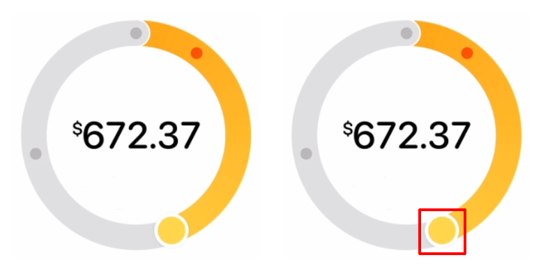
Hi there, I'm looking to create something similar to this component from Apple's website (picture below) but there's one part that I'm not sure how it can be achieved: the tip of the progress indicator has a circle/ball inside it with a 3px white border, how can that be replicated with React/CSS? https://codesandbox.io/s/base-react-circular-progressbar-examples-forked-um3bev?file=/index.js
noid09
CodeSandbox
Base react-circular-progressbar examples (forked) - CodeSandbox
Usage examples for react-circular-progressbar.
4 Replies
MarkBoots
MarkBoots3y ago
played a bit with it, created this in css alone https://codepen.io/MarkBoots/pen/OJwyQvo I think it can be a bit cleaner/easier with svg, but unfotunatly I can't help you with that because im from home and don't have the programs for it now
Muhct
MuhctOP3y ago
Oh wow that's amazing, thank you!
MarkBoots
MarkBoots3y ago
'no problem, you're welcome. make sure you copy or fork the pen, because i will probably remove it in a couple of days
MarkBoots
MarkBoots3y ago
backup because i removed the pen
<div class="circle-progress" style="--percentage: 40">40</div>
.circle-progress{
--text-color: hsl(0 0% 0%); /*text*/
--big-circle-border-width: 20%;
--big-circle-border-color-start: hsl(0 100% 50%);
--big-circle-border-color-end: hsl(250 100% 50%);
--big-circle-border-color-track: hsl(0 0% 90%);
--small-circle-border-width: 5%;
--small-circle-border-color: hsl(0 0% 100%);

width: 10rem;
aspect-ratio: 1;
font-size: 1.5rem;
font-family: system-ui, sans-serif;
color: var(--text-color);
display: grid;
place-items: center;
position: relative;
--degree: calc(360deg * (var(--percentage) / 100));
--small-circle-size-pos: center top / var(--big-circle-border-width) var(--big-circle-border-width) no-repeat;
}
.circle-progress::before, .circle-progress::after { content: ""; position: absolute; inset: 0}
.circle-progress::before{
border-radius: 50%;
background:
radial-gradient(
100% 100%,
var(--big-circle-border-color-track) 50%,
transparent calc(50% + 1px)
) var(--small-circle-size-pos),
conic-gradient(
var(--big-circle-border-color-start),
var(--big-circle-border-color-end) var(--degree),
var(--big-circle-border-color-track) 0
);
--color-stop: calc(50% - var(--big-circle-border-width));
--mask-image: radial-gradient(
100% 100%,
transparent var(--color-stop),
black calc(var(--color-stop) + 1px)
);
-webkit-mask-image: var(--mask-image);
mask-image: var(--mask-image);
}
.circle-progress::after{
--color-stop: calc(50% - var(--small-circle-border-width));
background:
radial-gradient(
100% 100%,
var(--big-circle-border-color-end) var(--color-stop),
var(--small-circle-border-color) calc(var(--color-stop) + 1px) 50%,
transparent calc(50% + 1px)
) var(--small-circle-size-pos);
transform: rotate(var(--degree));
}

Did you find this page helpful?