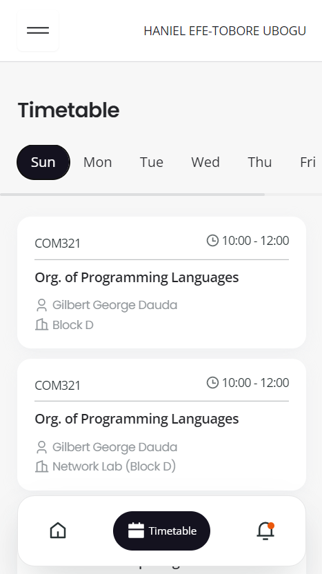
How can my design be improved?
I feel like the background color for the day-of-the-week selector should be different, but idk
7 Replies
Unknown User•3y ago
Message Not Public
Sign In & Join Server To View
Thanks for the feedback! Will definitely implement your suggestion!!
Looks really good!
Thanks!
A couple suggestions now that I'm not half asleep: The navbar on the bottom, with the word "Timetable" on the active page. I don't think it's necessary and clutters up the navbar. Another suggestion is that I think the time (10:00 - 12:00) should be more prominent as (from what I'm assuming) it's the most important things on the page. "Org. of Programming Lnaguages" is what draws my eyes the most, and I'm guessing that's not what you want but maybe it is
Here's an iteration:
- You have "Timetable" as a navbar label and as a title, it takes space, so we have an option to cut it;
- And Seven and Vince give a good feedback also, so colors and attention to time;
- Menu into navbar to free the screen space and make it all in one place;
