Feedback on Website Design & Visual Appeal
We have just completed the development of our website and would love to get your feedback on its design. At the moment, the content, button titles, and text are placeholders and will soon be replaced with the final content.
Could you let us know how the overall layout looks? Do the background colors, images, and animations appear balanced, or are they too extreme or too subtle? We would appreciate any suggestions on how to improve the visual appeal.
Thank you for your time and feedback!
https://robbin-25.github.io/Best_2/
29 Replies
the logo is unreadable and the bouncing annoying arrow isnt doing a ton being off the screen

english is a left-to-right language, and reading right-aligned english feels like my eyes are being tricked into pranking my brain

i have to force myself to look away to be able to read
the effects are in desperate need of a check - the image doesnt show up until way after the point where it already should be there
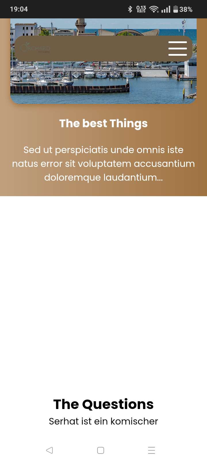
normally there is an image
i know
it shows if i move a tiny bit lower
is there anything else
probably, but im too tired
🤣👍
But thanks for the advice
Any other advice
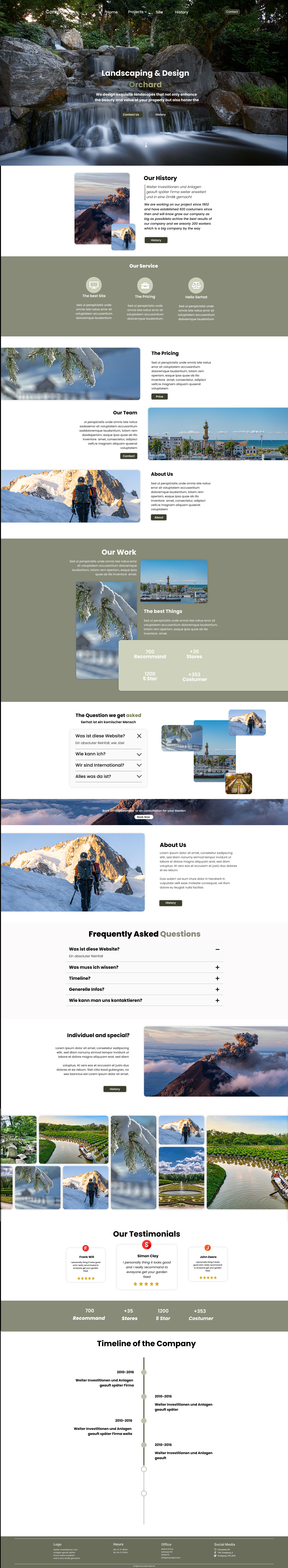
One thing I noticed: on desktop, the cursor changes to a pointer when hovering the testimonials, but there's no interactivity on the element.
In general, I think the brown/gold colour scheme works okay, but there are places where you have a blue accent colour, like in the header of the testimonial section and the dates on the timeline, which doesn't really match.
There's also some visual inconsistency in the card components, some of them have box shadows, others don't; I think it would benefit from one consistent approach.
what would you recommand for the color scheme like which color
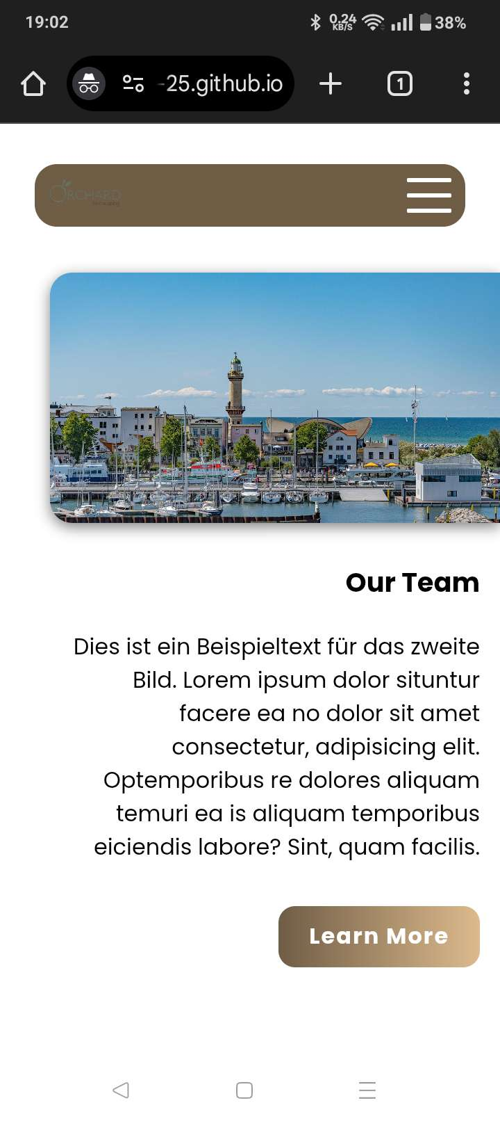
this is not justified correctly on the left
The button has too big of a font

In general the fonts are way too big
when you open the dropdowns the image on the right shifts

In general the dropdowns dont feel very smooth as when you close them the animation briefly slows down at the end
the footer is also way too big

Ok thanks for the advice I will try to fix everything you gussy said 😄
I personally think the brown is very ugly. It is not really a color associated with exquisite landscape design or just with anything fun and fresh. The gradient on the buttons makes it worse and doesn't help with the readability of the text on them.
What would you recommend
Green looks fresh and gives a nature vibe, so I would go for that
what about that ?
Personally I like something like this more:
https://coolors.co/palette/05668d-028090-00a896-02c39a-f0f3bd
https://coolors.co/palette/22577a-38a3a5-57cc99-80ed99-c7f9cc
Thanks
I changed the colors a bit in Figma, but I can't decide which design looks better. I know you can't zoom in on Discord, but if you download the file, you can see it better.

They both really similar
the white text, on the left side, is impossible to read on that background
Okay I will make it darker
But which overall design would you chose