Overlapping Scroll (how to do)?
Hey everyone,
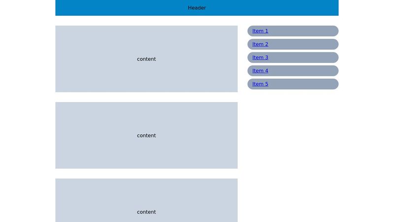
I’m trying to replicate an overlapping scroll effect (similar to the one in the video I’ve attached) using CSS and JavaScript without any external libraries. Could you suggest the best way to implement this?
Here’s my CodePen for reference:
https://codepen.io/Ibrahim-AbuFarha/pen/LYwpdgz
Looking forward to your advice. Thanks!
14 Replies
That looks like
position: sticky;
: https://developer.mozilla.org/en-US/docs/Web/CSS/position?v=example#stickyMDN Web Docs
position - CSS: Cascading Style Sheets | MDN
The position CSS property sets how an element is positioned in a document. The top, right, bottom, and left properties determine the final location of positioned elements.
no its not just a sticky i have tried it
You'd have to wrap the first section in a container and set a scroll value on it
oh, wait, I missed the purple bit the first time
yeah check the video please i tried many solutions but nothing work
any help!
As far as I can tell there are 4 things going on.
1. Side bar initially sticky but then fixed.
2. Main content stops before scrolling out of view completely
3. Purple section has sticky
3. Bottom content above both side bar and purple section
I forked your codepen and hacked together a solution.
I didn't change any of your code (and will admit that I didn't look too closely at it so as not to get distracted.
1. Using JS observationObserver it makes the sidebar "fixed" when it reaches it's sticky position (set at 10% as per your CSS). This could possibly be done with a scroll animation without the need for JS 🤔
2. I added sticky with a negative magic-numbered top value to get the "all-sections" container to stick before scrolling completely out of view.
3. I moved the purple element outside of the main container and gave it sticky (of course it now covers the sidebar - to resolve).
4. Wrapped the bottom elements in a container with a white background and a higher z-index.
This has really been a very quick hacky test to get it working. Unfortunately I don't have time to fine-tune this. Hopefully it might help you a little bit.
https://codepen.io/cbolson/pen/mdNeKzR
thank you a lot Chris ,
i will check .
Hi @Chris
Unfortunately, it didn't work. I tried multiple approaches, but nothing seems to work because the structure of the HTML doesn't align with the design requirements.
Could you please take a look and see if you can apply the scroll effect as needed?
I appreciate your effort!
Here’s the link: http://chess.com.dedi5536.your-server.de/ar/about-us
What have you tried?
As far as I can see in the link that you have provided there is no sticky, fixed or anything that even attempts to make this work.
clear cashe so u can check
I have never loaded that website before so there is nothing in my cache
I was working on the browser's source file, but then I pushed my styles to the server, which is why this happened.
could u help me to get that scroll overlapping?
Bro, sorry for bothering you, but is it doable or not? @Chris
It is probably doable as I demonstrated yesterday but I haven't yet seen anything that you have tried so don't know where the specific issue is.
i tried to give all of blocks above of purple view
and for the first section
position sticky;top:-90%;
and for purple view position sticky;top:0%;
and for the first section
position sticky;top:-90%;
and for the achivement section position sticky;top:0%;
but nothing work as i want
thats why i deleted it
http://chess.com.dedi5536.your-server.de/ar/about-us this is the link if u want to try and help me to get the desired scroll i appreciate you effort
thank you broThis is tricky, in a large part due to an excessive use of containers. You could probably achieve the same design with just 10% of the containers that you are currently using 😅
You don't need to endlessly wrap content un div after div.
In HTML, as with most coding languages, less is defiantly more.
The purple section needs to be taken out of the the main container otherwise, as it is the last element, it won't have a chance to stick anywere.
Let me see if I can set up a fresh demo without all the content and endless containers.... (no promises)
I have made a demo for you.
This is not based on your code as, as I mentioned, it has far too many containers for my liking which makes it overly complicated.
This uses a parent grid, some column declarations and a couple of sticky elements. No JS. Hopefully you will be able to understand what I have done and adapt it to your site.
https://codepen.io/cbolson/pen/QWeypXG