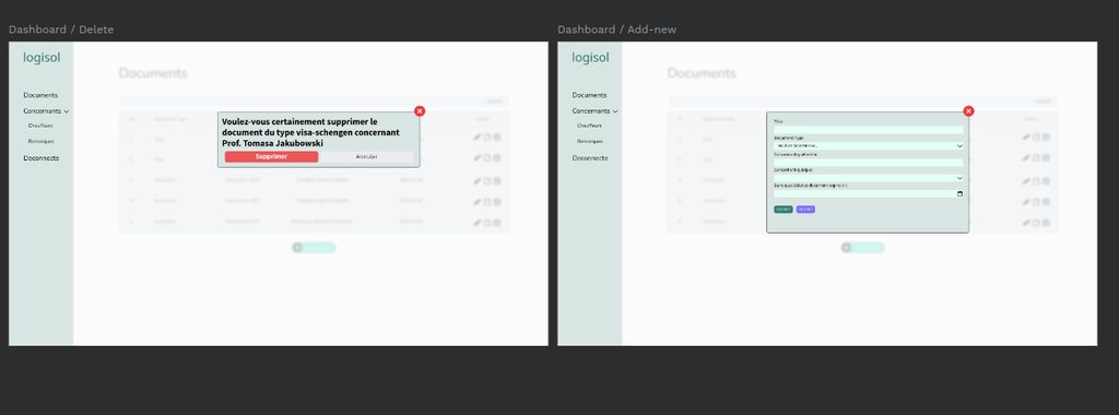
i can't seem to wrap my heads up around making good design

this just seems like a unfinished design, it looks like a prototype & i don't know how to improve it? https://imgur.com/a/oPNBx3l i did use the same color that was on the logo & same font nunito, but i don't know how to get more out of it, seems like i am out of ideas
8 Replies
Sleep Twitch
Sleep Twitch4w ago
I see 4 different color buttons to start with.. a dark green, purple, orange and in the background a sort of teal one.. And the color of the input fields doesn't really match with the background for instance.. it's best to just start with a color palette with less colors if you don't have a good intuition for color choices. A white / grey light color for backgrounds, a dark grey / almost black for text and an accent color (contrasting one, preferably the brand color) for actions and highlights
No description
Sleep Twitch
Sleep Twitch4w ago
Also.. maybe use some shadows on popups to make them stand above the background. And for modals, make the background a bit darker so it's more obvious you can not use the background when the modal is there
GrapDes
GrapDes4w ago
i don't know if you have penpot account but i can share it with you
GrapDes
GrapDes4w ago
i blur the background to make it stand i guess
Biggie Qualls
Biggie Qualls4w ago
Design is not a matter of simply choosing colors, shapes, fonts, and so forth. It is a much more involved process requiring years of study and practice to become accomplished at, much less to "master" if that's even possible to do. That said, however, the basics of a design process can be picked up rather quickly. Coming from a design background, I notice that many engineers and developers who are not coming from a design background think of design much like a layer or filter than can be applied to a site, page, or component after it has been built out. I would argue this is a mistake. Instead, design begins before any code is written, and ideally it starts with a pencil or pen and paper. Drawing the things you want to built by hand first will force you to think about the subject of your design in a much different way than one might think of building that subject with code. EDIT: Even before drawing your ideas, design really starts with asking questions and understanding the nature of what you are designing and who you are designing for. Answering this questions and understanding your users will help the design "reveal itself" to you, rather than you imposing your own ideas onto the design without understanding where the ideas come from or why they work (or don't work)! My suggestion is to perform a Google search for "design principles" and/or "design process" before you continue working on your project. Even better, go to your library, used book store, or to Amazon and ask/search for these same phrases, and pick up a book that interests you, then read it. In the mean time, here are a few resources I found on a quick search from some sites/organizations that are known in the design disciplines. These will at least give you a brief introduction into the scope of considerations designers take into account: * https://uxdesign.cc/what-is-the-design-process-and-why-every-designer-should-know-about-it-baab017eed82 * https://www.domestika.org/en/blog/9917-what-is-design-process-and-why-is-it-important * https://www.interaction-design.org/literature/topics/design-principles * https://paperform.co/blog/principles-of-design/ * https://logo.com/blog/principles-of-design * https://www.interaction-design.org/literature/article/5-stages-in-the-design-thinking-process Since this is a lot to absorb, I will stop here, but the last thing I will add is that good designers study the work of other designers, good and bad. Because web design utilizes a lot of 2D design the fields of graphic design, book design, magazine design, and even visual arts are excellent sources of inspiration and study. Even sites like CodePen are useful places to review the examples of others and to "steal" their ideas. Other design focused sites like Smashing Magazine are a wellspring of topical articles, easily searched, that help you understand more specific topics in design (such as typography) in the context of web development. I hope all of this provides a useful starting point for you. Happy designing!
clarkswift
clarkswift3w ago
the themed color you picked on logo is dark green, then stick with that one on the main buttons, then your secondary color pick is light green as you did on pick as background. remove that red and purple colors, you will feel much neater. use black, white and grey to helpl a little bit the next. Just play around in that way, you will work it out.
boberino
boberino3w ago
Find a color theme, look into padding, margins, and spacing in general. You're most of the way there, but don't be afraid to get creative and strive beyond your abilities in code.
Want results from more Discord servers?
Add your server