How do I choose column from 1-12 and make it auto responsive using grid?

Hello, I have tried to google and find YouTube videos, but I cannot find any solutions to my issue. The goal is that I know we could specify using the grid-template-columns with the trick of repeat() and auto-fill to make it automatically responsive:
.grid-layout {
display: grid;
grid-template-columns: repeat(auto-fill, minmax(12.5em, 1fr));
gap: 1em;
margin-block: 1em;
}
.grid-layout {
display: grid;
grid-template-columns: repeat(auto-fill, minmax(12.5em, 1fr));
gap: 1em;
margin-block: 1em;
}
The issue is that I am not even sure how to resolve it, for example, lets say I want to have 3 columns, then I want to make the grid-template-columns: repeat(auto-fill, minmax(12.5em, 1fr)); work. Also, no media queries involved in here. I am open to other suggestions as well. If using Flexbox is easier, then I am all for it! I hope someone could help me out!
46 Replies
lko
lkoā€¢2mo ago
you just have to change 12.5 em to a third of your container
Koicha
Koichaā€¢2mo ago
so using calc() function like calc(12.5 / 3)?
lko
lkoā€¢2mo ago
if 12.5 is your container yes Also calc(12.5em / 3) (remember the em)
Koicha
Koichaā€¢2mo ago
ooooh my god... I tried to do this did try this solution before, but without calc(12.5em / 3)! You are a life saviour! by the way, the 12.5em is just an arbitrary number I chose. Is there a better way to say for example if the parent component has X width, then I want to calculate the size of the total columns using CSS?
lko
lkoā€¢2mo ago
I'm not sure I understood the question but I think this is what you're looking for
.container {
--container-width: 100px;
max-width: var(--container-width);
}

.grid-layout {
--columns: 3;
--auto-fill-size: calc(var(--container-width) / var(--columns));
...
}
.container {
--container-width: 100px;
max-width: var(--container-width);
}

.grid-layout {
--columns: 3;
--auto-fill-size: calc(var(--container-width) / var(--columns));
...
}
Koicha
Koichaā€¢2mo ago
Let me try to explain this more clearly. Let's say the parent component is currently 600px wide. I want to ensure that there are 3 columns within this width, so each child element would be approximately 200px wide. However, the 600px width was just an arbitrary example. In reality, the parent component can automatically adjust its size based on the content inside it. For instance, if the parent expands to 1200px wide, then the 3 columns would adjust accordingly, and each child element would be about 400px wide. So, my question is, how can I detect the width of the parent component and dynamically ensure that the child elements are arranged into 3 columns correctly?
lko
lkoā€¢2mo ago
And what if the container becomes 30px width? the children should be 10px wide?
Koicha
Koichaā€¢2mo ago
yes it sounds pretty silly it will be 10px, but it would never be, hehe
lko
lkoā€¢2mo ago
then just do grid-template-columns: repeat(3,1fr)
Koicha
Koichaā€¢2mo ago
yeah, but then I lose the ability to do something like this
--column-start: 3
grid-template-columns: repeat(
auto-fill,
minmax(calc(25em / var(--column-start, 1)), 1fr)
);
--column-start: 3
grid-template-columns: repeat(
auto-fill,
minmax(calc(25em / var(--column-start, 1)), 1fr)
);
I am also opened to other suggestions if using Flexbox would be easier
lko
lkoā€¢2mo ago
I think you're overcomplicating things, can you show me an usecase where this would be useful? So I can find a solution to it
Koicha
Koichaā€¢2mo ago
I agree it is complicated. This is because I am using Vue where I have a component that is a wrapper that is something like this
// parent Component
<template>
<q-page-container>
<slot />
</q-page-container>
</template>

// Child component that has already been wrapped around the parent component
<grid-layout columns="3">
<input type="text" v-model="text1" />
<input type="text" v-model="text2" />
<input type="text" v-model="text3" />
<input type="text" v-model="text4" />
<input type="text" v-model="text5" />
<input type="text" v-model="text6" />
</grid-layout>

// grid layout component

<script setup lang="ts">
const { column } = defineProps<{ column: number | string }>();
</script>

<template>
<div class="grid-layout" :style="{ '--column-start': column }">
<slot />
</div>
</template>

<style scoped lang="scss">
.grid-layout {
display: grid;
grid-template-columns: repeat(
auto-fill,
minmax(calc(25em / var(--column-start, 1)), 1fr)
);
gap: 1em;
margin-block: 1em;
grid-auto-rows: minmax(75px, auto);


}
</style>
lko
lkoā€¢2mo ago
Ok but can you show me what's the final result you want to achieve?
Koicha
Koichaā€¢2mo ago
yes
No description
Koicha
Koichaā€¢2mo ago
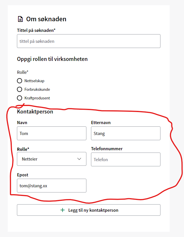
the marked around the red circle is the result the code I wrote above was just a short explanation of how it works, but it is doing something similar on my real code. It is to much code to paste the whole code in here Discord, so it would be easier to give a related pseudo code but the idea the red rectangle inside of the input fields. It needs to have the flexibility to let developer choose either 1-12 columns not that it will be ever 12 columns to fit in this use case, but the idea it is reusable component that can be user in other places of the code so it could be that the solution I want to choose using grid is not really good choice to be honest
lko
lkoā€¢2mo ago
Just do something like this I think
<div class="form-container">
<input type="text" />
</div>
<div class="form-container">
<input type="text" />
</div>
.form-container {
display: grid;
grid-template-columns: repeat(12, 1fr);
}

.form-container input {
--columns-width: 6;
grid-column: span var(--columns-width);
}
.form-container {
display: grid;
grid-template-columns: repeat(12, 1fr);
}

.form-container input {
--columns-width: 6;
grid-column: span var(--columns-width);
}
Koicha
Koichaā€¢2mo ago
hmm, not quite right. I have to modify your code a bit:
<script setup lang="ts">
const { column } = defineProps<{ column: number | string }>();
</script>

<template>
<div class="grid-layout" :style="{ '--column-start': column }">
<slot />
</div>
</template>

<style scoped lang="scss">
.grid-layout {
display: grid;
grid-template-columns: repeat(12, 1fr);

> * {
--columns-width: var(--column-start);

grid-column: span var(--columns-width);
}
}
</style>
// usage of the component
<grid-layout column="3">...</<grid-layout>
// usage of the component
<grid-layout column="3">...</<grid-layout>
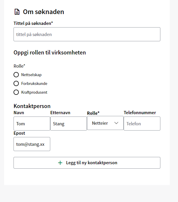
This is the result if I use 3 column
No description
Chris Bolson
Chris Bolsonā€¢2mo ago
I might be missing something but I would stick to a the basic grid-template-columns: repeat(3,1fr) as lko has already suggested. You just need to replace the "3" with a custom property grid-template-columns:repeat(var(--cols),1fr);
Koicha
Koichaā€¢2mo ago
sure, but isn't there a way to make it responsive? using the grid-template-columns: repeat(3,1fr), wont let it be responsive if there is a "hacky" solution or somet other way, I am opened for it
lko
lkoā€¢2mo ago
minmax(calc(var(--column-start, 1)), 1fr)?
Koicha
Koichaā€¢2mo ago
unfortunently, everything is now only 1 column
<script setup lang="ts">
const { column } = defineProps<{ column: number | string }>();
</script>

<template>
<div class="grid-layout" :style="{ '--columns': column }">
<slot />
</div>
</template>

<style scoped lang="scss">
.grid-layout {
display: grid;
grid-template-columns: repeat(auto-fill, minmax(calc(var(--columns)), 1fr));
grid-auto-rows: minmax(100px, auto);
gap: 1em;
margin-block: 1em;
}
</style>
This is what I did
lko
lkoā€¢2mo ago
why the calc?
Koicha
Koichaā€¢2mo ago
oh, I just copied your code, lol
lko
lkoā€¢2mo ago
also what is column?
Koicha
Koichaā€¢2mo ago
I removed the calc() now. Everything is still 1 column column is the input I am giving it to be 3. So it will be like this:
<grid-layout column="3"></<grid-layout>
this means I am expecting it to be 3 columns, but I am now only getting 1 column
lko
lkoā€¢2mo ago
does the browser see it correctly? in the dev tools
Koicha
Koichaā€¢2mo ago
yes, the browser sees it is grid you can try to see if it works with your solution using codepen. I will of course adapt your code using Vue
lko
lkoā€¢2mo ago
Yeah right Because you're saying minmax(3, 1fr) it doesnt mean anything
Koicha
Koichaā€¢2mo ago
Hmm, so I changed it to
grid-template-columns: repeat(var(--columns), minmax(0, 1fr));
The column is working now. Unfortunately, the auto responsiveness is not there šŸ˜¦
lko
lkoā€¢2mo ago
because you set the min to 0
Koicha
Koichaā€¢2mo ago
If I set it to 500px for example, then it becomes this + it is not also being responsive when I shrink the window size as well
No description
lko
lkoā€¢2mo ago
grid-template-columns: repeat(auto-fit, minmax(min(var(--columns), 100%), 1fr)); And --columns: 5rem or something like that I think it should work fine
Koicha
Koichaā€¢2mo ago
that is pretty arbitrary number but if I changed it to 3rem, then it wont work as expected either, and it will become 5 columns
lko
lkoā€¢2mo ago
What do you want the user to control? The number of columns? Or how large a single input should be I still dont get it
Koicha
Koichaā€¢2mo ago
It is pretty simple. If I want the developer to use the component that is called grid-layout and they want to adjust the column based on the layout of the column, then it will be for example 5 columns by using the props that is called columns
<grid-layout columns="5">...</grid-layout>
It's just the implementation I am trying to fix doesn't work
lko
lkoā€¢2mo ago
Ok and when should it wrap?
Chris Bolson
Chris Bolsonā€¢2mo ago
I think that your original idea might not be working because you aren't taking into account the gap when calculating the min value šŸ¤”
Koicha
Koichaā€¢2mo ago
The grid-layout component is wrapping the children for example like this
<grid-layout columns="3">
<input type="text" v-model="text1" />
<input type="text" v-model="text2" />
<input type="text" v-model="text3" />
<input type="text" v-model="text4" />
<input type="text" v-model="text5" />
<input type="text" v-model="text6" />
</grid-layout>
<grid-layout columns="3">
<input type="text" v-model="text1" />
<input type="text" v-model="text2" />
<input type="text" v-model="text3" />
<input type="text" v-model="text4" />
<input type="text" v-model="text5" />
<input type="text" v-model="text6" />
</grid-layout>
lko
lkoā€¢2mo ago
yes but you said you want that to be responsive, when do you want that to wrap? or do you want it to always have 3 columns?
Koicha
Koichaā€¢2mo ago
I want it to wrap based on the browser will do the automatic calculation without explicitly telling it to be 3 columns, 2 columns, 7 columns, etc.. The browser will need to do it automatically for me I am open for solution
Chris Bolson
Chris Bolsonā€¢2mo ago
https://codepen.io/cbolson/pen/rNEdgKo Subtract the gap from your minmax calculation
Koicha
Koichaā€¢2mo ago
YES! I think this is it!!! šŸ˜­ omg!! It works!!! Chris, you are a god saviour! Thank you so much! by the way, is there a way to make it work without using:
--width: 25em;
--width: 25em;
this is hard coded value
lko
lkoā€¢2mo ago
No there isn't that's what I what I was trying to say before, the browser is not magic, it can't wrap things on it's own You can use min-width
Koicha
Koichaā€¢2mo ago
aha
min-width: 0
min-width: 0
I assume?
Chris Bolson
Chris Bolsonā€¢2mo ago
--width: 25em; this is hard coded value
Yes, as per your original code where you also had a hard-coded value. As lko says, the browser needs something to base its calculations on.
Koicha
Koichaā€¢2mo ago
understood! Appreciate for the help guys!
Want results from more Discord servers?
Add your server