How to use curve fitted functions to eliminate media queries
Hello!
I'm trying to eliminate media queries for setting font-sizes across diff widths.
So as an example I want the font-size: 12px @ 320px width, 14px @ 768px width and so on till a max of 18px @ >= 1366px width
Problem is that exp() expects unitless values and i don't know how to do that
Specifically, 100vw should return 320 or 1024 or 1920 etc without the px unit
Any ideas would be greatly appreciated !
5 Replies
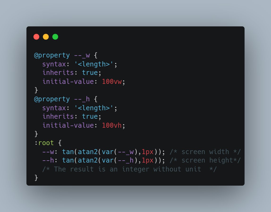
A few days ago I saw this handy trick to get the screen dimensions without units
https://x.com/ChallengesCss/status/1813154504113623393
T. Afif @ CSS Challenges (@ChallengesCss) on X
💡 CSS Tip!
Get the screen width and height using a few lines of CSS.
✅ Powered by @property (Now available in all the browsers)
✅ Unitless values so you can easily use them inside any formula
✅ Updates on screen resize (No need for JS)
@CodePen demo in the reply 👇
Twitter
Temani Afif
CodePen
Screen width/height (CSS-only)
What you see are the screen sizes (width x height) in pixel. No, I am not using JS to get them, it's a CSS-only trick! Online version: https://css-tip...
Thank you! This is a GREAT start 🙂
This is now correctly calculating the font size without the units
solved and it works 🙂
i need to test a bit more but looks like i just might be able to remove the extraneous media queries now
well, using a simple linear regression formula works great for me
freedom from media queries for simple props
nice, well done
I'm using SCSS and I've been using a lot this mixin to set font-size and other stuff across various viewport widths:
It will linearly change the $prop value between two viewport widths.
Example usage:
In this case the font-size will be 94px if the viewport width is more than 1450px. In the viewport width range [1450px, 770px], the font size will linearly decrease from 94px (for 1450px viewport-width) down to 62px (for 770px viewport-width). Below 770px viewport-width the font size will remain at 62px.