Flex-item not shrinking and causing overflow

Hello, I'm working on a simple UI for utility tool and I need bit a help with css, basically I got a div that lists all files inside a scripts folder, however the span item (so the file name) just doesn't shrink causing the whole container to overflow Like this https://mentally-insane.pixeluted.com/BOXe6/PELotUxU44.png I'm using svelte for this project, so this is the code for the div
<script lang="ts">
import FileExplorerFolderEntry from "./FileExplorerFolderEntry.svelte";
import FileExplorerFileEntry from "./FileExplorerFileEntry.svelte";
import Dropdown from "../Dropdown.svelte";
import type { FileData } from "../../managers/FileExplorerManager";
import FileExplorerManager from "../../managers/FileExplorerManager";

let currentFiles: FileData[];
FileExplorerManager.currentFiles.subscribe((value) => {
currentFiles = value;
});
</script>

<div class="file-explorer">
<FileExplorerFolderEntry name="Auto Exec" icon="fa-solid fa-robot">
{#each currentFiles as file}
{#if file.folder === "Auto Exec"}
<FileExplorerFileEntry fileName={file.title} fileId={file.id} />
{/if}
{/each}
</FileExplorerFolderEntry>

{#each currentFiles as file}
{#if file.folder === "Scripts"}
<FileExplorerFileEntry fileName={file.title} fileId={file.id} />
{/if}
{/each}

<Dropdown>
<button data-index="1">
<i class="fa-solid fa-file"></i>
<span>New File</span>
</button>
</Dropdown>
</div>

<style>
.file-explorer {
background-color: var(--light);
border: 1px solid var(--lighter);
border-radius: 2.5px;
box-sizing: border-box;
user-select: none;
overflow: auto;
height: 100%;

display: flex;
flex-direction: column;
gap: 1px;
padding-top: 5px;
padding-left: 5px;
}
</style>
I don't know what code you need, but feel free to ask for more code and I will send it. Also the main container is not overflowing https://mentally-insane.pixeluted.com/BOXe6/HaRiYaSa84.png Just the container that contains the search button and the list of files (this overflow didnt start until I started implementing the files) https://mentally-insane.pixeluted.com/BOXe6/HAjAjEhe20.png Thanks for any help!
47 Replies
MarkBoots
MarkBoots3mo ago
I suspect it is the editor together with the file explorer that is causing the issue. does the left part have a fixed / min-width. It might be easier for us if you copy the rendered html and css to a codepen or sandbox
Pixeluted
Pixeluted3mo ago
ohh that is possible? sorry im new to this all could u tell me how to do it?
MarkBoots
MarkBoots3mo ago
yea, just inspect the element, right click on the body tag and copy
Pixeluted
Pixeluted3mo ago
got it do i have to copy it over somewhere?
MarkBoots
MarkBoots3mo ago
you can do it on codepen.io (you need an account to be able to save it) then you can share the link
Pixeluted
Pixeluted3mo ago
hmm the html tag doesnt include css since im using vite
MarkBoots
MarkBoots3mo ago
css you can copy seperatly from you components
Pixeluted
Pixeluted3mo ago
like copy all the css from compoments to one css?
MarkBoots
MarkBoots3mo ago
yea
Pixeluted
Pixeluted3mo ago
k yeah that doesnt look good I don't think I can share the UI this way The two parts have set width one is 75% and the other is auto to fill whatever is left
MarkBoots
MarkBoots3mo ago
is it a flex container as well?
Pixeluted
Pixeluted3mo ago
inneed
MarkBoots
MarkBoots3mo ago
remove the percentage width and try flex: 1
Pixeluted
Pixeluted3mo ago
<script lang="ts">
import ExecutorButtons from "../lib/Executor/ExecutorButtons.svelte";
import Input from "../lib/Input.svelte";
import Tabs from "../lib/Executor/Tabs.svelte";
import ScriptEditor from "../lib/Executor/ScriptEditor.svelte";
import FileExplorer from "../lib/Executor/FileExplorer.svelte";

</script>

<main>
<ExecutorButtons/>
<div class="content-container">
<div class="tab-editor-container">
<Tabs/>
<ScriptEditor/>
</div>
<div class="search-file-explorer-container">
<Input placeholder="Search"/>
<FileExplorer/>
</div>
</div>
</main>

<style>
main {
height: calc(100vh - 24px); /* Full viewport size - size of title bar */
background-color: var(--dark);
}

.content-container {
display: flex;
height: calc(100vh - 24px - 35px - 20px); /* Full viewport size - size of title bar - size of buttons - size of tabs */
width: auto;
margin-top: 8px;
margin-right: 8px;
margin-left: 8px;
gap: 0.5rem;
}

.search-file-explorer-container {
display: flex;
flex-direction: column;
flex-grow: 1;
gap: 0.26rem;
}

.tab-editor-container {
display: flex;
flex-direction: column;
gap: 0.2rem;
width: 90%;
}

@media only screen and (max-width: 600px) {
.tab-editor-container {
width: 70%;
}
}

.search-file-explorer-container :global(input) {
padding: 0.7rem 0.3rem;
height: 15px;
width: 100%;
font-size: smaller;
}
</style>
MarkBoots
MarkBoots3mo ago
think this is the issue
.search-file-explorer-container {
display: flex;
flex-direction: column;
flex-grow: 1;
gap: 0.26rem;
}

.tab-editor-container {
display: flex;
flex-direction: column;
gap: 0.2rem;
width: 90%;
}
.search-file-explorer-container {
display: flex;
flex-direction: column;
flex-grow: 1;
gap: 0.26rem;
}

.tab-editor-container {
display: flex;
flex-direction: column;
gap: 0.2rem;
width: 90%;
}
90%is a lot. on the tab editor. make that flex 1 remove the flex-grow on the explorer
Pixeluted
Pixeluted3mo ago
yeah it now doesnt scale how i wanted to and the overflow wasnt fixed https://mentally-insane.pixeluted.com/BOXe6/WaZASAsA60.png
Pixeluted
Pixeluted3mo ago
yeah the width is there bc i want it to be bigger than the other part maybe better would be flex-basis for this
MarkBoots
MarkBoots3mo ago
so tab-editor: flex: 1 (that will take all available space) explorer: just empty (remove flex-grow) so it will be the smallest size possibly
Pixeluted
Pixeluted3mo ago
ok does the effect i wanted but still overflows
Pixeluted
Pixeluted3mo ago
oh yeah it just doesnt shrink at all
Pixeluted
Pixeluted3mo ago
when i removed the media query that set width to lower values
MarkBoots
MarkBoots3mo ago
yea, there must be more set values then. really hard to tell without having access to the whole thing maybe try codesandbox and upload the project there
Pixeluted
Pixeluted3mo ago
does it work with tauri apps?
MarkBoots
MarkBoots3mo ago
not sure, i normally don't use it. maybe someone else can chime in to help you share it
Pixeluted
Pixeluted3mo ago
well the code is public for the project maybe this could be also why
Pixeluted
Pixeluted3mo ago
yeah i removed the width and didnt help but didnt broke it so it wasnt needed
Pixeluted
Pixeluted3mo ago
I don't see any more set widths in the project
MarkBoots
MarkBoots3mo ago
well, seeing the code editor isnt shrinking makes me believe something is forcing the width. can you screenshot that part in the inspector
Pixeluted
Pixeluted3mo ago
editor? the editor is just div which uses monaco
Pixeluted
Pixeluted3mo ago
ok it is monaco causing the issue i just disabled it settuping the editor and it scales normally god damm you microsoft devs seems like someone got the same issue
Pixeluted
Pixeluted3mo ago
Stack Overflow
How can I make the monaco editor size to its parent div?
So I am trying to create a layout with two instances of the monaco editor side-by-side. I'm working with react, and I'm using the @monaco-edior/react component. I have created the desired layout u...
Pixeluted
Pixeluted3mo ago
monaco editor is the reason its being forced but idk why it just doesnt to shrink @MarkBoots so I got possible solution, that is make another container at the same position size as the real container so that doesnt get affected by monaco editor width and height and i can then update it myself in js side
Pixeluted
Pixeluted3mo ago
however i have trouble getting the mirror container properly working https://mentally-insane.pixeluted.com/BOXe6/roDAKobA84.png
Pixeluted
Pixeluted3mo ago
GitHub
[Bug] automaticLayout doesnt shrink to container within flex layout...
Reproducible in vscode.dev or in VS Code Desktop? Not reproducible in vscode.dev or VS Code Desktop Reproducible in the monaco editor playground? Not reproducible in the monaco editor playground Mo...
MarkBoots
MarkBoots3mo ago
a good. sorry wasn't able to respond anymore yesterday. Glad you still manage it
Pixeluted
Pixeluted3mo ago
👍 quick question, do you have any idea why is this not causing a scroll bar appear on my x axis?
No description
MarkBoots
MarkBoots3mo ago
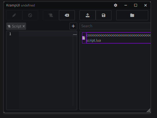
hard to tell, but probably there is an overflow: hidden on it somewhere
Pixeluted
Pixeluted3mo ago
interesting Figured it out, however bc the name is too long, it uses a lot of the space so they layout is bad
Pixeluted
Pixeluted3mo ago
No description
Pixeluted
Pixeluted3mo ago
if you get what i mean
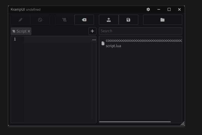
 Fixed