dealing with screen resolution

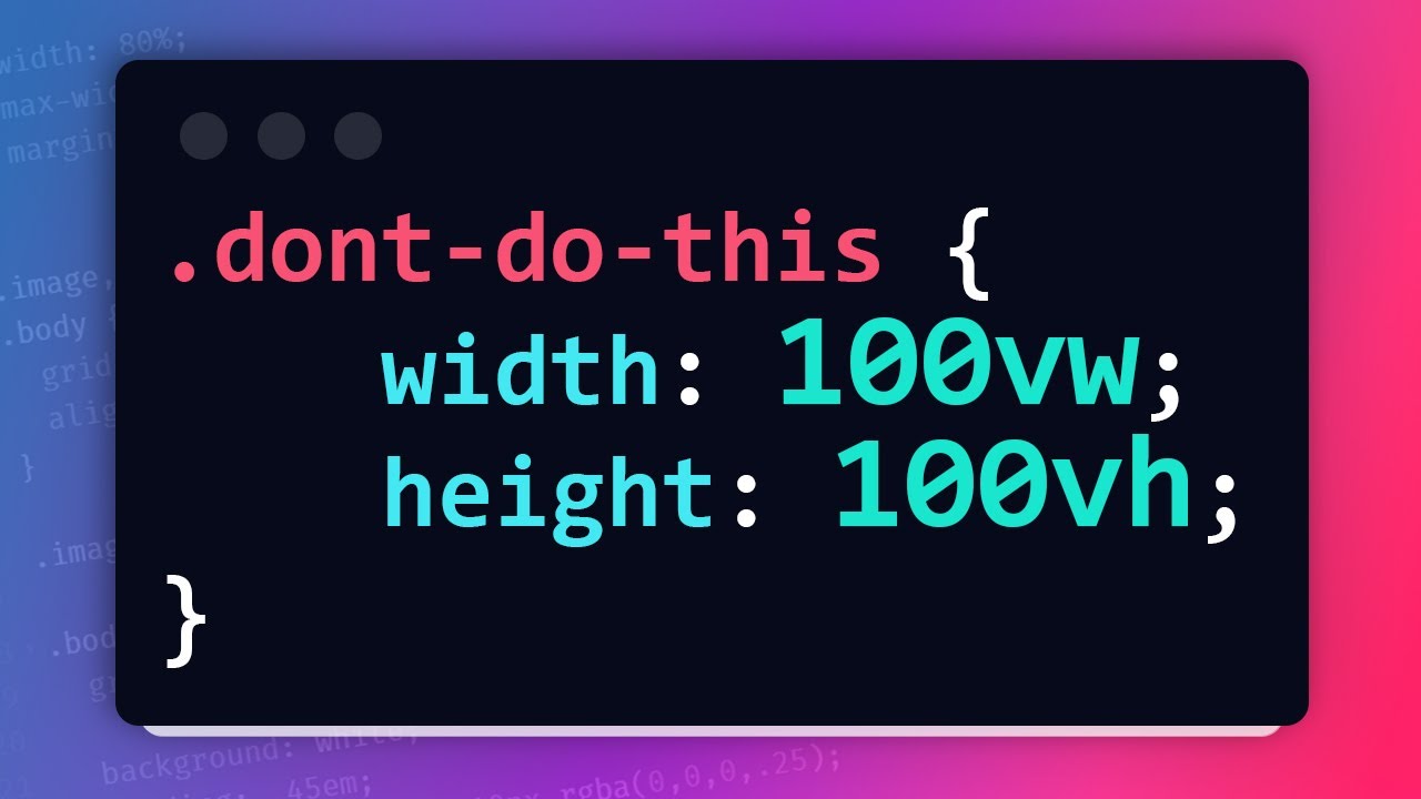
Hello friends I am working on some project, and I was going forward with coding the front-end until I found out that my application is aweful on old monitors with low screen resolution, the fonts the divs gets so bigger and things start to break. Horizontal slides, and many more new problems appeared. I didn't thought of this thing when I first started working on CSS. Is there any helpful tip that I can apply revisiting my CSS?
No description
36 Replies
elhanan
elhanan•9mo ago
The difference looks like this: This above is from my laptop, and the following is when I set the scale of my display to 150% which is similar to some old screen that I have tested out.
elhanan
elhanan•9mo ago
No description
Josoo
Josoo•9mo ago
you could try vw units and try media queries maybe to force width sizes depending on waht your CSS is
elhanan
elhanan•9mo ago
is there any other tweak like checking for screen resolution and zoom in zoom out or scaling thing to body?
Jochem
Jochem•9mo ago
That's what media queries are for You can check different display sizes using the responsive mode on dev tools
elhanan
elhanan•9mo ago
media queries are for screen size instead of resolution right? I am having a problem with screen resolution not screen size
Josoo
Josoo•9mo ago
same thing if you're dealing with monitors of a certain width like phones or super large screens you can use media queries to tackle those situations ex: @media screen and (min-width: 768px) { /* Apply styles for larger screens */ } vw units are another way of making fonts responsive, or using fr units if you're not focused on mobile
Jochem
Jochem•9mo ago
Media queries are for when the layout of your site breaks, that's it
elhanan
elhanan•9mo ago
I don't think you got me, let say I opened my web application on same screen size 15.4" but different resolution (number of pixels) , in such case I don't deal with screen size since they are equal, but since on of the laptop have dense pixel it shows can show multiple components from the web application, but the other laptop with low resolution only show some part of the web UI. So is still using media query is a way to go in such situation? I actually am using media query to deal with tab mobile phone and large screen, but that's not causing this issue
Jochem
Jochem•9mo ago
hmm, you can apparently use a media query on the screen resolution in dpi, but I'm not sure what the results would be https://developer.mozilla.org/en-US/docs/Web/CSS/@media/resolution
MDN Web Docs
resolution - CSS: Cascading Style Sheets | MDN
The resolution CSS media feature can be used to test the pixel density of the output device.
Jochem
Jochem•9mo ago
are you seeing this issue with actual clients, or testing for resolutions that actual clients use? Or are you just being extremely thorough in your testing?
elhanan
elhanan•9mo ago
no i just opened the application on dell monitor and i was frustrated when everything scaled up 😄
elhanan
elhanan•9mo ago
look at this:
No description
elhanan
elhanan•9mo ago
and this
No description
elhanan
elhanan•9mo ago
This is the simplest css applied to it but the difference is huge
Josoo
Josoo•9mo ago
I get what you mean now. Maybe you could try setting fixed dimensions (width and height) for your website elements .my-container { width: 1300px; /* Set your desired fixed width / height: auto; / Allow height to adjust proportionally */ } OR Positioning and Scaling: Set the position property of the <body> and <html> elements to fixed. This sets entire page remains fixed within the viewport. Adjust the positioning of individual elements using CSS properties like right, left, top, and bottom. Maybe try messing with JavaScript properties like window.devicePixelRatio.
elhanan
elhanan•9mo ago
ok I try my best figuring out with suggestion you have gave me, I already suggested a youtube video suggestion for kevin if he can discuss this issue on his tutorial. https://discord.com/channels/436251713830125568/1113603750540623872/1113603750540623872
Josoo
Josoo•9mo ago
yeah your situation is pretty niche since I've never had to deal with old monitor pixel ratios
b1mind
b1mind•9mo ago
noooooo please don't do this xD never use vw/vh for fonts and really avoid them period unless you know what you need (svh/lvh/vmax/vmin) will often be what you will want to use over it too if you really need to. Never for fonts though. I would be to question that this design is coded using widths/heights period? Or you just need to like mentiond above shift it in a @media query so things start to stack vs overflow CSS pixels != dpi You have a monitor that displays things at 1024/800 you will use the same for CSS pixels in a media query. Does not matter the actual size of the monitor could be a 17" or a 21" Also it does not matter for CSS if its higher DPI (but for images it will) Also if you are using fixed/absolute positioning that would probably lead to things getting wonky, hard to say without code. #learnGrid
Josoo
Josoo•9mo ago
whats wrong with using them? I havent personally used them in a web app but I have used them in email development. It was an okay solution but I am curious why you think its a bad idea
b1mind
b1mind•9mo ago
Using them for font-size creates an accessibility issue for users that set font-size. the other issues come from the bad spec really.. Here Kevin made me a video just so I could share 🤣
b1mind
b1mind•9mo ago
Kevin Powell
YouTube
The problems with viewport units
Conquering Responsive Layouts (free course): https://courses.kevinpowell.co/conquering-responsive-layouts Join the Discord: https://kevinpowell.co/discord Viewport units often feel like this cheat code that makes things so much easier when you first discover them, but they actually are problematic for a number of reasons, from creating horizon...
b1mind
b1mind•9mo ago
I don't like he used them for the fallback either.. You can use the 100% from html down for height* or use vmin/vmax in a media query depending what you need. Then use the newer units to override if they do support them. Also people think of them wrong I find lots of times they think they are a responsive unit when they are very much a fixed unit Best width and height unit ? Is to not set them period and let your content be free. (intrinsic containers ig?)
Josoo
Josoo•9mo ago
oh okay, how is it fixed? Wouldnt it calculate based on the current dimensions of the browser?
b1mind
b1mind•9mo ago
Its only based on the view so its not looking at any of its siblings or parents its a fixed value based on viewport That is why lots of people will use it to "overflow" a parent.
elhanan
elhanan•9mo ago
@b1mind @Josoo This is what I have applied to the login page that I have shared the screenshot with you guys.
main {
background-image: url("/img/bg.svg");
background-size: cover;
min-height: 100vh;
background-position: center;
display: flex;
justify-content: center;
}
h3 {
color: #6a81ed;
font-family: var(--ff-heading);
letter-spacing: 2px;
}
.login {
background-color: rgba(255, 255, 255, 1);
border-radius: 25px;
box-shadow: rgba(0, 0, 0, 0.1) 0 10px 50px;
padding: 2em;
height: max-content;
margin-top: 10em;
flex-basis: 15%;
}

.login_form {
row-gap: 1.5em;
flex-direction: column;
margin-top: 1.5em;
}
.login_form label {
text-align: right;
font-size: var(--fs-normal);
}
.login_form input[type='submit']{
width: 80%;
align-self: center;
}
.login_form input::placeholder {
font-family: var(--ff-heading);
font-size: var(--fs-plchldr);
line-height: 1.2;
letter-spacing: 2px;
color: var(--clr-white);
}
.login_input {
flex-direction: column;
}
elhanan
elhanan•9mo ago
I am just trying to remove some global.css and util.css imported styles I have applied there is a huge difference between this and the screenshot I have shared before, commenting out those made huge difference, take a look:
No description
elhanan
elhanan•9mo ago
and I have applied font-size to the body inside util.css which I imported on every application component. Removing that makes things much cleaner and no scrolls take a look:
No description
elhanan
elhanan•9mo ago
Font size is the thing that messing the UI, I didn't think it had such an impact on the UI and broke things. I started using rem units after I watched the REM/EM Kevins tutorial, but in my case, I applied the default font size on the body and again applied the same font size to elements, that is what made a problem. How can I make font-size a responsive since I am testing on different resolution it could so important for me to understand that
Josoo
Josoo•9mo ago
I wonder of when zooming in, the total screensize changes and the content reacts as it shrinks. Do you have a codepen or live example?
elhanan
elhanan•9mo ago
It's really not very good looking I have tried that 🤭 i am working on real project and shared from that and since it's sveltekit application I need to share you the whole source code to reproduce it @Josoo Now after I removed the font-size from the body as I said before, the font of the application on high resolution looks different and smaller
clevermissfox
clevermissfox•9mo ago
Use a clamp() function to make your font size responsive, and then, using EM for padding, margin, gap, etc. will keep all of the spacing relative https://developer.mozilla.org/en-US/docs/Web/CSS/clamp https://utopia.fyi/type/calculator?c=320,18,1.2,1240,20,1.25,5,2,&s=0.75%7C0.5%7C0.25,1.5%7C2%7C3%7C4%7C6,s-l&g=s,l,xl,12
MDN Web Docs
clamp() - CSS: Cascading Style Sheets | MDN
The clamp() CSS function clamps a middle value within a range of values between a defined minimum bound and a maximum bound. The function takes three parameters: a minimum value, a preferred value, and a maximum allowed value.
Utopia
Fluid type scale calculator
Fluid responsive design
elhanan
elhanan•9mo ago
Ok thank you so much I will check it out, I saw Kevin's tutorial on that, but forgot to revist. I am using em's for padding, margins as you said.
clevermissfox
clevermissfox•9mo ago
That’s great, so whenever they it text size shrinks or grows , the spacing for padding, margins, gap (and anything else you use it for , width etc ) will stay relative to that font size! I can’t live without clamp!
elhanan
elhanan•9mo ago
mm, I tried my best to play with the clamp after checking out Kevin's tutorial, and still not satisfied with the result, it is affecting the size of the divs in an uncontrollable manner.
clevermissfox
clevermissfox•8mo ago
Have you set a min or max width ?
Want results from more Discord servers?
Add your server