Help on Grid Layout

While trying to solve Code challenge by Kevin, I tried on using the Grid layout. Link to Codepen is here: https://codepen.io/anurag1989/pen/xxMqMXR Size of img_1, img_2 and img_3 = 471x628 
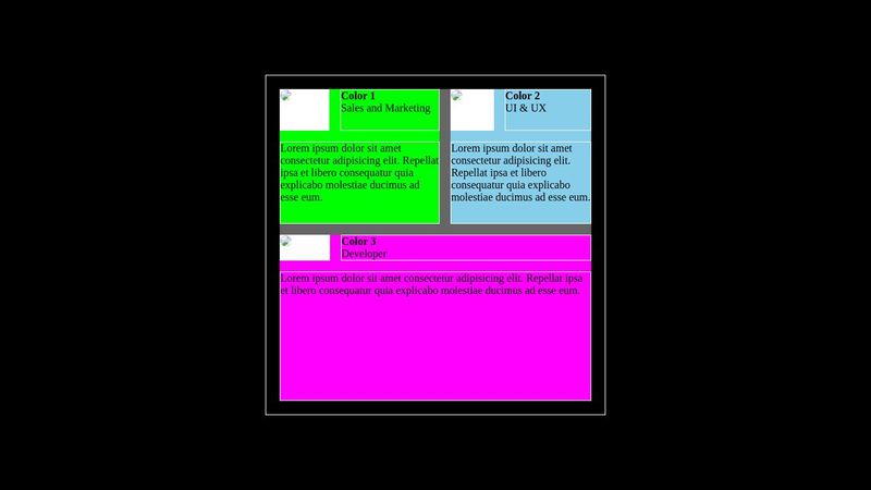
Now the main issue I am facing here is that even though I have declared row inside .container to be 1fr each (with display: grid ), still I am not getting equal height of box-1 and box-3. I thought by this I will get equal height of rows but height of box-3 is approximately twice from that of box-1 (or box-2). If I declare grid-template-rows: 50% 50% then it approx. solves the issue but still the heights are not equal. Why this code is causing issue?
6 Replies
Wolle
Wolle12mo ago
1) the size of everything gets dictated by the images. Via set size ratios (grid-rows) the rest of the elements are sized. 2) your .wrapper has a set height of 500px, which is not enough, so the grid-parent wants to overflow, but it does not because it has height: 100%. General advice: Try not to use height on elements, because it can cause problems (like this) and even more when trying to be responsive, use it only if you know why you need it, usually min-height is the better option. Most of the time width: 100% does nothing. If you set height, all children sizes have to be thought from the parent, which is the oposite of what browsers do normally.
Anurag Gupta
Anurag Gupta12mo ago
But for images, I ahve restricted their size by using max-width:100%. So why it is creating problem of overflow? Most importantly, the height of box1 and box3 are different although the size of images are same.
Wolle
Wolle12mo ago
Your Problem is height. You would have to limit their height to: ((500px - containerGap) / 2 - boxGap) / 3 Which is problematic. The question is: why does your container need to be exactly 500px in height?
Anurag Gupta
Anurag Gupta12mo ago
Hmm.. I got your point. But suppose instead we have to fix the height and I have arranged the containers as per Grid layout and have put the Image inside another container by declaring max-width: 100% (for image), so why we are facing issue here? If the wrapper height is not enough for the image, then what is the point of style for <img> having max-width:100%?
Wolle
Wolle12mo ago
Why do you think that max-width would restrict height of an element? On the other hand I am quite baffled, what is happening there exactly. If your problem is a practical one: just remove the height, if its more scientific: maybe someone else has an answer to this interesting behavior.
Anurag Gupta
Anurag Gupta12mo ago
I think I have figured out the problem. (1) The three boxes have two classes: box1 and display1 both of which have display: grid. So, I have removed one of the display (from box1). (2) Removed grid-template-rows from .display1 and .display2. With these changes, the output is as expected. The only problem 'now' is that I don't know why it works?
Want results from more Discord servers?
Add your server