Are you a designer @Niklas  ? Aaand, will you be here in the hypothetical future where a hypothetical ublue front page is devved up?
 ? Aaand, will you be here in the hypothetical future where a hypothetical ublue front page is devved up?
I will be here yes
And I don't pride myself as a designer but i do like to do shit in figma sometimes 

The peeps behind Astro are working on a docs-specific thingy https://starlight.astro.build/ which when it hits stability will probably be pretty cool. It'd allow you (and I) to write JSX components while allowing documentation / content authors write stuff in MDX using the components, which is pretty cool. All packed in a performant static site.
Yeah, that doesn't tell me much about the quality of the work. But, I guess judging yourself is hard.
I mean I have this right now

very basic atm though
This needs a catchy tagline
so the website will use NextJS as framework?
I'm only dabbling in Figma for this bazzite thingy
For now.
If I got to choose it myself, no, but that's personal bias. And I probably do get to choose it if I start the project. But if yall want NextJS I can work with it. I just like https://astro.build/ for static sites, it feels really fun to use and lightweight, good for static marketing pages & docs, but very easy for interactive stuff too as you can see with https://github.com/ublue-os/images-website. Best part is, you can still use React for components if you want to.
hmm astro is interesting
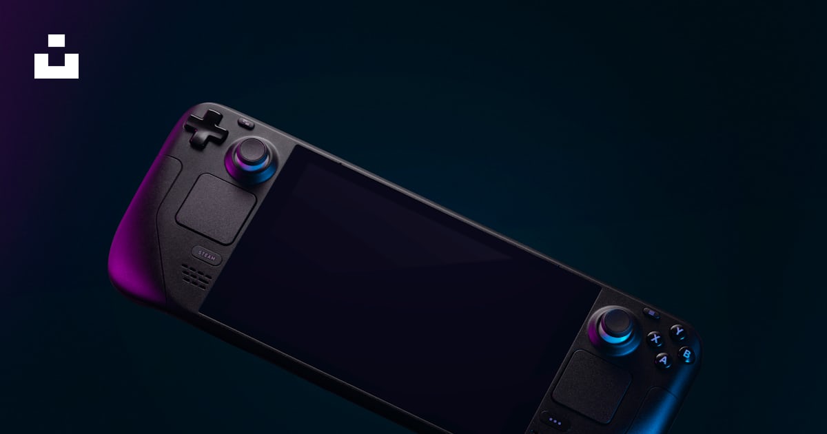
That looks cool, but I don't know if it's legally allowed to market another thing as SteamOS or using marketing images of the SteamDeck. And for a more general critique, full page images usually work pretty badly on mobile, where a lot of people browse the web nowadays.
Yeah I whipped out the SteamOS part.
And I think I can make use of this image since it was posted on Unsplash 

Ah, then it is.
I always make sure to use something that i am legally allowed to use, be it from Unsplash, Pixabay or Pexels. With proper credits of course.
Great
very rough mockup right now.


I think I am not happy with the second mockup tho. Need to change that.

other considerations; "download" should probably be more like "get" and redirect to documentation, i would remove the word bazzite from the hero text and instead place it in the header, as this feels cleaner and more like how others do it
You mean like this for the DL button?

Sure. That feels kinda short, though, idk.
Yeah that’s what I thought too
