space in h1 h2 p
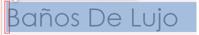
Hello, I hope you are well, is there any way to avoid that space that is generated when choosing a large size for the font? In the first image select what I mean, I ask because I am trying to align an h1 h2 and a p, and there are those spaces, the second image shows how it looks

5 Replies
That space is a part of the font, defined by the person who made the font. It's for decenders (look at the letter
j in the first image, which reaches the bottom), and things like accents and other things that might stick off the top of capital letters).
There is nothing we can do about it at the moment, other that putting very tight line-height, like a 0.8 or something. Takes experimentation, and it really depends on both the font and font-size, so there is no rule or anything you can follow.
There is a new property in the works called leading-trim that will help with this, but it's still very early days, so not something we can use at the moment.i believe they are talking about the small space in front of the capital K and B in the first grid-row. they're not aligned with the letter P in the next row.
this gap gets larger with the font size.
lel, they even drew a box around it in the left image
was facing this issue before as well, but haven't found a solution which didn't involve magic numbers for negative margin-inline-start.
It's still related to the font though. Like Kevin is saying
Ah, yes... wrong thing that I was looking at, but same answer 😄
It's very intentional by the creator of the font, though usually for text used at smaller sizes. If you have a paragraph of text, you don't actually want the letters perfectly aligned down the left side. Because of letters like
C, S, V, etc. that aren't actually straight on the left, the alignment looks off, so a good font will have unique spacing to account for that.
The issue with most fonts is at larger sizes, since most fonts are designed for use as body text.
There are display fonts though, which aren't meant to be used at larger sizes where things like that are often fixed. You'll sometimes see one font that has a display version, and that means it has for small sizes, and the display is for large sizes.
You can use ::first-letter to fix it in a bit of a hacky way
https://codepen.io/kevinpowell/pen/bGQVvXW
Only issue there is if it wraps, it's even worse 😅
(and actually, to see why it's intentional, if you shrink the viewport in that codepen so the big paragraphs have text on it's own line, you'll notice the t alignment, the little thing sticking off the left going to the edge, but the vertical bar is still aligned with the b above it. The S also sticks out into that space just a touch, but only the bottom of it).
Just one of those typography things really, including inside design software (though good page layout tools like InDesign do have different ways of dealing with it)Thanks for all the answers and the help, I really wasn't aware that certain fonts come with that space I didn't realize until now, and clearly it only happens when the font is used in a large size. I decided that those h1 should be centered, although I also tried lowering the size and it worked but I felt that I was losing sight of what I expected people to see first, again I thank you for everything!