Grid on the viewport
Hi everyone
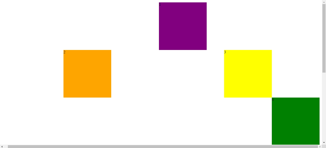
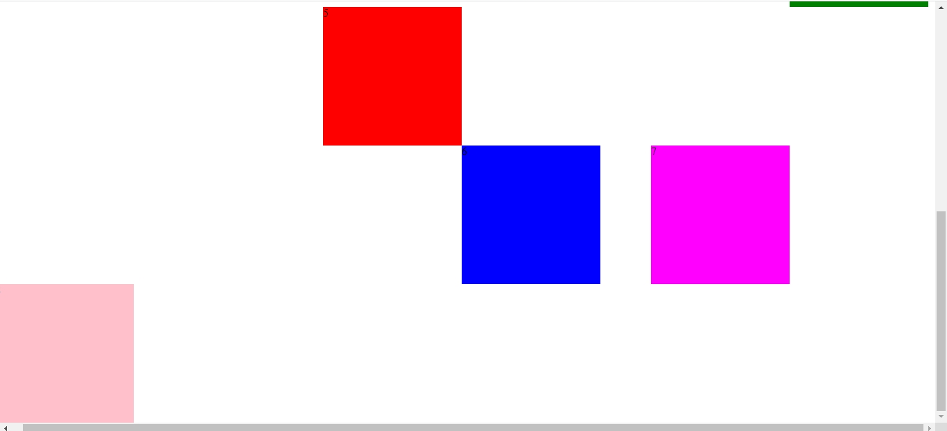
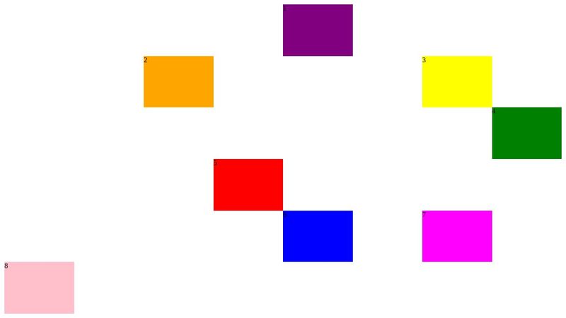
I built a grid I which all the grid should appear on the viewport but I have a vertical scrollbar
my code:
my css code:
can I get some idea about the way to solve this problem
(Sorry for my english I'm from french country)
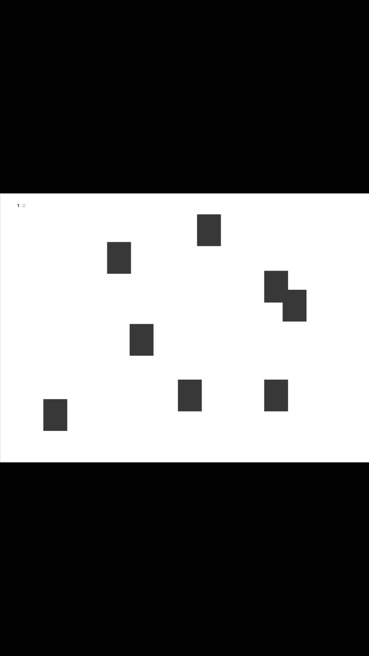
this is what I want build:
I built a grid I which all the grid should appear on the viewport but I have a vertical scrollbar
my code:
<body>
    <main class="content">
               <div class="un">1</div>
               <div class="deux">2</div>
               <div class="trois">3</div>
               <div class="quatre">4</div>
               <div class="cinq">5</div>
               <div class="six">6</div>
               <div class="sept">7</div>
               <div class="huit">8</div>

    </main>
</body><body>
<main class="content">
<div class="un">1</div>
<div class="deux">2</div>
<div class="trois">3</div>
<div class="quatre">4</div>
<div class="cinq">5</div>
<div class="six">6</div>
<div class="sept">7</div>
<div class="huit">8</div>
</main>
</body>my css code:
.content{
    width: 100vw;
    height: 100vh;
    display: grid;
    grid-template-areas: ". . . . un . . ."
                         ". . deux . . . trois ."
                         ". . . . . . . quatre "
                         ". . . cinq . . . .  "
                         ". . . . six . sept ."
                         "huit . . . . . . .";

    grid-template-columns:repeat(8, 1fr);
    grid-template-rows: repeat(6, 1fr);
    padding: 10px;
}

.un{
     grid-area: un;
     background-color: purple;
     width: 200px;
     height: 200px;
}

.deux{
   grid-area: deux;
   background-color: orange;
   width: 200px;
   height: 200px;
}

.trois{
   grid-area: trois;
   background-color: yellow;
   width: 200px;
   height: 200px;
}

.quatre{
   grid-area: quatre;
   background-color: green;
   width: 200px;
   height: 200px;
}

.cinq{
grid-area: cinq;
background-color: red;
width: 200px;
height: 200px;
}

.six{
   grid-area: six;
   background-color: blue;
   width: 200px;
   height: 200px;
}

.sept{
grid-area: sept;
background-color:magenta ;
width: 200px;
height: 200px;
}

.huit{
    grid-area: huit;
    background-color: pink;
    width: 200px;
     height: 200px;
}.content{
width: 100vw;
height: 100vh;
display: grid;
grid-template-areas: ". . . . un . . ."
". . deux . . . trois ."
". . . . . . . quatre "
". . . cinq . . . . "
". . . . six . sept ."
"huit . . . . . . .";
grid-template-columns:repeat(8, 1fr);
grid-template-rows: repeat(6, 1fr);
padding: 10px;
}
.un{
grid-area: un;
background-color: purple;
width: 200px;
height: 200px;
}
.deux{
grid-area: deux;
background-color: orange;
width: 200px;
height: 200px;
}
.trois{
grid-area: trois;
background-color: yellow;
width: 200px;
height: 200px;
}
.quatre{
grid-area: quatre;
background-color: green;
width: 200px;
height: 200px;
}
.cinq{
grid-area: cinq;
background-color: red;
width: 200px;
height: 200px;
}
.six{
grid-area: six;
background-color: blue;
width: 200px;
height: 200px;
}
.sept{
grid-area: sept;
background-color:magenta ;
width: 200px;
height: 200px;
}
.huit{
grid-area: huit;
background-color: pink;
width: 200px;
height: 200px;
}can I get some idea about the way to solve this problem
(Sorry for my english I'm from french country)
this is what I want build: