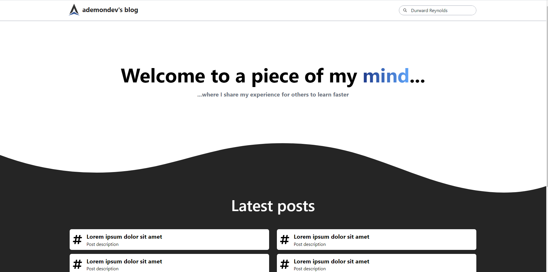
I'm making my first blog, feedback?
I'm only starting on the UI/UX world, and I decided to make a blog to learn and also post things I'm interested in. I feel the posts layout is missing something and I don't know what. I'd really appreciate if someone could give me feedback on the whole design and specifically on the latest posts layout


15 Replies
Well your navbar is lacking buttons
The only thing you can really do is search for posts in the searchbar, do I really need buttons?
the normal covention on nav is to have Logo on the left and Contact on the rightmost. The footer is supposed to have all the important links
Its just basic UX must-have
But if you only have one page then you wont have a selling point for your website
I have this page and then a different template for displaying the actual post

The gap between the blog post is not equal yet
You might wanna use gap in flexbox

The actual post is not yet styled
Because I have to modify the way I process the markdown file
But the layout is there
Take in mind I zoomed it out so the whole thing fits
You probably dont wanna have that big wave on the footer. Might hurt reading experience. i suggest using a smaller one
I'll take a note on that
Thanks, I didn't notice that
What would you recommend me to do about the "Latest posts" layout?
I feel it needs more of something
It's too empty
well if it serves its purpose then empty is good
I suggest watching this dude's youtube. He explain a lot of mistakes and must-have on a website. he has a whole video about footers too
you probably can add an image as a background for "welcome to a piece of my mind"
just need to dim it to not hurt text contrast
I'm looking through the channel and I feel like I must watch most of his videos
Let me try it real quick
If you don't look at the space between the wave and the image, it's good
