How do I handle images with too many different sizes on a blog page?
soo there are small images, big 16:9 images, square images lying everywhere on my blog page and I just don't know how to write css to handle them all at once. Is there a solve-all css line that I can use to automatically make sure all are in the right aspect ratio, doesn't clip content, doesn't overflow out of its container
8 Replies
do you do a css reset? For instance, are you adding:
img,
picture {
max-width: 100%;
display: block;
}
to your file? this should solve most of your issues if not
but I'm worried about the fact that I have to manually add "width" and "height" to each images
why?
if you set the width and height, then you are going to lose your responsiveness
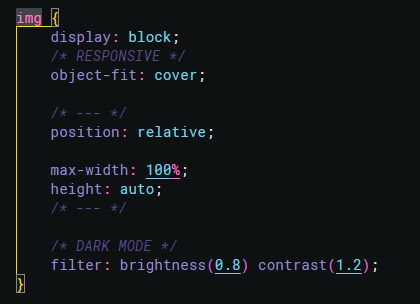
this is the css I use for img

but if I have one image that are way too small compared to the rest then it get stretched too hard and get blurry
if you set it to cover, it will stretch to fill the entire container
if you set it to contain, it will preserve the aspect ratio, but only fill the space as much as it can
oooh I see now
I was under the impression that 'cover' is the most popular option
thank you
both have their uses, just depends on what you are trying to accomplish, 🙂