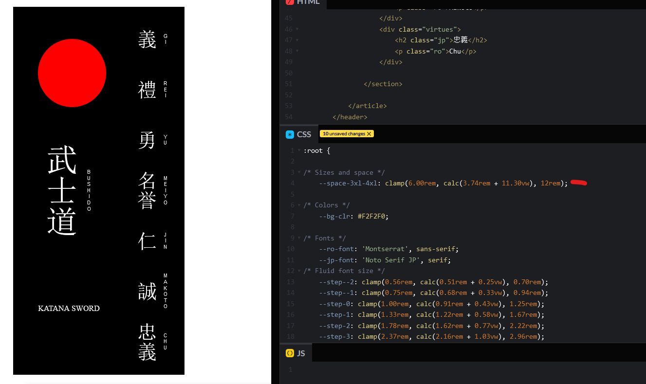
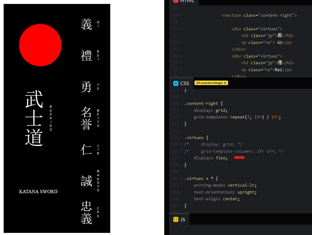
Centering circle
Justify, align, place ... this is driving me crazy.
So why isn't my
.red-circle centering inside the .circle-box with place-self: center;, when .katana is doing it inside of .sword. It's even disappering which just throws me off completely!
I just know there's some stupidly easy way of doing it, but I am missing it now ...
main.css in css folder:
https://github.com/AMarlonG/Japanese-style-responsivenessGitHub
GitHub - AMarlonG/Japanese-style-responsiveness: Creating a traditi...
Creating a traditional japanese card with principals from Jen simmons and Utopia fluid responsive calculations - GitHub - AMarlonG/Japanese-style-responsiveness: Creating a traditional japanese car...
28 Replies
I've made it work with some really hacky ways, like
align-self: center; and then adding margin. But that doesn´t feel sustainable ...you get a grid and you get a grid, everyone gets grid 🤣 don't you think you went a little overboard with the grid usage ?
Haha! Maybe, but at least for this issue removing the grid on the parent doesn't let place work. So if I remove grid on
.sword then the place-self on .katana doesn't work. I would love to make it work without! I just get so confused with the damn placement properties ... 😭you don't need grid on circle-box and sword at all
place-items: center on content-left should do all the jobyou are missing a semi colon in calc.css on line 6
there for your circle does not get a size, the variable

also the words they just flex bro no need for grid
you are also importing/adding the calc.css twice in html and css
with that semicolon it will work (did not change anything else)

... it's to late here in Norway now. I think that is the answer. 😅
9pm ain't late 😉
Ok, so it's all working now with all of your help. Thank you so much!
same time here in Netherlands,
But a few questions ...
I don't have to add the @import css in the css file, is that what you're saying?
no if you already loaded that file in html

cool!
And finally: using
place only works when you use flex or grid, right? justify / align can be used outside, but also with, a flex or grid container?place is grid only
And to this point, what do you mean?
https://css-tricks.com/snippets/css/complete-guide-grid/
https://css-tricks.com/snippets/css/a-guide-to-flexbox/
Chris House
CSS-Tricks
A Complete Guide to CSS Grid | CSS-Tricks
Our comprehensive guide to CSS grid, focusing on all the settings both for the grid parent container and the grid child elements.
Chris Coyier
CSS-Tricks
A Complete Guide to Flexbox | CSS-Tricks
Our comprehensive guide to CSS flexbox layout. This complete guide explains everything about flexbox, focusing on all the different possible properties for the parent element (the flex container) and the child elements (the flex items). It also includes history, demos, patterns, and a browser support chart.
you want them side by side so there is no need for grid when you can use flex
one less property to write
he means this, it's about the same

Ah! I see!
you could also change this btw
So I could really just write
.bushido, .virtues {display:flex;} and then .bushido > *, .virtues > * {writing mode, text direction etc.}?it depends a bit, with flex it will make the width of the columns based on the content, width grid-template-columns you can define them more to you liking. So it's preference, im not really against it tbh. I find grid easier to control
Oh, that's really interesting! Because as you can see in my repo description my goal is to use fluid responsiveness (that's the main challenge here), so by using flex I can control the size of the children better? In other words control there fluidness better ...
Well, yes, at least I find controlling grid more intuitive ...
other way around. grid sets the limits for the children. It defines the space where they can live in
Hmm ... my brain is boiling now, but this is interesting.
So I'm looking at how I could implement the Utopia space principles (https://utopia.fyi/space/calculator?c=320,18,1.2,1240,20,1.25,5,2,&s=0.75%7C0.5%7C0.25,1.5%7C2%7C3%7C4%7C6,s-l&g=s,l,xl,12).
If I calculate the fluid width of each grid cell then the children will move with it?
I don't have to worry about the childrens size at all?
The ultimate fluidity in this project would be if you comment out everything inside
content in the html, and then resize the screen.
Thats the goal!
Then you're left with a black card with perfect aspect ratio of 20/43, which is what the original printed card is.