Remarks
Am not a UI/UX designer, I've been working and don't have a portfolio decided to make one at least 50% is done so this is more of a template any things to change before I even go deep in it
9 Replies
The white boxes would be changed with animations, hover, and pictures and links to my main work and GitHub just did this
Today at night time (it's still night time tho) don't even if to continue with pattern
Couldn't share figma link sorry lol don't even know how to use it efficiently
Hey Electronic! I'll suggest couple of things:
1. Try to use motion to focus attention and maybe inform user on what you want them to do. Hero screen loading animation right now focusing on the wrong thing: on the background instead of your CTA. Look how after "Hi I'm... Contact me" appears, moving background steals the focus. I'll also suggest to make motion smoother, right now its a bit chunky. Here's a quick example:
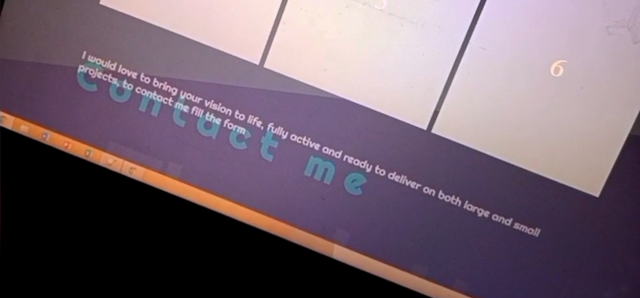
2. This looks a bit off to me)) And again I'll suggest to use motion to lead an eye, to emphasise the direction.

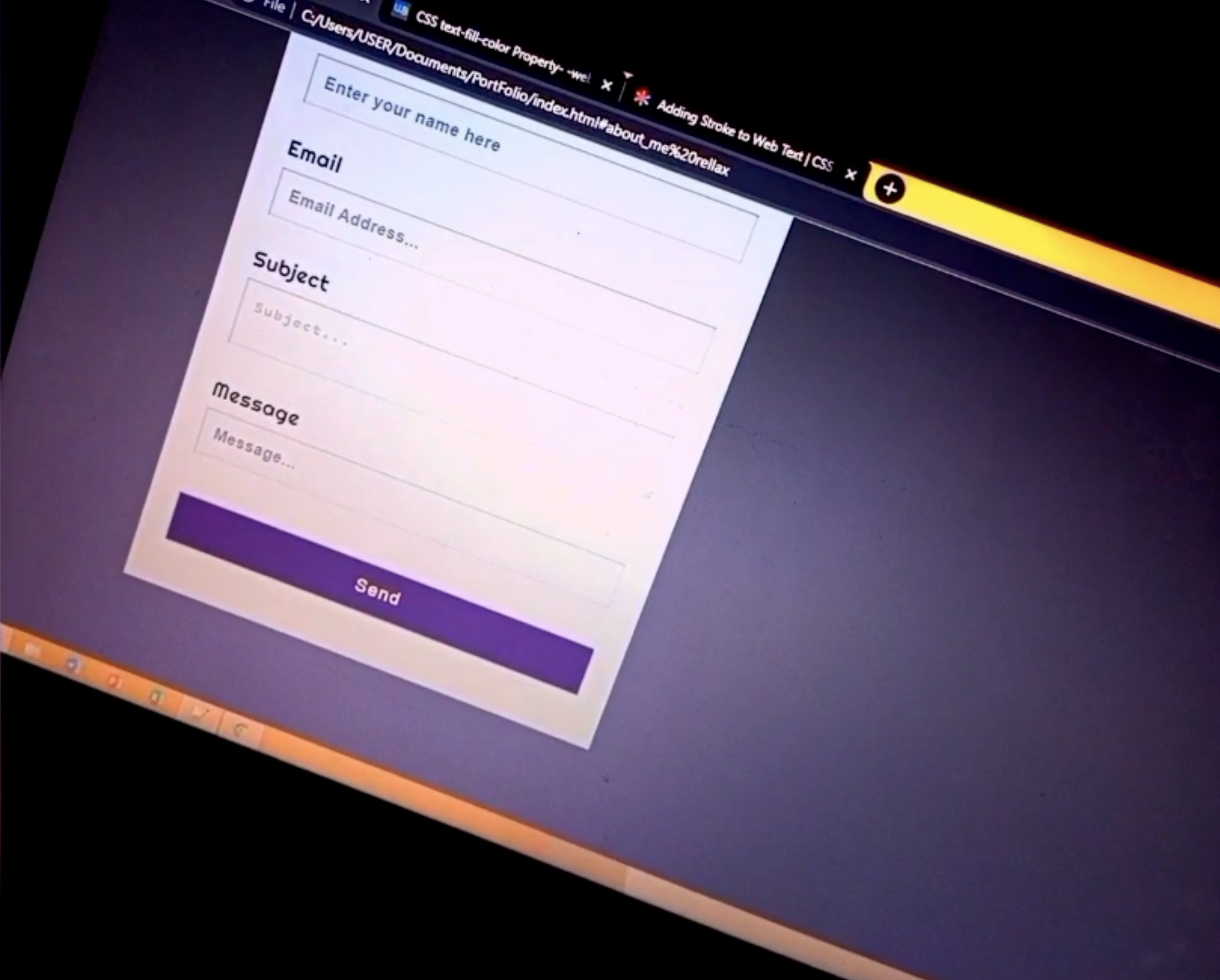
3. Form. Not sure, do you need this "Subject" field? It's and opportunity to make the form easier to fill, without asking for unnecessary things. Also fonts, I guess something went wrong with them, fixable, but the "Message" field needs to look like you can write a message in it. Its size should tell visually "It's a message field". Right now the "Subject" field looks like the "Message" field should look))

That's part of an animation as you scroll it loads through
True but I kind of don't need them to contact me right away I doubt anyone would without going through the site
Am not done with the form yet so far but thanks
The way they are crossing (overlapping) each other, idk, looks off to me))
Okay I'll do it from below then or take it all off
You can make it something like “See my works”… But the point was on what your animation is emphasising.
🤝