do clamps work on image width?
i tried using this on 2 images but it does not seem to ever reach a minimum width anyone has a clue on how clamp works when mixed with image sizes?
width: clamp(0.5rem, 2vw +1rem ,5rem);
14 Replies
Unknown User•3y ago
Message Not Public
Sign In & Join Server To View
I think it might be a problem with the calculation.
Unknown User•3y ago
Message Not Public
Sign In & Join Server To View
Responsive content without media queries using CSS Clamp()
There's a useful function in CSS called CSS Clamp. It's better than using a width property because you can set up a minimum and maximum value, which are the clamps.
i am actually using the clamp on the image not the container
i will try and get a code pen 1 moment
but not sure if code pen gives images
https://codepen.io/X-Ur-X/pen/VwdRppY
these are the 2 images i used not sure if it is possible for codepen
so main issue is when i make screen go very small it never reaches the smallest value ( i kinda want it to behave in that way reach lowest value at small screens and highest at big and prefer mid value generally)
this is as much info i can give ( just trying to improve and learn responsiveness properly)
Unknown User•3y ago
Message Not Public
Sign In & Join Server To View
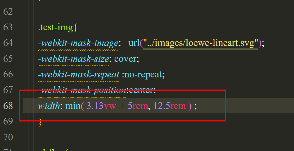
clamp() will work on images, no problem.
With the code you put above with the
min()
function... 3.13vw + 5rem
- I played with that, it works too, but very slowly to the point where you can barely notice it. And unless you go pretty big, the 3.13vw + 5rem
will be the smaller value.mmm i kinda wanted it to reach the min value at 320 px cs smallest screen
i wanted to exaggerate how small it reaches on purpose to see if the min value actually worked
Just wondering, but why use
clamp()
on images instead of max-width: 100%;
? What's the use case to have the image size dependent on the browser window and not the image itself?using
min()
will pick the smallest of the two values, not stop at the smallest.
to stop at 320px, you'd want something like max(100%, 20rem)
. Then it'll grow/shrink with it's parent, but never be smaller than 20rem, because if 20rem is bigger than 100%, it wins.
I will echo beck's question though... what's the use case?honestly i do not know the use case i was just testing around and trying to make the image reach a minimum value at 320px then have an ideal width then reach a max of wtvr number to make images responsive
i am learning web dev and i am watching almost all videos from your channel kevin 😅