Transform scale to increase size of image causing overflow
Hello. I'm using transform scale property to increase the size of an image but that is making an x overflow. If I write overflow-x: hidden that doesn't fix the overflow. The image isn't overflowing from the page, rather it's the parent div that is overflowing. Only happening on mobile device
19 Replies
mm can you recreate the issue in a codepen maybe to help others troubleshoot*?
Unknown User•3y ago
Message Not Public
Sign In & Join Server To View
Shots in the dark without code folks they must help us help them
I'm using WP so don't know how to recreate it in a codepen


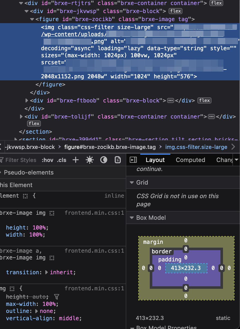
This is how it looks. Simple layout
If I increase this png image with transform scale then overflow comes on the x axis, if I use width and height to increase then also overflow comes
I want the image to be larger because it's barely visible
Resize the parent or change parents padding is my guess. Still only just a guess. The image source appears to be massive so that is not an issue to go bigger, and its set to be 100% of its parent so.
Resizing the parent causes the same issue
is there a smaller srcset that I'm not seeing when its on mobile?
cause you have two in the screen shot so it should be up to 1024px widht
This screenshot is taken when it's on mobile viewport in the responsive viewer
Is there any way I can screenshare here with Discord?

You can see my parent div holding the image is actually small
It's the image that is big
Because I want it big
Reducing the width reduces the size of the image, which I don't want
is there a strict or height on the parent or grandparent?
Other than max-width being 100%, no
so is the raw img have all that transparent space? Idk what I'm looking at with that screenshots, some drag in drop thing?
if the image is that size crop the thing wasted space
Yes the image is basically that mobile mockup. Transparent
right but what I'm saying is the spacing around it
like you would want your asset to be this size

and let CSS control the space
last idea I have would be to simply put overflow: hidden on the figure or that flex parent and size the image strict not %
https://codepen.io/b1mind/pen/XWYGbbW