Logo Design Feedback
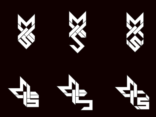
Personal Logo supposed to spellout M(arcius)XS, but isnt really meant to be read, rather something to have as a symbol which looks sort of like an arrow.

11 Replies
originally meant to be MVXS but blends into X way too much and adding another V like symbol makes it too busy, so maybe i can just abandon the v in the name
typically, you would want to use a lettermark style logo when the brand name is too 'wordy'. Ie - FBI instead of federal burea of investigation, or hbo or nasa or cnn etc
in your case, yours is pretty straight forward, and I would recommend using a wordmark type logo (Marcius XS) or whatever
however, i like this design, and it could make a pretty interesting brand mark that you could use alongside your pure text logo
and then it wouldn't matter as much that people don't immediately see the MXS and read it as Marcius
and of the 6 you are showing, I like the 2nd one the best, and the 4th. they are the most visually pleasing to me
expanded on the variations a bit
first one makes out MWS (obviously not 100% settled on the name yet)

I will definitely use it along side text
it might be easier to narrow it down by placing them next to the text logo and seeing which makes the best text / mark combo
Good point
and also to consider, which will look the most centered in a circle, and the largest in a rectangle and a square
adding color does seem to help it alot

ill experiment with it a lot more, thanks for the pointers
color is good, but just be careful. there are lots of times especially in real world printing, where you can't control what color bg your mark will end up
so having a black or white variation that you like, will be very useful
yeah sounds fair
going to make a few dozen variations using each tip