Looking for design feedback
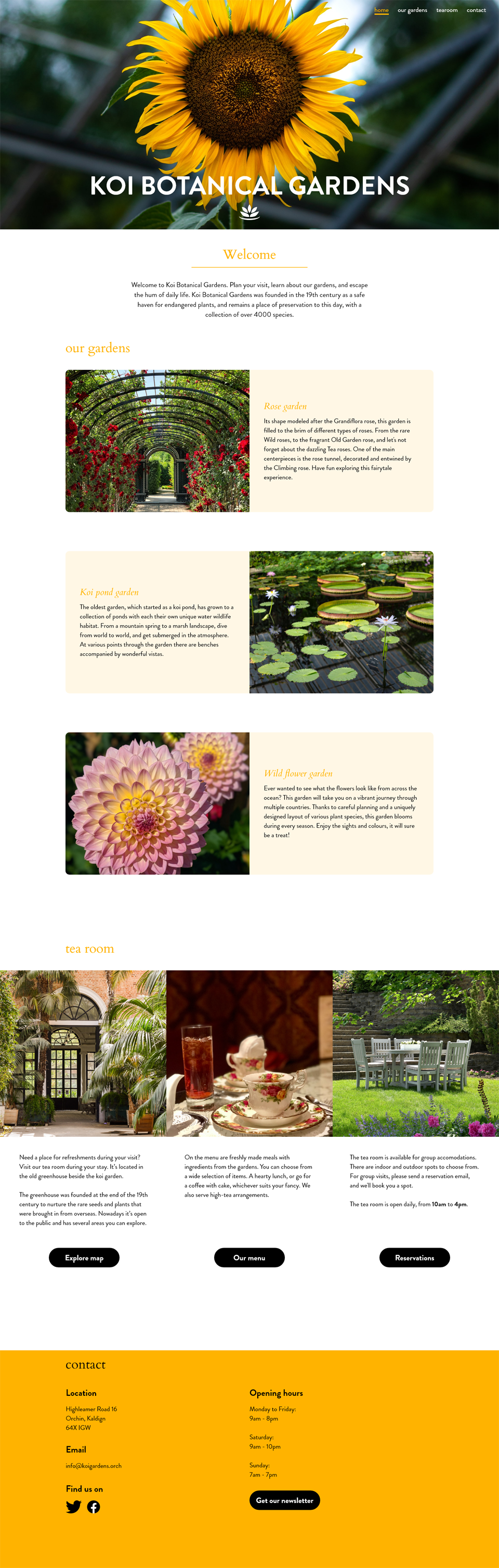
Looking for feedback on this mockup website design for desktop and mobile. Any feedback regarding positioning, layout, and UX/UI flow is very welcome. Other feedback too. I'm still new to UX/UI design, so I might be missing general notes/rules.

2 Replies
Hi -eve. Everything looks good. It's hard to tell from a screen shot, but make sure your minimum font sizes are big enough (1rem / 16px for your paragraphs). Other than that, I would consider changing the desktop footer to a 4 column, and remove some of the opacity on the mobile navbar bg so the hamburger is more visible. If they have a logo, add it to the top
Beyond that - I would classify this layout as the standard 'beginner' design. Each section works, but I would challenge you to look for more advanced design solutions as you progress on your design path.
Thank you for your feedback, good points I can work with!